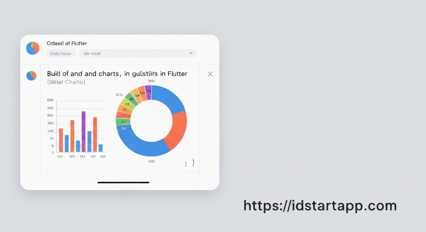

Creating Pie Chart & Bar Chart Widgets in Flutter
Data visualization is a critical aspect of modern applications, providing users with intuitive insights into complex datasets. Flutter, with its rich ecosystem, offers powerful tools to create beautiful and interactive charts. This article will guide you through creating professional Pie Chart and Bar Chart widgets in Flutter using the popular fl_chart package.
Prerequisites
Before we begin, ensure you have a basic understanding of Flutter development. The primary package we'll be using is fl_chart, a highly customizable charting library for Flutter.
Setting Up fl_chart
First, you need to add the fl_chart dependency to your project's pubspec.yaml file. Open your pubspec.yaml and add the following under dependencies:
dependencies:
  flutter:
    sdk: flutter
  fl_chart: ^0.68.0 # Use the latest version
After adding the dependency, run flutter pub get in your terminal to fetch the package.
Creating a Pie Chart Widget
A Pie Chart is ideal for showing proportional distribution of categories. The fl_chart package provides a PieChart widget that can be configured using PieChartData.
Let's create a reusable MyPieChart widget:
import 'package:fl_chart/fl_chart.dart';
import 'package:flutter/material.dart';

class MyPieChart extends StatelessWidget {
  @override
  Widget build(BuildContext context) {
    return AspectRatio(
      aspectRatio: 1.3,
      child: PieChart(
        PieChartData(
          sections: [
            // Section 1: Blue - 40%
            PieChartSectionData(
              color: Colors.blue,
              value: 40,
              title: '40%',
              radius: 50,
              titleStyle: TextStyle(fontSize: 14, fontWeight: FontWeight.bold, color: Colors.white),
            ),
            // Section 2: Orange - 30%
            PieChartSectionData(
              color: Colors.orange,
              value: 30,
              title: '30%',
              radius: 50,
              titleStyle: TextStyle(fontSize: 14, fontWeight: FontWeight.bold, color: Colors.white),
            ),
            // Section 3: Purple - 20%
            PieChartSectionData(
              color: Colors.purple,
              value: 20,
              title: '20%',
              radius: 50,
              titleStyle: TextStyle(fontSize: 14, fontWeight: FontWeight.bold, color: Colors.white),
            ),
            // Section 4: Green - 10%
            PieChartSectionData(
              color: Colors.green,
              value: 10,
              title: '10%',
              radius: 50,
              titleStyle: TextStyle(fontSize: 14, fontWeight: FontWeight.bold, color: Colors.white),
            ),
          ],
          borderData: FlBorderData(show: false), // Hide outer border
          sectionsSpace: 0, // Space between sections
          centerSpaceRadius: 40, // Radius of the hole in the center
        ),
      ),
    );
  }
}
In the code above:
AspectRatioensures the chart maintains a consistent size ratio.PieChartDatais the main configuration object.sectionsis a list ofPieChartSectionData, where each object represents a slice of the pie.- Each
PieChartSectionDatadefines itscolor,value(its proportion),title(text displayed on the slice),radius, andtitleStyle. borderData,sectionsSpace, andcenterSpaceRadiusare used for visual customization.
Creating a Bar Chart Widget
Bar Charts are excellent for comparing discrete categories or showing changes over time. The fl_chart package offers a BarChart widget, configured with BarChartData.
Let's create a reusable MyBarChart widget:
import 'package:fl_chart/fl_chart.dart';
import 'package:flutter/material.dart';

class MyBarChart extends StatelessWidget {
  @override
  Widget build(BuildContext context) {
    return AspectRatio(
      aspectRatio: 1.7,
      child: BarChart(
        BarChartData(
          barGroups: [
            // Bar for Monday
            BarChartGroupData(x: 0, barRods: [BarChartRodData(toY: 8, color: Colors.blue)]),
            // Bar for Tuesday
            BarChartGroupData(x: 1, barRods: [BarChartRodData(toY: 10, color: Colors.orange)]),
            // Bar for Wednesday
            BarChartGroupData(x: 2, barRods: [BarChartRodData(toY: 14, color: Colors.purple)]),
            // Bar for Thursday
            BarChartGroupData(x: 3, barRods: [BarChartRodData(toY: 15, color: Colors.green)]),
            // Bar for Friday
            BarChartGroupData(x: 4, barRods: [BarChartRodData(toY: 13, color: Colors.red)]),
          ],
          titlesData: FlTitlesData(
            show: true,
            bottomTitles: AxisTitles(
              sideTitles: SideTitles(
                showTitles: true,
                getTitlesWidget: (value, meta) {
                  const style = TextStyle(color: Colors.black, fontWeight: FontWeight.bold, fontSize: 14);
                  Widget text;
                  switch (value.toInt()) {
                    case 0: text = const Text('Mon', style: style); break;
                    case 1: text = const Text('Tue', style: style); break;
                    case 2: text = const Text('Wed', style: style); break;
                    case 3: text = const Text('Thu', style: style); break;
                    case 4: text = const Text('Fri', style: style); break;
                    default: text = const Text('', style: style); break;
                  }
                  return SideTitleWidget(axisSide: meta.axisSide, child: text);
                },
                reservedSize: 32,
              ),
            ),
            leftTitles: AxisTitles(
              sideTitles: SideTitles(showTitles: false), // Hide left axis titles for simplicity
            ),
            topTitles: AxisTitles(sideTitles: SideTitles(showTitles: false)),
            rightTitles: AxisTitles(sideTitles: SideTitles(showTitles: false)),
          ),
          gridData: FlGridData(show: false), // Hide grid lines
          borderData: FlBorderData(
            show: true,
            border: Border.all(color: const Color(0xff37434d), width: 1), // Chart border
          ),
        ),
      ),
    );
  }
}
Key components of the Bar Chart:
barGroupsis a list ofBarChartGroupData, where each group typically represents a category on the x-axis.- Each
BarChartGroupDatahas anxvalue and a list ofBarChartRodData. ABarChartRodDatadefines the bar's properties, most importantly itstoYvalue (height) andcolor. titlesData, configured withFlTitlesData, allows you to customize the labels for each axis. ThebottomTitles(x-axis) usegetTitlesWidgetto map numerical values to custom text labels (e.g., 'Mon', 'Tue').gridDataandborderDataare used to control the grid lines and the chart's overall border.
Integrating Charts into a Flutter App
To display these widgets, you can integrate them into any Flutter screen. For demonstration, let's create a simple ChartsPage that displays both charts.
import 'package:flutter/material.dart';
import 'my_pie_chart.dart'; // Assuming you saved the Pie Chart code in my_pie_chart.dart
import 'my_bar_chart.dart'; // Assuming you saved the Bar Chart code in my_bar_chart.dart

void main() {
  runApp(MyApp());
}

class MyApp extends StatelessWidget {
  @override
  Widget build(BuildContext context) {
    return MaterialApp(
      title: 'Flutter Charts Demo',
      debugShowCheckedModeBanner: false,
      theme: ThemeData(
        primarySwatch: Colors.blue,
      ),
      home: ChartsPage(),
    );
  }
}

class ChartsPage extends StatelessWidget {
  @override
  Widget build(BuildContext context) {
    return Scaffold(
      appBar: AppBar(
        title: Text('Flutter Charts'),
      ),
      body: SingleChildScrollView(
        child: Padding(
          padding: const EdgeInsets.all(16.0),
          child: Column(
            crossAxisAlignment: CrossAxisAlignment.start,
            children: [
              Text(
                'Monthly Sales Distribution',
                style: TextStyle(fontSize: 20, fontWeight: FontWeight.bold),
              ),
              SizedBox(height: 20),
              // Display the Pie Chart
              MyPieChart(),
              SizedBox(height: 40),
              Text(
                'Weekly Activity Levels',
                style: TextStyle(fontSize: 20, fontWeight: FontWeight.bold),
              ),
              SizedBox(height: 20),
              // Display the Bar Chart
              MyBarChart(),
            ],
          ),
        ),
      ),
    );
  }
}
This setup provides a basic page where both chart widgets are displayed within a scrollable column, making them adaptable to different screen sizes.
Conclusion
The fl_chart package offers a flexible and powerful way to create stunning and informative Pie Charts and Bar Charts in your Flutter applications. By leveraging its extensive customization options, developers can tailor data visualizations to perfectly match their application's design and data requirements. With these examples, you now have a solid foundation to integrate sophisticated charting capabilities into your Flutter projects.


