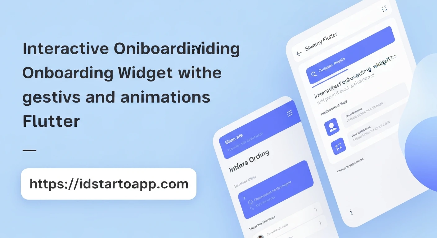

Creating Interactive Onboarding Widgets with Swipe and Animation in Flutter
Onboarding screens are crucial for engaging users from their very first interaction with a mobile application. They serve to introduce key features, explain the app's value proposition, and guide users through initial setup. In Flutter, crafting interactive onboarding experiences with swipe gestures and captivating animations can significantly enhance user retention and satisfaction. This article delves into building such widgets, focusing on a professional and intuitive implementation.
Core Components of an Interactive Onboarding
An effective interactive onboarding experience typically comprises several key elements:
PageView for Swiping
The fundamental component for enabling horizontal swiping between different onboarding pages.
PageViewin Flutter allows users to navigate through a series of full-screen widgets with a natural swipe gesture.Custom Page Content
Each onboarding page should present distinct content, usually an image or illustration, a prominent title, and a concise description. These elements need to be thoughtfully designed to convey information effectively.
Animated Page Indicators
Visual indicators (often dots) that show the user their current position within the onboarding flow and the total number of pages. These indicators should animate smoothly as the user swipes, providing clear visual feedback.
Navigation Buttons
Buttons such as "Skip" and "Next" or "Done" are essential for user control. "Skip" allows users to bypass the onboarding, while "Next" or "Done" facilitates progression or completion of the flow.
Step-by-Step Implementation in Flutter
Let's walk through building an interactive onboarding widget in Flutter.
1. Project Setup
First, ensure you have a basic Flutter project. You can create one using:
flutter create onboarding_app
cd onboarding_app
2. Defining Onboarding Data
We'll create a simple data model to hold the content for each onboarding page.
// lib/models/onboarding_item.dart
class OnboardingItem {
  final String imageUrl;
  final String title;
  final String description;

  OnboardingItem({
    required this.imageUrl,
    required this.title,
    required this.description,
  });
}
Then, define your onboarding content within your main widget.
3. The Main Onboarding Screen (OnboardingScreen)
This widget will manage the PageView, track the current page, and orchestrate the indicators and buttons.
// lib/main.dart (or lib/screens/onboarding_screen.dart)
import 'package:flutter/material.dart';
// import 'package:onboarding_app/models/onboarding_item.dart'; // Uncomment if in a separate file

// Placeholder OnboardingItem class if not using a separate file
class OnboardingItem {
  final String imageUrl;
  final String title;
  final String description;

  OnboardingItem({
    required this.imageUrl,
    required this.title,
    required this.description,
  });
}


class OnboardingScreen extends StatefulWidget {
  const OnboardingScreen({super.key});

  @override
  State createState() => _OnboardingScreenState();
}

class _OnboardingScreenState extends State {
  final PageController _pageController = PageController(initialPage: 0);
  int _currentPage = 0;

  final List _onboardingData = [
    OnboardingItem(
      imageUrl: 'assets/onboarding_1.png', // Ensure this asset exists or use NetworkImage
      title: 'Welcome to Our App',
      description: 'Discover a world of features designed to simplify your life.',
    ),
    OnboardingItem(
      imageUrl: 'assets/onboarding_2.png',
      title: 'Seamless Experience',
      description: 'Navigate with ease through our intuitive user interface.',
    ),
    OnboardingItem(
      imageUrl: 'assets/onboarding_3.png',
      title: 'Stay Connected',
      description: 'Connect with friends and family, share moments effortlessly.',
    ),
    OnboardingItem(
      imageUrl: 'assets/onboarding_4.png',
      title: 'Get Started!',
      description: 'Join us now and unlock your full potential.',
    ),
  ];

  @override
  void initState() {
    super.initState();
    _pageController.addListener(() {
      setState(() {
        _currentPage = _pageController.page!.round();
      });
    });
  }

  @override
  void dispose() {
    _pageController.dispose();
    super.dispose();
  }

  void _onSkipPressed() {
    // Navigate to home screen or login
    Navigator.of(context).pushReplacement(
      MaterialPageRoute(builder: (_) => const HomeScreen()),
    );
  }

  void _onNextPressed() {
    if (_currentPage < _onboardingData.length - 1) {
      _pageController.nextPage(
        duration: const Duration(milliseconds: 300),
        curve: Curves.easeIn,
      );
    } else {
      // Last page, navigate to home screen or login
      _onSkipPressed();
    }
  }

  @override
  Widget build(BuildContext context) {
    return Scaffold(
      body: SafeArea(
        child: Column(
          children: [
            Expanded(
              child: PageView.builder(
                controller: _pageController,
                itemCount: _onboardingData.length,
                itemBuilder: (context, index) {
                  return OnboardingPage(item: _onboardingData[index]);
                },
              ),
            ),
            Padding(
              padding: const EdgeInsets.symmetric(vertical: 20.0),
              child: PageIndicator(
                count: _onboardingData.length,
                currentPage: _currentPage,
              ),
            ),
            _buildNavigationButtons(),
            const SizedBox(height: 20),
          ],
        ),
      ),
    );
  }

  Widget _buildNavigationButtons() {
    return Padding(
      padding: const EdgeInsets.symmetric(horizontal: 20.0),
      child: Row(
        mainAxisAlignment: MainAxisAlignment.spaceBetween,
        children: [
          TextButton(
            onPressed: _onSkipPressed,
            child: const Text('SKIP', style: TextStyle(color: Colors.blue)),
          ),
          ElevatedButton(
            onPressed: _onNextPressed,
            style: ElevatedButton.styleFrom(
              backgroundColor: Colors.blue,
              foregroundColor: Colors.white,
              shape: RoundedRectangleBorder(
                borderRadius: BorderRadius.circular(20),
              ),
              padding: const EdgeInsets.symmetric(horizontal: 30, vertical: 12),
            ),
            child: Text(_currentPage == _onboardingData.length - 1 ? 'DONE' : 'NEXT'),
          ),
        ],
      ),
    );
  }
}

// Dummy HomeScreen for navigation
class HomeScreen extends StatelessWidget {
  const HomeScreen({super.key});

  @override
  Widget build(BuildContext context) {
    return Scaffold(
      appBar: AppBar(title: const Text('Home Screen')),
      body: const Center(
        child: Text('You have completed the onboarding!'),
      ),
    );
  }
}
4. Creating Individual Onboarding Pages (OnboardingPage)
Each page will display an image, title, and description based on our OnboardingItem data.
// lib/widgets/onboarding_page.dart (or within main.dart for simplicity)
import 'package:flutter/material.dart';
// import 'package:onboarding_app/models/onboarding_item.dart'; // Uncomment if in separate files

// Placeholder OnboardingItem class if not using a separate file
class OnboardingItem {
  final String imageUrl;
  final String title;
  final String description;

  OnboardingItem({
    required this.imageUrl,
    required this.title,
    required this.description,
  });
}

class OnboardingPage extends StatelessWidget {
  final OnboardingItem item;

  const OnboardingPage({super.key, required this.item});

  @override
  Widget build(BuildContext context) {
    return Padding(
      padding: const EdgeInsets.all(40.0),
      child: Column(
        mainAxisAlignment: MainAxisAlignment.center,
        children: [
          Expanded(
            child: Image.asset(
              item.imageUrl,
              height: MediaQuery.of(context).size.height * 0.4,
            ),
          ),
          const SizedBox(height: 30),
          Text(
            item.title,
            style: const TextStyle(
              fontSize: 28.0,
              fontWeight: FontWeight.bold,
              color: Colors.black87,
            ),
            textAlign: TextAlign.center,
          ),
          const SizedBox(height: 15),
          Text(
            item.description,
            style: const TextStyle(
              fontSize: 16.0,
              color: Colors.black54,
            ),
            textAlign: TextAlign.center,
          ),
        ],
      ),
    );
  }
}
Note: Make sure to add your image assets to your `pubspec.yaml` file under the `assets:` section and place them in the specified path (e.g., `assets/onboarding_1.png`).
5. Implementing Animated Page Indicators
This widget will display a series of dots, with the current page's dot animated to be more prominent.
// lib/widgets/page_indicator.dart (or within main.dart)
import 'package:flutter/material.dart';

class PageIndicator extends StatelessWidget {
  final int count;
  final int currentPage;

  const PageIndicator({
    super.key,
    required this.count,
    required this.currentPage,
  });

  @override
  Widget build(BuildContext context) {
    return Row(
      mainAxisAlignment: MainAxisAlignment.center,
      children: List.generate(count, (index) => _buildIndicator(index == currentPage)),
    );
  }

  Widget _buildIndicator(bool isActive) {
    return AnimatedContainer(
      duration: const Duration(milliseconds: 300),
      height: 8,
      width: isActive ? 24 : 8,
      margin: const EdgeInsets.symmetric(horizontal: 4),
      decoration: BoxDecoration(
        color: isActive ? Colors.blue : Colors.grey.shade400,
        borderRadius: BorderRadius.circular(4),
      ),
    );
  }
}
6. The main function
Finally, put it all together in your `main.dart` to run the app.
// lib/main.dart (cont.)
void main() {
  runApp(const MyApp());
}

class MyApp extends StatelessWidget {
  const MyApp({super.key});

  @override
  Widget build(BuildContext context) {
    return MaterialApp(
      title: 'Onboarding App',
      theme: ThemeData(
        primarySwatch: Colors.blue,
      ),
      home: const OnboardingScreen(), // Start with the OnboardingScreen
      debugShowCheckedModeBanner: false,
    );
  }
}
Enhancing Interactivity with More Animations
While `AnimatedContainer` handles the indicator animations, you can further enrich the onboarding experience with explicit animations:
- Page Transitions: Use
PageTransitionSwitcheror customizePageView.builderto apply different slide or fade animations when pages change. - Hero Animations: If you have common elements (like a logo) that transition between pages,
Herowidgets can create a beautiful shared element transition. - Animated Texts/Images: Animate the appearance of text or images within each page using widgets like
FadeTransition,SlideTransition, or more complexAnimationControllerandTweencombinations for staggered animations. - Lottie Animations: Integrate Lottie files for rich, vector-based animations that can be played on each page, adding a premium feel.
Best Practices
- Keep it Concise: Onboarding should be brief. Aim for 3-5 pages to avoid overwhelming users.
- Clear Value Proposition: Each page should clearly communicate a benefit or key feature.
- Accessibility: Ensure sufficient contrast for text and make sure navigation is intuitive for all users.
- Test on Devices: Always test the animations and gestures on actual devices to ensure smooth performance.
- Customization: Design the widgets to be easily customizable with themes, colors, and content.
Conclusion
Creating interactive onboarding widgets with swipe and animation in Flutter is a straightforward process thanks to powerful built-in widgets like PageView and the rich animation framework. By combining these tools with thoughtful design, developers can build engaging initial user experiences that effectively introduce their applications and set the stage for long-term user engagement.


