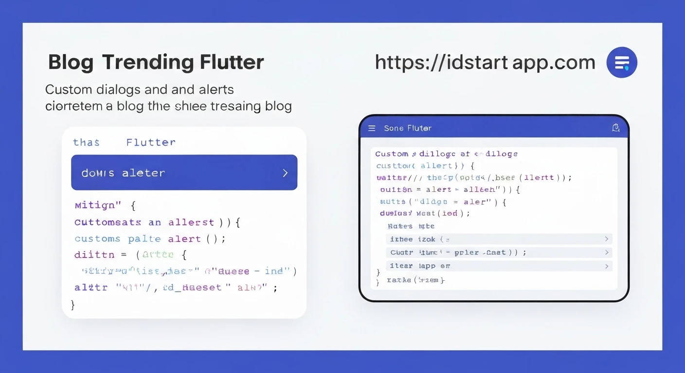

Creating Custom Dialogs & Alerts in Flutter
Dialogs and alerts are essential UI components for user interaction in any mobile application. They provide a way to prompt users for information, display crucial messages, or confirm actions without navigating away from the current screen. While Flutter offers robust built-in solutions like AlertDialog and SimpleDialog, applications often require highly customized dialogs to match specific branding, complex layouts, or unique user experiences.
Understanding Flutter's Built-in Dialogs
Flutter provides two primary Material Design dialogs out of the box:
AlertDialog: Ideal for interrupting users with urgent information, requiring decisions, or confirming actions. It typically includes a title, content, and an array of actions (buttons).SimpleDialog: Used for presenting a list of choices to the user. It usually consists of a title and a list ofSimpleDialogOptionwidgets.
Here's a quick example of a standard AlertDialog:
Future<void> _showAlertDialog(BuildContext context) async {
  return showDialog<void>(
    context: context,
    builder: (BuildContext context) {
      return AlertDialog(
        title: const Text('Discard Changes?'),
        content: const SingleChildScrollView(
          child: ListBody(
            children: <Widget>[
              Text('You have unsaved changes.'),
              Text('Would you like to discard them?'),
            ],
          ),
        ),
        actions: <Widget>[
          TextButton(
            child: const Text('Cancel'),
            onPressed: () {
              Navigator.of(context).pop();
            },
          ),
          TextButton(
            child: const Text('Discard'),
            onPressed: () {
              Navigator.of(context).pop(); // You might pass true/false here
            },
          ),
        ],
      );
    },
  );
}
Why Custom Dialogs?
While the built-in dialogs are convenient, they have limitations when you need:
- Unique UI/UX Designs: To precisely match a custom design system that deviates from Material Design.
- Complex Layouts: Dialogs containing forms, image carousels, maps, or other intricate widgets.
- Custom Animations: Specific entry/exit animations not achievable with standard dialogs.
- Interactive Elements: Custom input fields, sliders, or other interactive components within the dialog body.
- Non-modal Behavior: Although less common for "dialogs," sometimes you might want overlay-like elements that aren't strict modals.
The Foundation: showDialog
The core function for displaying any dialog in Flutter, custom or otherwise, is showDialog. It's a top-level function that pushes a route (a dialog route) onto the navigator, displaying the dialog above the current contents of the app.
The showDialog function takes a BuildContext and a builder function as its primary arguments. The builder function is responsible for returning the widget that will serve as your dialog.
Future<T?> showDialog<T>({
  required BuildContext context,
  required WidgetBuilder builder,
  bool barrierDismissible = true,
  Color? barrierColor = Colors.black54,
  String? barrierLabel,
  bool useSafeArea = true,
  bool useRootNavigator = true,
  RouteSettings? routeSettings,
  Offset? anchorPoint,
})
The key here is the builder. Whatever widget you return from the builder will be enclosed within a Material Design dialog theme and presented to the user. This is where your custom dialog widget comes in.
Building a Custom Dialog Widget
To create a custom dialog, you typically define a new StatelessWidget or StatefulWidget that encapsulates its entire UI and logic. This widget will then be returned by the builder function of showDialog.
Let's create a simple custom confirmation dialog that looks a bit different from the standard AlertDialog.
// custom_confirm_dialog.dart
import 'package:flutter/material.dart';

class CustomConfirmDialog extends StatelessWidget {
  final String title;
  final String content;
  final String confirmButtonText;
  final String cancelButtonText;

  const CustomConfirmDialog({
    Key? key,
    required this.title,
    required this.content,
    this.confirmButtonText = 'Yes',
    this.cancelButtonText = 'No',
  }) : super(key: key);

  @override
  Widget build(BuildContext context) {
    return Dialog( // Or AlertDialog for more default styling
      shape: RoundedRectangleBorder(borderRadius: BorderRadius.circular(16.0)),
      elevation: 0,
      backgroundColor: Colors.transparent,
      child: _dialogContent(context),
    );
  }

  Widget _dialogContent(BuildContext context) {
    return Stack(
      children: <Widget>[
        Container(
          padding: const EdgeInsets.only(
            top: 60,
            bottom: 16,
            left: 16,
            right: 16,
          ),
          margin: const EdgeInsets.only(top: 45),
          decoration: BoxDecoration(
            color: Colors.white,
            shape: BoxShape.rectangle,
            borderRadius: BorderRadius.circular(16),
            boxShadow: const [
              BoxShadow(
                color: Colors.black26,
                blurRadius: 10.0,
                offset: Offset(0.0, 10.0),
              ),
            ],
          ),
          child: Column(
            mainAxisSize: MainAxisSize.min, // To make the dialog compact
            children: <Widget>[
              Text(
                title,
                style: const TextStyle(
                  fontSize: 24.0,
                  fontWeight: FontWeight.w700,
                ),
              ),
              const SizedBox(height: 16.0),
              Text(
                content,
                textAlign: TextAlign.center,
                style: const TextStyle(
                  fontSize: 16.0,
                ),
              ),
              const SizedBox(height: 24.0),
              Row(
                mainAxisAlignment: MainAxisAlignment.spaceEvenly,
                children: <Widget>[
                  Expanded(
                    child: ElevatedButton(
                      onPressed: () {
                        Navigator.of(context).pop(false); // User canceled
                      },
                      style: ElevatedButton.styleFrom(
                        backgroundColor: Colors.grey[300],
                        foregroundColor: Colors.black,
                        shape: RoundedRectangleBorder(
                          borderRadius: BorderRadius.circular(8.0),
                        ),
                      ),
                      child: Text(cancelButtonText),
                    ),
                  ),
                  const SizedBox(width: 16.0),
                  Expanded(
                    child: ElevatedButton(
                      onPressed: () {
                        Navigator.of(context).pop(true); // User confirmed
                      },
                      style: ElevatedButton.styleFrom(
                        backgroundColor: Theme.of(context).primaryColor,
                        shape: RoundedRectangleBorder(
                          borderRadius: BorderRadius.circular(8.0),
                        ),
                      ),
                      child: Text(confirmButtonText),
                    ),
                  ),
                ],
              ),
            ],
          ),
        ),
        Positioned(
          left: 16,
          right: 16,
          child: CircleAvatar(
            backgroundColor: Theme.of(context).primaryColor,
            radius: 45,
            child: const Icon(Icons.help_outline, color: Colors.white, size: 50),
          ),
        ),
      ],
    );
  }
}
In this example:
- We use a
Dialogwidget as the root of our custom dialog. It gives us more control over its shape, elevation, and background compared to directly using anAlertDialog. _dialogContentbuilds the actual layout, using aStackto overlay a circular icon at the top, mimicking a common custom alert design.Navigator.of(context).pop(true)or(false)is used to close the dialog and return a boolean value, indicating the user's choice.
Integrating the Custom Dialog
To display your CustomConfirmDialog, you simply pass it to the builder of showDialog:
// In your widget where you want to show the dialog
ElevatedButton(
  child: const Text('Show Custom Confirm'),
  onPressed: () async {
    final bool? confirmed = await showDialog<bool>(
      context: context,
      barrierDismissible: false, // User must tap a button to close
      builder: (BuildContext context) {
        return const CustomConfirmDialog(
          title: 'Confirm Action',
          content: 'Are you sure you want to proceed with this action? This cannot be undone.',
        );
      },
    );

    if (confirmed != null && confirmed) {
      // User tapped 'Yes'
      ScaffoldMessenger.of(context).showSnackBar(
        const SnackBar(content: Text('Action Confirmed!')),
      );
    } else {
      // User tapped 'No' or dismissed (if barrierDismissible was true)
      ScaffoldMessenger.of(context).showSnackBar(
        const SnackBar(content: Text('Action Canceled.')),
      );
    }
  },
),
Notice how showDialog returns a Future<T?>. By awaiting this future, you can capture the value (in this case, a boolean) that was passed to Navigator.of(context).pop(), allowing you to react to the user's choice.
Creating a Custom Alert (e.g., Success/Error)
Often, you need a transient alert, like a success or error message, that doesn't necessarily require user interaction to dismiss, or presents a more visually distinct look. While SnackBar is great for this, sometimes a full-modal custom alert is preferred.
Let's create a custom "Success" alert that appears as a modal dialog and automatically dismisses after a few seconds or when the user taps 'OK'.
// custom_success_alert.dart
import 'package:flutter/material.dart';

class CustomSuccessAlert extends StatelessWidget {
  final String message;
  final VoidCallback? onOkPressed;

  const CustomSuccessAlert({
    Key? key,
    required this.message,
    this.onOkPressed,
  }) : super(key: key);

  @override
  Widget build(BuildContext context) {
    return Dialog(
      shape: RoundedRectangleBorder(borderRadius: BorderRadius.circular(16.0)),
      elevation: 0,
      backgroundColor: Colors.transparent,
      child: _alertContent(context),
    );
  }

  Widget _alertContent(BuildContext context) {
    return Container(
      padding: const EdgeInsets.all(16.0),
      decoration: BoxDecoration(
        color: Colors.white,
        borderRadius: BorderRadius.circular(16.0),
        boxShadow: const [
          BoxShadow(
            color: Colors.black26,
            blurRadius: 10.0,
            offset: Offset(0.0, 10.0),
          ),
        ],
      ),
      child: Column(
        mainAxisSize: MainAxisSize.min,
        children: <Widget>[
          const CircleAvatar(
            backgroundColor: Colors.green,
            radius: 30,
            child: Icon(Icons.check, color: Colors.white, size: 40),
          ),
          const SizedBox(height: 16.0),
          const Text(
            'Success!',
            style: TextStyle(
              fontSize: 22.0,
              fontWeight: FontWeight.w700,
            ),
          ),
          const SizedBox(height: 8.0),
          Text(
            message,
            textAlign: TextAlign.center,
            style: const TextStyle(
              fontSize: 16.0,
            ),
          ),
          const SizedBox(height: 24.0),
          Align(
            alignment: Alignment.bottomRight,
            child: TextButton(
              onPressed: () {
                Navigator.of(context).pop();
                onOkPressed?.call();
              },
              child: const Text('OK'),
            ),
          ),
        ],
      ),
    );
  }
}
To show this custom alert:
// In your widget
ElevatedButton(
  child: const Text('Show Custom Success Alert'),
  onPressed: () {
    showDialog(
      context: context,
      barrierDismissible: false, // Can't dismiss by tapping outside
      builder: (BuildContext context) {
        return CustomSuccessAlert(
          message: 'Your data has been saved successfully!',
          onOkPressed: () {
            // Optional: Do something after 'OK' is pressed and dialog is closed
            print('Success alert dismissed via OK button.');
          },
        );
      },
    );

    // Optional: Auto-dismiss after a few seconds
    Future.delayed(const Duration(seconds: 3), () {
      if (Navigator.of(context).canPop()) {
        Navigator.of(context).pop();
      }
    });
  },
),
Best Practices and Considerations
useRootNavigator: Set this totrue(the default) if you want the dialog to appear above all navigators, including those nested within your app (e.g., if you have aBottomNavigationBarand want the dialog to cover it). Set tofalseif the dialog should only appear above the current navigator's content.barrierDismissible: Controls whether tapping outside the dialog will dismiss it. Defaults totrue. For critical actions, set tofalseto force a user decision.- Accessibility: Ensure your custom dialogs are accessible. Use semantic labels for interactive elements and consider how screen readers will interpret your layout.
- Responsiveness: Design your dialogs to look good on various screen sizes and orientations. Use
FractionallySizedBoxorConstrainedBoxto manage the dialog's width/height relative to the screen. - Keep it Concise: Dialogs should be short and to the point. Avoid cramming too much information or too many actions into a single dialog.
- Animations: For more complex animations, you can wrap your custom dialog widget within Flutter's
AnimatedBuilderor use a customPageRouteBuilderwithshowGeneralDialoginstead ofshowDialog.
Conclusion
Flutter's flexible widget tree and the showDialog function empower developers to create highly customized dialogs and alerts that perfectly align with an application's unique design and functional requirements. By understanding the core principles and leveraging Flutter's powerful layout widgets, you can build engaging and intuitive interactive experiences for your users.


