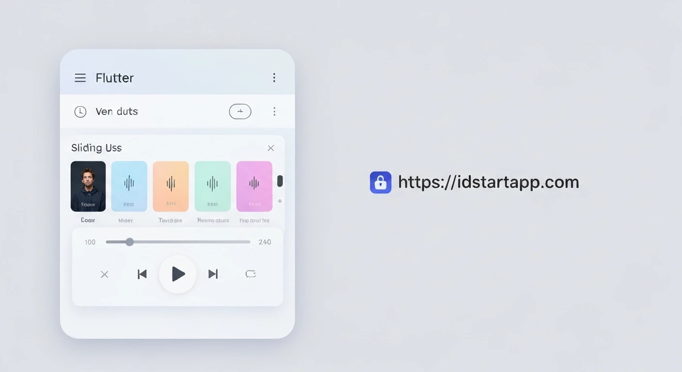

Creating a Sliding Panel Widget for a Music Player in Flutter
A music player application often requires an intuitive and accessible UI for controlling playback without obstructing the main content. A sliding panel, common in many popular music apps, provides an elegant solution by offering a persistent player bar that can be expanded into a full-screen interface. This article will guide you through building such a sliding panel widget in Flutter, utilizing the popular sliding_up_panel package.
Why a Sliding Panel?
Sliding panels offer several advantages for music players:
- Persistent Control: Users can always see and interact with the basic playback controls (play/pause, next/previous) regardless of the main screen content.
- Space Efficiency: It maximizes screen real estate by allowing the full player UI to be hidden when not needed, revealing more of the app's primary content (e.g., song lists, albums).
- Enhanced User Experience: A smooth sliding animation provides a modern and responsive feel, making the app more engaging.
Getting Started: The sliding_up_panel Package
While you could build a sliding panel from scratch using DraggableScrollableSheet or custom animations, the sliding_up_panel package simplifies this process significantly. It provides a highly customizable widget that handles the gestures, animations, and states required for a robust sliding panel.
Installation
First, add the sliding_up_panel dependency to your pubspec.yaml file:
dependencies:
  flutter:
    sdk: flutter
  sliding_up_panel: ^2.0.0 # Use the latest version
Then, run flutter pub get to fetch the package.
Implementing the Sliding Panel
The core of our music player will involve the SlidingUpPanel widget, which requires two main builders: panelBuilder for the content that slides up, and body for the main content behind the panel.
Basic Structure
Let's set up a basic Flutter application with a Scaffold and integrate SlidingUpPanel.
import 'package:flutter/material.dart';
import 'package:sliding_up_panel/sliding_up_panel.dart';

void main() {
  runApp(const MyApp());
}

class MyApp extends StatelessWidget {
  const MyApp({super.key});

  @override
  Widget build(BuildContext context) {
    return MaterialApp(
      title: 'Flutter Music Player',
      theme: ThemeData(
        primarySwatch: Colors.blue,
      ),
      home: const MusicPlayerScreen(),
    );
  }
}

class MusicPlayerScreen extends StatefulWidget {
  const MusicPlayerScreen({super.key});

  @override
  State<MusicPlayerScreen> createState() => _MusicPlayerScreenState();
}

class _MusicPlayerScreenState extends State<MusicPlayerScreen> {
  final PanelController _panelController = PanelController();

  @override
  Widget build(BuildContext context) {
    return Scaffold(
      appBar: AppBar(
        title: const Text('My Music'),
      ),
      body: SlidingUpPanel(
        controller: _panelController,
        minHeight: 60, // Height of the collapsed panel
        maxHeight: MediaQuery.of(context).size.height * 0.8, // Max height for expanded panel
        panelBuilder: (sc) => _buildPanel(sc),
        body: _buildBody(),
        collapsed: _buildCollapsedPanel(), // Optional: a separate collapsed view
        borderRadius: const BorderRadius.vertical(top: Radius.circular(24)),
        parallaxEnabled: true,
        parallaxOffset: 0.1,
        panelSnapping: true,
      ),
    );
  }

  Widget _buildBody() {
    return Center(
      child: Column(
        mainAxisAlignment: MainAxisAlignment.center,
        children: [
          const Text(
            'Welcome to your music library!',
            style: TextStyle(fontSize: 20),
          ),
          const SizedBox(height: 20),
          ElevatedButton(
            onPressed: () {
              // Example: Open the panel programmatically
              _panelController.open();
            },
            child: const Text('Open Player'),
          ),
          const SizedBox(height: 10),
          ElevatedButton(
            onPressed: () {
              // Example: Close the panel programmatically
              _panelController.close();
            },
            child: const Text('Close Player'),
          ),
        ],
      ),
    );
  }

  Widget _buildCollapsedPanel() {
    return Container(
      decoration: const BoxDecoration(
        color: Colors.blueGrey,
        borderRadius: BorderRadius.vertical(top: Radius.circular(24)),
      ),
      padding: const EdgeInsets.symmetric(horizontal: 16),
      child: Row(
        children: [
          const Icon(Icons.music_note, color: Colors.white),
          const SizedBox(width: 10),
          const Expanded(
            child: Text(
              'Now Playing: Song Title - Artist',
              style: TextStyle(color: Colors.white, fontSize: 16),
              overflow: TextOverflow.ellipsis,
            ),
          ),
          IconButton(
            icon: const Icon(Icons.play_arrow, color: Colors.white),
            onPressed: () {
              // Handle play/pause
            },
          ),
          IconButton(
            icon: const Icon(Icons.skip_next, color: Colors.white),
            onPressed: () {
              // Handle skip next
            },
          ),
        ],
      ),
    );
  }

  Widget _buildPanel(ScrollController sc) {
    return Container(
      decoration: const BoxDecoration(
        color: Colors.white,
        borderRadius: BorderRadius.vertical(top: Radius.circular(24)),
      ),
      child: Column(
        children: [
          // Drag handle
          Container(
            width: 40,
            height: 5,
            margin: const EdgeInsets.symmetric(vertical: 8),
            decoration: BoxDecoration(
              color: Colors.grey[300],
              borderRadius: BorderRadius.circular(5),
            ),
          ),
          Expanded(
            child: ListView(
              controller: sc, // Important for scrollable content within the panel
              padding: EdgeInsets.zero,
              children: [
                Padding(
                  padding: const EdgeInsets.all(16.0),
                  child: Column(
                    children: [
                      // Album Art
                      Container(
                        width: 200,
                        height: 200,
                        decoration: BoxDecoration(
                          color: Colors.blueGrey[100],
                          borderRadius: BorderRadius.circular(16),
                        ),
                        child: const Icon(Icons.album, size: 100, color: Colors.blueGrey),
                      ),
                      const SizedBox(height: 20),
                      const Text(
                        'Amazing Song Title',
                        style: TextStyle(fontSize: 24, fontWeight: FontWeight.bold),
                      ),
                      const Text(
                        'Artist Name - Album Name',
                        style: TextStyle(fontSize: 16, color: Colors.grey),
                      ),
                      const SizedBox(height: 20),
                      // Playback Controls
                      Row(
                        mainAxisAlignment: MainAxisAlignment.center,
                        children: [
                          IconButton(
                            icon: const Icon(Icons.skip_previous, size: 40),
                            onPressed: () {},
                          ),
                          IconButton(
                            icon: const Icon(Icons.play_circle_filled, size: 60),
                            onPressed: () {},
                          ),
                          IconButton(
                            icon: const Icon(Icons.skip_next, size: 40),
                            onPressed: () {},
                          ),
                        ],
                      ),
                      const SizedBox(height: 20),
                      // Placeholder for progress bar and volume controls
                      const LinearProgressIndicator(value: 0.5),
                      const SizedBox(height: 10),
                      Row(
                        mainAxisAlignment: MainAxisAlignment.spaceBetween,
                        children: const [
                          Text('0:00'),
                          Text('3:45'),
                        ],
                      ),
                      const SizedBox(height: 20),
                      // Example for additional content
                      ListTile(
                        leading: const Icon(Icons.queue_music),
                        title: const Text('Up Next'),
                        onTap: () {},
                      ),
                      ListTile(
                        leading: const Icon(Icons.share),
                        title: const Text('Share Song'),
                        onTap: () {},
                      ),
                    ],
                  ),
                ),
                // Add more content here if needed
                const SizedBox(height: 100), // To make the list view scrollable
              ],
            ),
          ),
        ],
      ),
    );
  }
}
Key SlidingUpPanel Properties
controller: An instance ofPanelControllerto programmatically open, close, or animate the panel.minHeight: The height of the panel when it's collapsed.maxHeight: The maximum height the panel can reach when expanded. This can be a fixed value or a percentage of screen height.panelBuilder: A builder function that provides aScrollController. This controller must be assigned to any scrollable widget within your panel to enable proper drag behavior.collapsed: An optional widget that is displayed when the panel is fully collapsed. This allows for a dedicated UI for the minimized player. If omitted, the top part ofpanelBuildercontent will be shown.body: The widget displayed behind the panel, which typically represents the main content of your app (e.g., song list, albums).borderRadius: Applies a border radius to the top corners of the panel, creating a floating card effect.parallaxEnabled,parallaxOffset: Creates a parallax scrolling effect on thebodycontent as the panel slides.panelSnapping: When true, the panel will snap to itsminHeight,maxHeight, and optionally asnappingControllersvalue.
Conclusion
By leveraging the sliding_up_panel package, you can effortlessly integrate a sleek and functional sliding music player panel into your Flutter application. This pattern enhances user experience by providing persistent controls and efficient use of screen space, making your music player both powerful and user-friendly. Experiment with different styles, animations, and additional controls to tailor it perfectly to your app's design.


