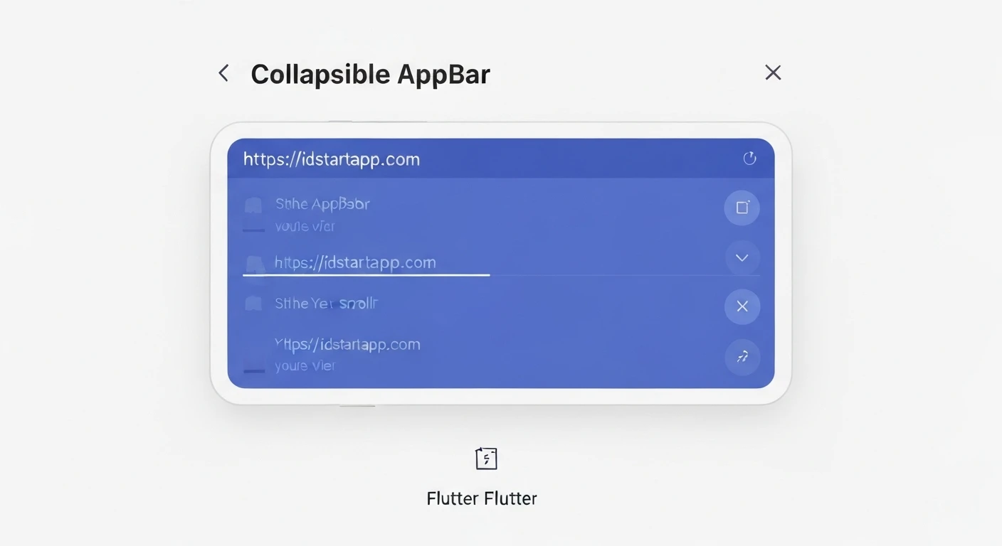

Creating a Collapsible App Bar in Flutter
A collapsible App Bar, often seen in modern mobile applications, enhances user experience by providing a larger, more visually engaging header that shrinks or transforms as the user scrolls. This dynamic behavior saves screen space and keeps essential navigation elements accessible. Flutter offers robust tools for implementing such an effect with relative ease, primarily leveraging its custom scroll view widgets.
Understanding the Core Components
Flutter's flexible scrolling model makes creating such dynamic app bars straightforward, primarily utilizing three key widgets:
CustomScrollView: A scroll view that creates custom scroll effects using slivers. It takes a list of slivers as its children.SliverAppBar: A material design app bar that integrates with aCustomScrollView. It can expand and collapse as the user scrolls, offering properties to control its behavior during scrolling.FlexibleSpaceBar: A widget typically used as theflexibleSpaceof aSliverAppBar. It provides the parallax effect and can show a title that fades in/out, along with a background image that zooms or pans.
Basic Implementation
Let's begin by creating a simple collapsible app bar with a background image and a title that appears as the app bar collapses.
import 'package:flutter/material.dart';

void main() {
  runApp(const MyApp());
}

class MyApp extends StatelessWidget {
  const MyApp({super.key});

  @override
  Widget build(BuildContext context) {
    return MaterialApp(
      title: 'Collapsible AppBar Demo',
      theme: ThemeData(
        primarySwatch: Colors.blue,
        useMaterial3: false, // Optional: Set to false for pre-Material 3 styling consistency
      ),
      home: const CollapsibleAppBarScreen(),
    );
  }
}

class CollapsibleAppBarScreen extends StatelessWidget {
  const CollapsibleAppBarScreen({super.key});

  @override
  Widget build(BuildContext context) {
    return Scaffold(
      body: CustomScrollView(
        slivers: <Widget>[
          SliverAppBar(
            expandedHeight: 200.0, // Height of the app bar when fully expanded
            floating: false,       // Stays visible at the top initially
            pinned: true,          // App bar remains visible in a collapsed state
            flexibleSpace: FlexibleSpaceBar(
              centerTitle: true,
              title: const Text('Collapsible App Bar',
                style: TextStyle(
                  color: Colors.white,
                  fontSize: 20.0,
                  shadows: [
                    Shadow(
                      blurRadius: 10.0,
                      color: Colors.black,
                      offset: Offset(0, 0)
                    )
                  ]
                ),
              ),
              background: Image.network(
                'https://picsum.photos/id/1018/800/400', // Example image URL
                fit: BoxFit.cover,
              ),
            ),
          ),
          // A SliverList to demonstrate scrolling content below the app bar
          SliverList(
            delegate: SliverChildBuilderDelegate(
              (BuildContext context, int index) {
                return Container(
                  color: index.isOdd ? Colors.white : Colors.grey[200],
                  height: 100.0,
                  child: Center(
                    child: Text('Item $index', style: const TextStyle(fontSize: 18)),
                  ),
                );
              },
              childCount: 30, // Number of list items
            ),
          ),
        ],
      ),
    );
  }
}
Customization and Advanced Features
SliverAppBar offers several properties for fine-tuning its behavior and adding more elements:
floating: If set totrue, the app bar will immediately reappear when the user scrolls up, even if they haven't reached the top of the scroll view.pinned: If set totrue, the app bar will remain visible at the top of the screen in its collapsed state, rather than scrolling completely off-screen.snap: Requiresfloatingto betrue. If set totrue, when the user scrolls up or down, the app bar will "snap" into its fully expanded or fully collapsed state.actions: A list of widgets to display in a row after thetitlewidget, typically for icons or text buttons.bottom: APreferredSizeWidget, commonly used for integrating aTabBarfor navigation.
Adding a Tab Bar
Integrating a TabBar into a collapsible app bar is a common pattern for displaying different content sections while maintaining a dynamic header. This requires wrapping your Scaffold or relevant part of the widget tree with a DefaultTabController.
import 'package:flutter/material.dart';

void main() {
  runApp(const MyApp());
}

class MyApp extends StatelessWidget {
  const MyApp({super.key});

  @override
  Widget build(BuildContext context) {
    return MaterialApp(
      title: 'Collapsible AppBar with Tabs',
      theme: ThemeData(
        primarySwatch: Colors.blue,
        useMaterial3: false,
      ),
      home: const CollapsibleAppBarWithTabsScreen(),
    );
  }
}

class CollapsibleAppBarWithTabsScreen extends StatelessWidget {
  const CollapsibleAppBarWithTabsScreen({super.key});

  @override
  Widget build(BuildContext context) {
    return DefaultTabController(
      length: 3, // Number of tabs
      child: Scaffold(
        body: CustomScrollView(
          slivers: <Widget>[
            SliverAppBar(
              expandedHeight: 250.0,
              pinned: true,          // Keeps the app bar (and tabs) visible
              floating: false,
              flexibleSpace: FlexibleSpaceBar(
                centerTitle: true,
                title: const Text('User Profile',
                  style: TextStyle(
                    color: Colors.white,
                    fontSize: 20.0,
                    shadows: [
                      Shadow(
                        blurRadius: 10.0,
                        color: Colors.black,
                        offset: Offset(0, 0)
                      )
                    ]
                  ),
                ),
                background: Image.network(
                  'https://picsum.photos/id/237/800/400', // Different example image
                  fit: BoxFit.cover,
                ),
              ),
              bottom: const TabBar(
                indicatorColor: Colors.white, // Color of the selected tab indicator
                tabs: [
                  Tab(icon: Icon(Icons.info), text: 'Info'),
                  Tab(icon: Icon(Icons.photo), text: 'Photos'),
                  Tab(icon: Icon(Icons.settings), text: 'Settings'),
                ],
              ),
            ),
            // SliverFillRemaining fills the rest of the available scroll space
            SliverFillRemaining(
              child: TabBarView(
                children: <Widget>[
                  Center(child: Text('Content for Info Tab', style: TextStyle(fontSize: 24))),
                  Center(child: Text('Content for Photos Tab', style: TextStyle(fontSize: 24))),
                  Center(child: Text('Content for Settings Tab', style: TextStyle(fontSize: 24))),
                ],
              ),
            ),
          ],
        ),
      ),
    );
  }
}
Conclusion
Creating a collapsible app bar in Flutter is a powerful way to enhance the visual appeal and interactivity of your applications. By understanding and utilizing CustomScrollView, SliverAppBar, and FlexibleSpaceBar, developers can implement sophisticated scrolling effects with minimal code. The flexibility of these widgets allows for a wide range of customizations, from simple titles and images to complex layouts with integrated tab navigation, making it an indispensable tool for modern UI/UX design in Flutter.


