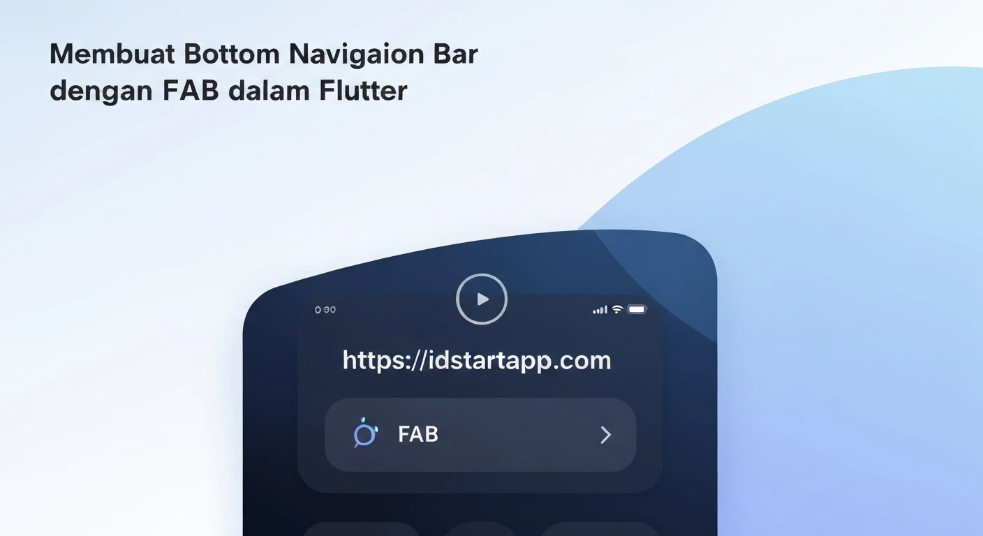

Creating a Bottom Navigation Bar with a Floating Action Button in Flutter
Introduction
In modern mobile application design, a Bottom Navigation Bar (BNB) and a Floating Action Button (FAB) are crucial UI elements that enhance user experience. A Bottom Navigation Bar provides quick access to top-level destinations in an app, while a Floating Action Button represents the primary action on a screen. Combining these two elements effectively, often by integrating the FAB into the BNB with a distinct notch, creates an intuitive and visually appealing interface. This article will guide you through the process of implementing such a design in Flutter.
Prerequisites
- Basic understanding of Flutter and Dart.
- Flutter SDK installed and configured.
- An IDE like VS Code or Android Studio with Flutter and Dart plugins.
Step-by-Step Implementation
1. Set Up a New Flutter Project
First, create a new Flutter project if you don't have one. You can do this via your terminal:
flutter create bottom_nav_fab_example
cd bottom_nav_fab_example
Open the project in your IDE and clear the default boilerplate code in lib/main.dart, leaving just a basic MaterialApp.
import 'package:flutter/material.dart';

void main() {
  runApp(const MyApp());
}

class MyApp extends StatelessWidget {
  const MyApp({super.key});

  @override
  Widget build(BuildContext context) {
    return MaterialApp(
      title: 'Bottom Nav with FAB',
      theme: ThemeData(
        primarySwatch: Colors.blue,
      ),
      home: const MyHomePage(),
    );
  }
}

class MyHomePage extends StatefulWidget {
  const MyHomePage({super.key});

  @override
  State<MyHomePage> createState() => _MyHomePageState();
}

class _MyHomePageState extends State<MyHomePage> {
  int _selectedIndex = 0;

  static const List<Widget> _widgetOptions = <Widget>[
    Text(
      'Home Page',
      style: TextStyle(fontSize: 30, fontWeight: FontWeight.bold),
    ),
    Text(
      'Search Page',
      style: TextStyle(fontSize: 30, fontWeight: FontWeight.bold),
    ),
    Text(
      'Profile Page',
      style: TextStyle(fontSize: 30, fontWeight: FontWeight.bold),
    ),
  ];

  void _onItemTapped(int index) {
    setState(() {
      _selectedIndex = index;
    });
  }

  @override
  Widget build(BuildContext context) {
    return Scaffold(
      appBar: AppBar(
        title: const Text('Bottom Nav with FAB'),
      ),
      body: Center(
        child: _widgetOptions.elementAt(_selectedIndex),
      ),
      // Bottom Navigation Bar and FAB will go here
    );
  }
}
2. Implement a Basic Bottom Navigation Bar
Within the Scaffold of your _MyHomePageState, add the bottomNavigationBar property. For now, we'll use a standard BottomNavigationBar.
// Inside _MyHomePageState's build method, within Scaffold:

// ... body ...

bottomNavigationBar: BottomNavigationBar(
  items: const <BottomNavigationBarItem>[
    BottomNavigationBarItem(
      icon: Icon(Icons.home),
      label: 'Home',
    ),
    BottomNavigationBarItem(
      icon: Icon(Icons.search),
      label: 'Search',
    ),
    BottomNavigationBarItem(
      icon: Icon(Icons.person),
      label: 'Profile',
    ),
  ],
  currentIndex: _selectedIndex,
  selectedItemColor: Colors.blueAccent,
  onTap: _onItemTapped,
),
3. Add a Floating Action Button
Next, add a basic FloatingActionButton to your Scaffold.
// Inside _MyHomePageState's build method, within Scaffold:

// ... body ...
// ... bottomNavigationBar ...

floatingActionButton: FloatingActionButton(
  onPressed: () {
    // Handle FAB press
    ScaffoldMessenger.of(context).showSnackBar(
      const SnackBar(content: Text('FAB pressed!')),
    );
  },
  child: const Icon(Icons.add),
),
At this point, the FAB will appear in the bottom-right corner, potentially overlapping with the bottom navigation items.
4. Integrate FAB with Bottom Navigation Bar (Centering and Notch)
To center the FAB and create a notch in the bottom navigation bar, we need to make a few changes:
-
Set
floatingActionButtonLocationin theScaffoldtoFloatingActionButtonLocation.centerDocked. -
Replace the direct
BottomNavigationBarwith aBottomAppBar, which allows for custom shaping and child placement. -
The
BottomAppBarwill have ashapeofCircularNotchedRectangle()to create the desired notch. -
Inside the
BottomAppBar, we'll place ourBottomNavigationBaritems, adjusting their layout to accommodate the centered FAB.
Modify the Scaffold's floatingActionButton and bottomNavigationBar properties as follows:
// Inside _MyHomePageState's build method, within Scaffold:

// ... body ...

floatingActionButton: FloatingActionButton(
  onPressed: () {
    ScaffoldMessenger.of(context).showSnackBar(
      const SnackBar(content: Text('FAB pressed!')),
    );
  },
  shape: const CircleBorder(), // Use CircleBorder for a perfectly round FAB
  child: const Icon(Icons.add),
),
floatingActionButtonLocation: FloatingActionButtonLocation.centerDocked,
bottomNavigationBar: BottomAppBar(
  shape: const CircularNotchedRectangle(), // Creates the notch
  notchMargin: 6.0, // Distance between FAB and BottomAppBar
  color: Colors.blue, // Background color of the BottomAppBar
  child: Row(
    mainAxisAlignment: MainAxisAlignment.spaceAround,
    children: <Widget>[
      IconButton(
        icon: Icon(Icons.home, color: _selectedIndex == 0 ? Colors.white : Colors.blue.shade100),
        onPressed: () => _onItemTapped(0),
        tooltip: 'Home',
      ),
      IconButton(
        icon: Icon(Icons.search, color: _selectedIndex == 1 ? Colors.white : Colors.blue.shade100),
        onPressed: () => _onItemTapped(1),
        tooltip: 'Search',
      ),
      // Spacer for the FAB, if you want only two items on each side
      const SizedBox(width: 48.0), // The width of the FAB itself roughly
      IconButton(
        icon: Icon(Icons.person, color: _selectedIndex == 2 ? Colors.white : Colors.blue.shade100),
        onPressed: () => _onItemTapped(2),
        tooltip: 'Profile',
      ),
      // Add more items here if needed, like a "Settings" button
      // IconButton(
      //   icon: Icon(Icons.settings, color: _selectedIndex == 3 ? Colors.white : Colors.blue.shade100),
      //   onPressed: () => _onItemTapped(3),
      //   tooltip: 'Settings',
      // ),
    ],
  ),
),
Notice that we manually created IconButton widgets inside the Row within BottomAppBar. This gives us finer control over their placement relative to the FAB notch. We also added a SizedBox as a placeholder to push items apart and make space for the FAB. The icons' colors are updated based on _selectedIndex for visual feedback.
If you have more than two navigation items, you might want to adjust the number of items on each side of the FAB or use a different layout within the BottomAppBar's child. For instance, if you have 4 items, you could place 2 on the left and 2 on the right of the FAB.
5. Refining the Page Content (Optional)
For a better demonstration, let's create actual pages instead of just Text widgets.
// Create new files like home_page.dart, search_page.dart, profile_page.dart
// For example, in lib/home_page.dart:
import 'package:flutter/material.dart';

class HomePage extends StatelessWidget {
  const HomePage({super.key});

  @override
  Widget build(BuildContext context) {
    return const Center(
      child: Text(
        'Home Page Content',
        style: TextStyle(fontSize: 24, fontWeight: FontWeight.bold, color: Colors.blueAccent),
      ),
    );
  }
}

// Similarly for SearchPage and ProfilePage.
Then, update your _widgetOptions list in main.dart:
import 'package:bottom_nav_fab_example/home_page.dart';
import 'package:bottom_nav_fab_example/search_page.dart';
import 'package:bottom_nav_fab_example/profile_page.dart';

// ...

class _MyHomePageState extends State<MyHomePage> {
  int _selectedIndex = 0;

  static const List<Widget> _widgetOptions = <Widget>[
    HomePage(),
    SearchPage(),
    ProfilePage(),
  ];

  // ...
}
Full Code Example (main.dart)
Here's the complete main.dart file incorporating all the steps:
import 'package:flutter/material.dart';

// Assuming you have these files in your lib directory
// import 'package:bottom_nav_fab_example/home_page.dart';
// import 'package:bottom_nav_fab_example/search_page.dart';
// import 'package:bottom_nav_fab_example/profile_page.dart';

// Placeholder Pages for demonstration if you don't create separate files
class HomePage extends StatelessWidget {
  const HomePage({super.key});
  @override
  Widget build(BuildContext context) {
    return const Center(
      child: Text(
        'Home Page Content',
        style: TextStyle(fontSize: 24, fontWeight: FontWeight.bold, color: Colors.blueAccent),
      ),
    );
  }
}

class SearchPage extends StatelessWidget {
  const SearchPage({super.key});
  @override
  Widget build(BuildContext context) {
    return const Center(
      child: Text(
        'Search Page Content',
        style: TextStyle(fontSize: 24, fontWeight: FontWeight.bold, color: Colors.green),
      ),
    );
  }
}

class ProfilePage extends StatelessWidget {
  const ProfilePage({super.key});
  @override
  Widget build(BuildContext context) {
    return const Center(
      child: Text(
        'Profile Page Content',
        style: TextStyle(fontSize: 24, fontWeight: FontWeight.bold, color: Colors.redAccent),
      ),
    );
  }
}


void main() {
  runApp(const MyApp());
}

class MyApp extends StatelessWidget {
  const MyApp({super.key});

  @override
  Widget build(BuildContext context) {
    return MaterialApp(
      title: 'Bottom Nav with FAB',
      theme: ThemeData(
        primarySwatch: Colors.blue,
      ),
      home: const MyHomePage(),
    );
  }
}

class MyHomePage extends StatefulWidget {
  const MyHomePage({super.key});

  @override
  State<MyHomePage> createState() => _MyHomePageState();
}

class _MyHomePageState extends State<MyHomePage> {
  int _selectedIndex = 0;

  static const List<Widget> _widgetOptions = <Widget>[
    HomePage(),
    SearchPage(),
    ProfilePage(),
  ];

  void _onItemTapped(int index) {
    setState(() {
      _selectedIndex = index;
    });
  }

  @override
  Widget build(BuildContext context) {
    return Scaffold(
      appBar: AppBar(
        title: const Text('Bottom Nav with FAB'),
      ),
      body: Center(
        child: _widgetOptions.elementAt(_selectedIndex),
      ),
      floatingActionButton: FloatingActionButton(
        onPressed: () {
          ScaffoldMessenger.of(context).showSnackBar(
            const SnackBar(content: Text('FAB pressed!')),
          );
        },
        shape: const CircleBorder(),
        backgroundColor: Colors.amber, // Example color
        child: const Icon(Icons.add, color: Colors.white),
      ),
      floatingActionButtonLocation: FloatingActionButtonLocation.centerDocked,
      bottomNavigationBar: BottomAppBar(
        shape: const CircularNotchedRectangle(),
        notchMargin: 8.0, // Increased margin for better visual separation
        color: Theme.of(context).primaryColor, // Use theme's primary color
        child: Row(
          mainAxisAlignment: MainAxisAlignment.spaceAround,
          children: <Widget>[
            IconButton(
              icon: Icon(Icons.home, color: _selectedIndex == 0 ? Colors.white : Colors.blue.shade100),
              onPressed: () => _onItemTapped(0),
              tooltip: 'Home',
            ),
            IconButton(
              icon: Icon(Icons.search, color: _selectedIndex == 1 ? Colors.white : Colors.blue.shade100),
              onPressed: () => _onItemTapped(1),
              tooltip: 'Search',
            ),
            // The FAB itself is between the navigation items, so we need a spacer
            const SizedBox(width: 48.0), // Adjust based on FAB size
            IconButton(
              icon: Icon(Icons.person, color: _selectedIndex == 2 ? Colors.white : Colors.blue.shade100),
              onPressed: () => _onItemTapped(2),
              tooltip: 'Profile',
            ),
            // If you had a fourth item, you'd place it here:
            // IconButton(
            //   icon: Icon(Icons.settings, color: _selectedIndex == 3 ? Colors.white : Colors.blue.shade100),
            //   onPressed: () => _onItemTapped(3),
            //   tooltip: 'Settings',
            // ),
          ],
        ),
      ),
    );
  }
}
Conclusion
By following these steps, you can successfully create a Bottom Navigation Bar with a centrally docked Floating Action Button and a circular notch in Flutter. This design pattern is highly effective for applications that have a primary action and multiple top-level navigation destinations, providing a clean, functional, and aesthetically pleasing user interface. Experiment with different colors, margins, and item arrangements to best suit your application's design language.


