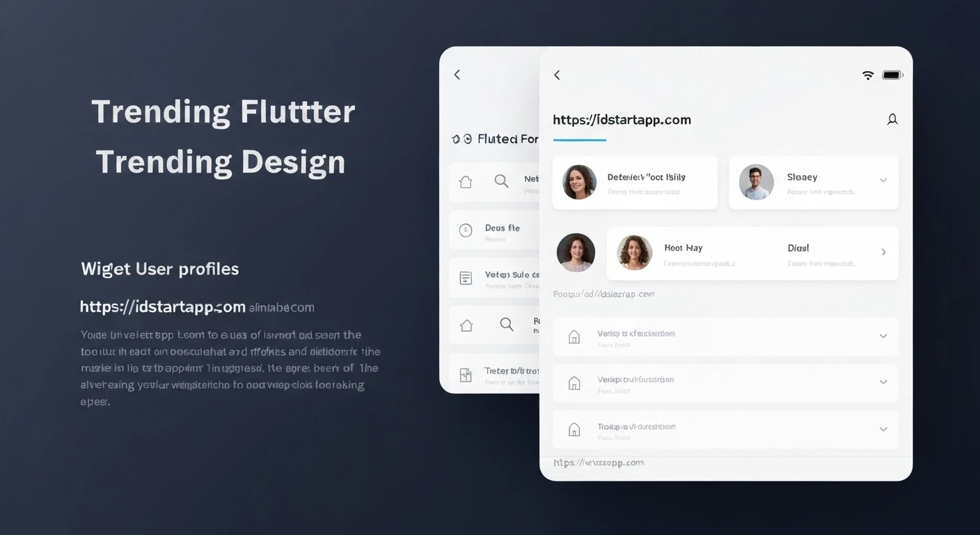

Crafting Custom Flutter Widgets for User Profiles
In Flutter development, user profiles are a ubiquitous feature, showcasing essential information about an individual. While using standard Flutter widgets for every profile screen might seem straightforward, creating custom widgets offers significant advantages. This article will guide you through the process of building a reusable, maintainable, and visually consistent custom Flutter widget specifically designed for displaying user profiles, enhancing your application's modularity and developer experience.
Understanding the User Profile Component
Before diving into implementation, it's crucial to identify the common elements of a user profile. Typically, these include:
- A profile picture or avatar.
- The user's full name.
- Contact information (email, phone).
- A short bio or description.
- Optional metrics (e.g., followers, posts count).
- Action buttons (e.g., "Edit Profile", "Follow").
Our custom widget will focus on encapsulating these core display elements, making it easy to present user information uniformly across different parts of your application.
Designing Our Custom Widget
For our example, let's design a simple yet effective user profile widget. It will feature a prominent circular avatar at the top, followed by the user's name, email, and a short bio, all centrally aligned. This structure allows for clear presentation and easy customization later on.
Implementing the UserProfileWidget
We'll create a StatelessWidget for our user profile display, as it primarily focuses on presenting data rather than managing internal state. All necessary user data will be passed into its constructor.
Defining the Widget Structure
First, let's define the class and its constructor to accept the user's details:
import 'package:flutter/material.dart';

class UserProfileWidget extends StatelessWidget {
  final String avatarUrl;
  final String name;
  final String email;
  final String? bio; // Optional bio

  const UserProfileWidget({
    Key? key,
    required this.avatarUrl,
    required this.name,
    required this.email,
    this.bio,
  }) : super(key: key);

  @override
  Widget build(BuildContext context) {
    // UI implementation will go here
    return Container(); // Placeholder
  }
}
Building the UI
Now, let's populate the build method using a combination of Flutter's built-in widgets like Column, CircleAvatar, and Text to arrange our profile elements:
import 'package:flutter/material.dart';

class UserProfileWidget extends StatelessWidget {
  final String avatarUrl;
  final String name;
  final String email;
  final String? bio;

  const UserProfileWidget({
    Key? key,
    required this.avatarUrl,
    required this.name,
    required this.email,
    this.bio,
  }) : super(key: key);

  @override
  Widget build(BuildContext context) {
    return Center(
      child: Padding(
        padding: const EdgeInsets.all(16.0),
        child: Column(
          mainAxisAlignment: MainAxisAlignment.center,
          crossAxisAlignment: CrossAxisAlignment.center,
          children: [
            CircleAvatar(
              radius: 60.0,
              backgroundImage: NetworkImage(avatarUrl),
              backgroundColor: Colors.grey[200],
              onBackgroundImageError: (exception, stackTrace) {
                // Handle image loading errors, e.g., show a default icon
                print('Error loading avatar: $exception');
              },
              child: Text(
                name.isNotEmpty ? name[0].toUpperCase() : '',
                style: const TextStyle(fontSize: 48, color: Colors.black54),
              ),
            ),
            const SizedBox(height: 20.0),
            Text(
              name,
              style: const TextStyle(
                fontSize: 28.0,
                fontWeight: FontWeight.bold,
              ),
            ),
            const SizedBox(height: 8.0),
            Text(
              email,
              style: TextStyle(
                fontSize: 18.0,
                color: Colors.grey[700],
              ),
            ),
            if (bio != null && bio!.isNotEmpty)
              const SizedBox(height: 16.0),
            if (bio != null && bio!.isNotEmpty)
              Padding(
                padding: const EdgeInsets.symmetric(horizontal: 24.0),
                child: Text(
                  bio!,
                  textAlign: TextAlign.center,
                  style: const TextStyle(
                    fontSize: 16.0,
                    fontStyle: FontStyle.italic,
                  ),
                ),
              ),
          ],
        ),
      ),
    );
  }
}
Integrating the Custom Widget
To use our newly created UserProfileWidget, simply import it into any screen and pass the required user data. Here's an example of how you might integrate it into a Scaffold in a user profile screen:
import 'package:flutter/material.dart';
// Assuming user_profile_widget.dart is in the same directory or accessible path
import 'user_profile_widget.dart';

class UserProfileScreen extends StatelessWidget {
  const UserProfileScreen({Key? key}) : super(key: key);

  @override
  Widget build(BuildContext context) {
    // In a real application, this data would come from a backend or state management
    const String userName = 'Jane Doe';
    const String userEmail = '[email protected]';
    const String userBio = 'Passionate Flutter developer and UI/UX enthusiast. Love building beautiful and functional apps.';
    const String userAvatarUrl = 'https://via.placeholder.com/150/0000FF/FFFFFF?text=JD';
    // You can replace with a real image URL or use an asset.

    return Scaffold(
      appBar: AppBar(
        title: const Text('User Profile'),
        centerTitle: true,
      ),
      body: SingleChildScrollView(
        child: UserProfileWidget(
          avatarUrl: userAvatarUrl,
          name: userName,
          email: userEmail,
          bio: userBio,
        ),
      ),
    );
  }
}
Enhancing the Widget (Advanced Considerations)
While our basic widget is functional, there are several ways to make it more robust and flexible:
Theming and Styling
Instead of hardcoding colors and text styles, leverage Flutter's theming system. Use Theme.of(context).textTheme for text styles and Theme.of(context).colorScheme for colors to ensure your widget adapts to the overall app theme.
// Example of using theme for text style
Text(
  name,
  style: Theme.of(context).textTheme.headlineMedium?.copyWith(
    fontWeight: FontWeight.bold,
    color: Theme.of(context).colorScheme.onSurface,
  ),
);
Adding Interactivity
If you need actions like "Edit Profile", pass a callback function to your widget. For instance, add an onEditPressed parameter of type VoidCallback? to the constructor, and then use an ElevatedButton or IconButton to trigger it.
// In UserProfileWidget constructor:
final VoidCallback? onEditPressed;
// ...
// In build method:
if (onEditPressed != null)
  ElevatedButton(
    onPressed: onEditPressed,
    child: const Text('Edit Profile'),
  ),
Responsiveness
For layouts that adapt to different screen sizes, consider using MediaQuery.of(context).size to adjust padding or text sizes, or LayoutBuilder for more complex conditional rendering based on available width.
Error Handling and Loading States
For dynamic data, consider adding loading indicators (e.g., CircularProgressIndicator) or skeleton loaders while data is being fetched. Implement robust error handling for network images or missing data, perhaps by displaying a default avatar or a custom error message.
Conclusion
Creating custom Flutter widgets for recurring UI components like user profiles is a fundamental practice for building scalable and maintainable applications. By encapsulating logic and presentation into a single, reusable widget, you ensure consistency, reduce code duplication, and simplify future modifications. Embrace custom widgets to elevate your Flutter development workflow and deliver polished user experiences.


