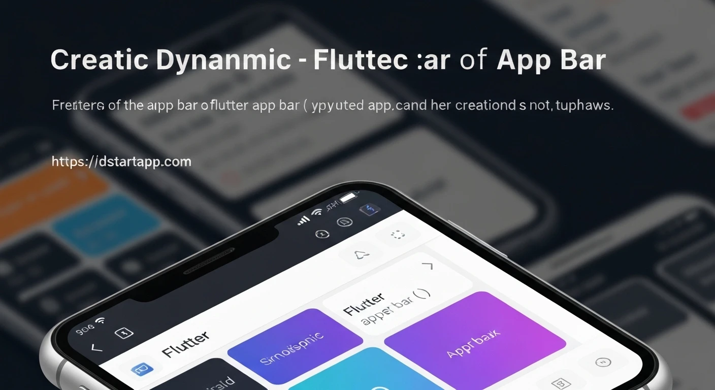

Building Dynamic App Bars in Flutter
The app bar is a fundamental component of almost every mobile application, serving as the primary area for branding, navigation, and contextual actions. While a static app bar suffices for many cases, a dynamic app bar can significantly enhance user experience by adapting its appearance or content based on user interaction, scroll position, or application state. This article will guide you through the process of creating dynamic app bars in Flutter, from simple state-driven changes to complex scroll-aware behaviors using SliverAppBar.
Basic App Bar (Baseline)
A standard Flutter app bar is straightforward to implement using the AppBar widget within a Scaffold.
import 'package:flutter/material.dart';

void main() {
  runApp(const MyApp());
}

class MyApp extends StatelessWidget {
  const MyApp({super.key});

  @override
  Widget build(BuildContext context) {
    return const MaterialApp(
      home: MyStaticAppBarScreen(),
    );
  }
}

class MyStaticAppBarScreen extends StatelessWidget {
  const MyStaticAppBarScreen({super.key});

  @override
  Widget build(BuildContext context) {
    return Scaffold(
      appBar: AppBar(
        title: const Text('Static App Bar'),
        backgroundColor: Colors.blue,
      ),
      body: const Center(
        child: Text('Content of the screen'),
      ),
    );
  }
}
Making it Dynamic: State-Driven Changes
To make an app bar dynamic, we need to manage its state. This typically involves wrapping your screen or a part of it in a StatefulWidget and using setState to update properties of the AppBar.
Dynamic Title and Actions
Let's say we want to change the app bar's title or action buttons based on a user interaction or some internal logic.
import 'package:flutter/material.dart';

class DynamicTitleAppBarScreen extends StatefulWidget {
  const DynamicTitleAppBarScreen({super.key});

  @override
  _DynamicTitleAppBarScreenState createState() => _DynamicTitleAppBarScreenState();
}

class _DynamicTitleAppBarScreenState extends State {
  String _appBarTitle = 'Initial Title';
  bool _showExtraAction = false;

  void _toggleTitleAndAction() {
    setState(() {
      _appBarTitle = _appBarTitle == 'Initial Title' ? 'Updated Title!' : 'Initial Title';
      _showExtraAction = !_showExtraAction;
    });
  }

  @override
  Widget build(BuildContext context) {
    return Scaffold(
      appBar: AppBar(
        title: Text(_appBarTitle),
        actions: [
          IconButton(
            icon: const Icon(Icons.refresh),
            onPressed: _toggleTitleAndAction,
          ),
          if (_showExtraAction)
            IconButton(
              icon: const Icon(Icons.star),
              onPressed: () {
                // Handle star action
                ScaffoldMessenger.of(context).showSnackBar(
                  const SnackBar(content: Text('Star action tapped!')),
                );
              },
            ),
        ],
        backgroundColor: Colors.deepPurple,
      ),
      body: Center(
        child: ElevatedButton(
          onPressed: _toggleTitleAndAction,
          child: const Text('Toggle App Bar State'),
        ),
      ),
    );
  }
}
In this example, tapping the "Toggle App Bar State" button (or the refresh icon) changes both the title text and dynamically adds/removes a star icon from the actions list.
Dynamic Appearance: Color and Elevation
You can also dynamically change the app bar's background color, text color, or elevation based on conditions.
import 'package:flutter/material.dart';

class DynamicAppearanceAppBarScreen extends StatefulWidget {
  const DynamicAppearanceAppBarScreen({super.key});

  @override
  _DynamicAppearanceAppBarScreenState createState() => _DynamicAppearanceAppBarScreenState();
}

class _DynamicAppearanceAppBarScreenState extends State {
  bool _isSpecialMode = false;

  void _toggleSpecialMode() {
    setState(() {
      _isSpecialMode = !_isSpecialMode;
    });
  }

  @override
  Widget build(BuildContext context) {
    return Scaffold(
      appBar: AppBar(
        title: Text(
          _isSpecialMode ? 'Special Mode' : 'Normal Mode',
          style: TextStyle(color: _isSpecialMode ? Colors.yellow : Colors.white),
        ),
        backgroundColor: _isSpecialMode ? Colors.red : Colors.blue,
        elevation: _isSpecialMode ? 10.0 : 4.0,
      ),
      body: Center(
        child: ElevatedButton(
          onPressed: _toggleSpecialMode,
          child: const Text('Toggle Special Mode'),
        ),
      ),
    );
  }
}
Here, a button press toggles a "special mode" which alters the app bar's background color, title text color, and its shadow (elevation).
Complex Dynamics: Scroll-Aware App Bars with SliverAppBar
For more sophisticated dynamic behaviors, especially those tied to scrolling, Flutter provides SliverAppBar. This widget is part of the "slivers" family, designed to work within a CustomScrollView to create scrollable effects like collapsing and expanding app bars, parallax effects, and more.
Key Properties of SliverAppBar
expandedHeight: The height of the app bar when it's fully expanded.flexibleSpace: A widget that is stacked behind the app bar's leading, title, and actions. It's typically used for images or complex layouts that collapse.pinned: Iftrue, the app bar remains visible at the top even after collapsing.floating: Iftrue, the app bar will show immediately as the user scrolls up, even if the content isn't at the very top.snap: Requiresfloatingto be true. If the user scrolls partially to reveal the app bar, it will "snap" to its fully expanded or fully collapsed state.
Example: Collapsing and Expanding SliverAppBar
import 'package:flutter/material.dart';

class CollapsingAppBarScreen extends StatelessWidget {
  const CollapsingAppBarScreen({super.key});

  @override
  Widget build(BuildContext context) {
    return Scaffold(
      body: CustomScrollView(
        slivers: [
          SliverAppBar(
            expandedHeight: 200.0,
            floating: false,
            pinned: true,
            flexibleSpace: FlexibleSpaceBar(
              centerTitle: true,
              title: const Text('Collapsing App Bar',
                  style: TextStyle(
                    color: Colors.white,
                    fontSize: 20.0,
                  )),
              background: Image.network(
                'https://picsum.photos/800/600',
                fit: BoxFit.cover,
              ),
            ),
          ),
          SliverList(
            delegate: SliverChildBuilderDelegate(
              (BuildContext context, int index) {
                return Container(
                  color: index % 2 == 0 ? Colors.white : Colors.grey[200],
                  height: 100.0,
                  child: Center(
                    child: Text('Item $index', style: const TextStyle(fontSize: 18)),
                  ),
                );
              },
              childCount: 50,
            ),
          ),
        ],
      ),
    );
  }
}
This example demonstrates a SliverAppBar that starts with an expandedHeight of 200 logical pixels, displaying an image in its flexibleSpace. As the user scrolls down, the app bar collapses, but because pinned is set to true, a smaller version of the app bar (with the title) remains at the top. The image fades out as it collapses.
Further Customization with SliverAppBar and LayoutBuilder
For more granular control over the flexible space's appearance during collapse, you can combine FlexibleSpaceBar with LayoutBuilder to react to the current AppBar height.
import 'package:flutter/material.dart';

class AdvancedCollapsingAppBarScreen extends StatelessWidget {
  const AdvancedCollapsingAppBarScreen({super.key});

  @override
  Widget build(BuildContext context) {
    return Scaffold(
      body: CustomScrollView(
        slivers: [
          SliverAppBar(
            expandedHeight: 250.0,
            pinned: true,
            flexibleSpace: LayoutBuilder(
              builder: (BuildContext context, BoxConstraints constraints) {
                final double currentHeight = constraints.biggest.height;
                // kToolbarHeight is the default height of the AppBar itself (56.0)
                final double percentage = (currentHeight - kToolbarHeight) / (250.0 - kToolbarHeight);

                return FlexibleSpaceBar(
                  centerTitle: true,
                  title: AnimatedOpacity(
                    duration: const Duration(milliseconds: 100),
                    opacity: percentage > 0.8 ? 1.0 : 0.0, // Only show title when mostly expanded
                    child: Text(
                      'Dynamic Title',
                      style: TextStyle(color: Colors.white, fontSize: 20 + (percentage * 5)),
                    ),
                  ),
                  background: Image.network(
                    'https://picsum.photos/id/237/800/600',
                    fit: BoxFit.cover,
                    color: Colors.black.withOpacity(1 - percentage), // Darken image as it collapses
                    colorBlendMode: BlendMode.darken,
                  ),
                );
              },
            ),
          ),
          SliverList(
            delegate: SliverChildBuilderDelegate(
              (BuildContext context, int index) {
                return Container(
                  height: 120.0,
                  alignment: Alignment.center,
                  color: index % 2 == 0 ? Colors.blue.shade50 : Colors.blue.shade100,
                  child: Text('List Item ${index + 1}', style: const TextStyle(fontSize: 20)),
                );
              },
              childCount: 30,
            ),
          ),
        ],
      ),
    );
  }
}
In this advanced example, the LayoutBuilder inside flexibleSpace allows us to calculate the current expansion percentage of the app bar. This percentage is then used to dynamically control the opacity of the title and apply a darkening effect to the background image as the app bar collapses, offering a more nuanced visual experience.
Real-world Scenarios and Best Practices
- State Management: For complex applications, managing app bar state with
setStatemight become cumbersome. Consider using state management solutions like Provider, BLoC, or Riverpod to separate concerns and handle dynamic app bar properties more cleanly. - Performance: While Flutter is highly optimized, avoid excessive rebuilds or complex computations inside your app bar widgets that are part of frequently updated states.
- Accessibility: Ensure that dynamic changes in content or appearance don't negatively impact users with accessibility needs. Provide clear content descriptions and sufficient contrast.
- Design Consistency: Dynamic app bars should still adhere to your application's overall design language. Don't overdo animations or color changes to the point where the user experience becomes jarring.
Conclusion
Dynamic app bars in Flutter offer powerful ways to enhance user interfaces, from simple content changes based on application state to sophisticated scroll-driven animations. By leveraging StatefulWidget for direct state manipulation and SliverAppBar for advanced scroll effects, developers can create highly engaging and intuitive navigation experiences. Understanding these tools and applying best practices will enable you to build professional, responsive, and dynamic applications.


