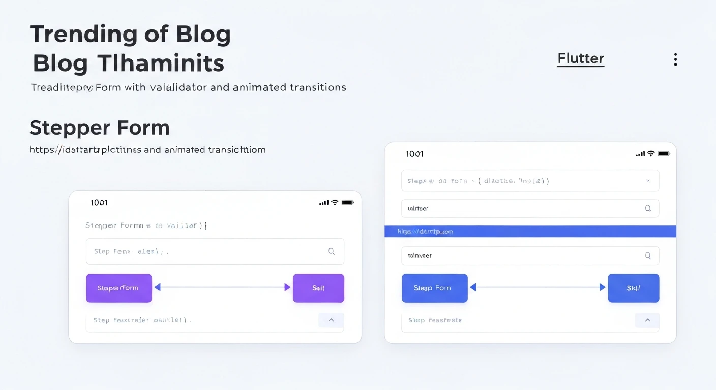

Building an Animated & Validated Stepper Form Widget in Flutter
Introduction
Stepper forms are a common UI pattern used to break down complex forms or multi-stage processes into smaller, manageable steps. This improves user experience by reducing cognitive load and providing a clear sense of progress. In Flutter, building a stepper form that includes both robust validation and smooth animated transitions can significantly enhance its usability and visual appeal.
In this article, we will walk through the process of creating a custom stepper form widget in Flutter. We'll cover:
- Defining a data model for each step.
- Structuring the main stepper widget.
- Implementing per-step form validation.
- Adding animated transitions between steps for a polished look.
Defining the Step Data Model
First, let's define a simple data structure to represent each step in our form. Each step will need a title, the actual form content widget, and a GlobalKey for its validation.
import 'package:flutter/material.dart';

class FormStep {
  final String title;
  final Widget content;
  final GlobalKey formKey;

  FormStep({
    required this.title,
    required this.content,
    required this.formKey,
  });
}
The Core Stepper Widget Structure
Our main stepper form will be a StatefulWidget to manage the current step index and other states. We'll initialize a list of FormStep objects and manage the _currentStepIndex.
import 'package:flutter/material.dart';
import 'package:flutter/widgets.dart'; // For Widget

// Assume FormStep class is defined as above

class StepperFormPage extends StatefulWidget {
  const StepperFormPage({super.key});

  @override
  State createState() => _StepperFormPageState();
}

class _StepperFormPageState extends State {
  int _currentStepIndex = 0;
  late List _steps;

  @override
  void initState() {
    super.initState();
    _steps = [
      FormStep(
        title: 'Personal Info',
        content: Column(
          children: [
            TextFormField(
              decoration: const InputDecoration(labelText: 'First Name'),
              validator: (value) {
                if (value == null || value.isEmpty) {
                  return 'Please enter your first name';
                }
                return null;
              },
            ),
            TextFormField(
              decoration: const InputDecoration(labelText: 'Last Name'),
              validator: (value) {
                if (value == null || value.isEmpty) {
                  return 'Please enter your last name';
                }
                return null;
              },
            ),
          ],
        ),
        formKey: GlobalKey(),
      ),
      FormStep(
        title: 'Contact Details',
        content: Column(
          children: [
            TextFormField(
              decoration: const InputDecoration(labelText: 'Email'),
              keyboardType: TextInputType.emailAddress,
              validator: (value) {
                if (value == null || value.isEmpty) {
                  return 'Please enter your email';
                }
                if (!RegExp(r'^[^@]+@[^@]+\.[^@]+').hasMatch(value)) {
                  return 'Please enter a valid email';
                }
                return null;
              },
            ),
            TextFormField(
              decoration: const InputDecoration(labelText: 'Phone'),
              keyboardType: TextInputType.phone,
              validator: (value) {
                if (value == null || value.isEmpty) {
                  return 'Please enter your phone number';
                }
                return null;
              },
            ),
          ],
        ),
        formKey: GlobalKey(),
      ),
      FormStep(
        title: 'Review & Submit',
        content: const Center(
          child: Text('Please review your information before submitting.'),
        ),
        formKey: GlobalKey(), // This step might not need validation, but key is good practice
      ),
    ];
  }

  void _nextStep() {
    if (_currentStepIndex < _steps.length - 1) {
      if (_steps[_currentStepIndex].formKey.currentState?.validate() ?? false) {
        setState(() {
          _currentStepIndex++;
        });
      }
    } else {
      // This is the last step, handle submission
      if (_steps[_currentStepIndex].formKey.currentState?.validate() ?? false) {
        ScaffoldMessenger.of(context).showSnackBar(
          const SnackBar(content: Text('Form Submitted!')),
        );
      }
    }
  }

  void _previousStep() {
    if (_currentStepIndex > 0) {
      setState(() {
        _currentStepIndex--;
      });
    }
  }

  @override
  Widget build(BuildContext context) {
    return Scaffold(
      appBar: AppBar(
        title: const Text('Animated Stepper Form'),
      ),
      body: Column(
        children: [
          // Step indicators (optional, but good for UX)
          Padding(
            padding: const EdgeInsets.all(16.0),
            child: Row(
              mainAxisAlignment: MainAxisAlignment.spaceAround,
              children: _steps.asMap().entries.map((entry) {
                int index = entry.key;
                FormStep step = entry.value;
                return GestureDetector(
                  onTap: () {
                    // Optional: allow jumping to steps if validation is handled
                    // For simplicity, we'll navigate using buttons
                  },
                  child: Column(
                    children: [
                      CircleAvatar(
                        backgroundColor: _currentStepIndex >= index
                            ? Theme.of(context).primaryColor
                            : Colors.grey,
                        child: Text(
                          '${index + 1}',
                          style: const TextStyle(color: Colors.white),
                        ),
                      ),
                      const SizedBox(height: 4),
                      Text(
                        step.title,
                        style: TextStyle(
                          fontWeight: _currentStepIndex == index
                              ? FontWeight.bold
                              : FontWeight.normal,
                          color: _currentStepIndex >= index
                              ? Colors.black87
                              : Colors.grey,
                        ),
                      ),
                    ],
                  ),
                );
              }).toList(),
            ),
          ),
          Expanded(
            child: AnimatedSwitcher(
              duration: const Duration(milliseconds: 300),
              transitionBuilder: (Widget child, Animation animation) {
                final offsetAnimation = Tween(
                  begin: const Offset(1.0, 0.0), // Starts from right
                  end: Offset.zero,
                ).animate(animation);
                return SlideTransition(
                  position: offsetAnimation,
                  child: FadeTransition(
                    opacity: animation,
                    child: child,
                  ),
                );
              },
              child: Container(
                key: ValueKey(_currentStepIndex), // Key is crucial for AnimatedSwitcher
                padding: const EdgeInsets.all(16.0),
                child: Form(
                  key: _steps[_currentStepIndex].formKey,
                  child: _steps[_currentStepIndex].content,
                ),
              ),
            ),
          ),
          Padding(
            padding: const EdgeInsets.all(16.0),
            child: Row(
              mainAxisAlignment: MainAxisAlignment.spaceBetween,
              children: [
                if (_currentStepIndex > 0)
                  ElevatedButton(
                    onPressed: _previousStep,
                    child: const Text('Previous'),
                  ),
                const Spacer(),
                ElevatedButton(
                  onPressed: _nextStep,
                  child: Text(_currentStepIndex == _steps.length - 1 ? 'Submit' : 'Next'),
                ),
              ],
            ),
          ),
        ],
      ),
    );
  }
}
Implementing Form Validation
Form validation is critical in a stepper form to ensure data integrity before proceeding to the next step. Each step's content is wrapped in a Form widget, which uses its associated GlobalKey to trigger validation.
In the _nextStep method, we call _steps[_currentStepIndex].formKey.currentState?.validate(). This method returns true if all form fields within that step's Form are valid, and false otherwise. If valid, the stepper can proceed; if not, validation messages will be displayed by the TextFormField widgets.
  // Inside _StepperFormPageState
  void _nextStep() {
    if (_currentStepIndex < _steps.length - 1) {
      // Validate the current step's form
      if (_steps[_currentStepIndex].formKey.currentState?.validate() ?? false) {
        setState(() {
          _currentStepIndex++;
        });
      }
    } else {
      // This is the last step, handle submission
      if (_steps[_currentStepIndex].formKey.currentState?.validate() ?? false) {
        // Here you would typically collect all data and send it
        ScaffoldMessenger.of(context).showSnackBar(
          const SnackBar(content: Text('Form Submitted!')),
        );
      }
    }
  }
Each TextFormField inside a step's content needs a validator function to define its validation rules.
// Example TextFormField with validator
TextFormField(
  decoration: const InputDecoration(labelText: 'First Name'),
  validator: (value) {
    if (value == null || value.isEmpty) {
      return 'Please enter your first name';
    }
    return null;
  },
),
Enhancing with Animated Transitions
To make the step transitions smooth and engaging, we use Flutter's AnimatedSwitcher widget. AnimatedSwitcher automatically animates between two child widgets when its child property changes, provided the children have unique Keys.
We wrap the current step's content in an AnimatedSwitcher. The key of the content is set to ValueKey, ensuring that AnimatedSwitcher detects a change and triggers the animation whenever _currentStepIndex updates.
// Inside _StepperFormPageState's build method
Expanded(
  child: AnimatedSwitcher(
    duration: const Duration(milliseconds: 300),
    transitionBuilder: (Widget child, Animation animation) {
      // Custom slide and fade transition
      final offsetAnimation = Tween(
        begin: const Offset(1.0, 0.0), // Starts from right
        end: Offset.zero,
      ).animate(animation);
      return SlideTransition(
        position: offsetAnimation,
        child: FadeTransition(
          opacity: animation,
          child: child,
        ),
      );
    },
    child: Container(
      // Key is crucial for AnimatedSwitcher to detect changes
      key: ValueKey(_currentStepIndex),
      padding: const EdgeInsets.all(16.0),
      child: Form(
        key: _steps[_currentStepIndex].formKey,
        child: _steps[_currentStepIndex].content,
      ),
    ),
  ),
),
The transitionBuilder allows us to define a custom animation. Here, we've combined a SlideTransition (moving from right to left) with a FadeTransition for a pleasant visual effect. You can customize this to any animation type you prefer.
Putting It All Together
Here's how you can integrate the StepperFormPage into a basic Flutter application:
import 'package:flutter/material.dart';
// Assuming form_step.dart and stepper_form_page.dart files exist
// import 'form_step.dart';
// import 'stepper_form_page.dart';

// Or, if all code is in one file:
// Define FormStep class here
// Define StepperFormPage and _StepperFormPageState here

void main() {
  runApp(const MyApp());
}

class MyApp extends StatelessWidget {
  const MyApp({super.key});

  @override
  Widget build(BuildContext context) {
    return MaterialApp(
      title: 'Flutter Stepper Form Demo',
      theme: ThemeData(
        primarySwatch: Colors.blue,
        visualDensity: VisualDensity.adaptivePlatformDensity,
      ),
      home: const StepperFormPage(),
    );
  }
}
Conclusion
By combining a well-defined step data model, per-step form validation, and smooth animated transitions, we've built a robust and user-friendly stepper form widget in Flutter. This approach enhances the user experience by breaking down complex input processes into manageable segments, guiding users effectively through their journey.
You can further extend this implementation by adding a global progress indicator, allowing users to jump to previous steps (with appropriate validation handling), or integrating more complex state management solutions like Provider or Bloc for larger applications.


