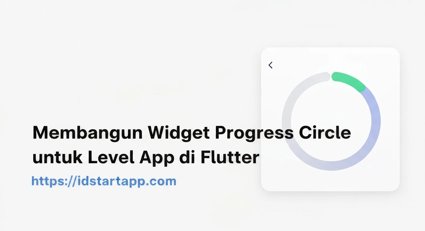

Building a Progress Circle Widget for App Levels in Flutter
Progress circles are a common and visually appealing way to display progress in user interfaces. They are particularly effective in apps that feature levels, experience points, or goal completion, providing instant feedback and a sense of accomplishment. In Flutter, building a custom progress circle widget allows for complete control over its appearance and behavior. This article will guide you through creating a reusable Progress Circle widget, ideal for visualizing app level progression.
Understanding the Core Components
To create our animated progress circle, we'll primarily rely on three Flutter concepts:
StatefulWidget: For managing the internal state of the progress (e.g., animation controller, current progress value).CustomPaint: This widget allows us to draw custom graphics directly onto the canvas. It takes aCustomPainterclass as an argument.CustomPainter: A class that extendsCustomPainterand implements thepaintandshouldRepaintmethods. This is where we define how our circle and progress arc are drawn.AnimationControllerandTween: To create smooth transitions when the progress value changes.
Step 1: Setting Up the Widget Structure
First, let's create a basic StatefulWidget for our progress circle. This widget will hold the properties like size, colors, stroke width, and the current progress value.
import 'package:flutter/material.dart';
import 'dart:math' as math;

class LevelProgressCircle extends StatefulWidget {
  final double progress; // Value between 0.0 and 1.0
  final double size;
  final double strokeWidth;
  final Color backgroundColor;
  final Color progressColor;
  final String? centerText;
  final TextStyle? centerTextStyle;

  const LevelProgressCircle({
    Key? key,
    required this.progress,
    this.size = 100.0,
    this.strokeWidth = 10.0,
    this.backgroundColor = Colors.grey,
    this.progressColor = Colors.blue,
    this.centerText,
    this.centerTextStyle,
  }) : assert(progress >= 0.0 && progress <= 1.0),
       super(key: key);

  @override
  _LevelProgressCircleState createState() => _LevelProgressCircleState();
}

class _LevelProgressCircleState extends State with SingleTickerProviderStateMixin {
  late AnimationController _animationController;
  late Animation _animation;

  @override
  void initState() {
    super.initState();
    _animationController = AnimationController(
      vsync: this,
      duration: const Duration(milliseconds: 700),
    );

    _animation = Tween(begin: 0.0, end: widget.progress).animate(
      CurvedAnimation(parent: _animationController, curve: Curves.easeInOut),
    )..addListener(() {
        setState(() {}); // Rebuild when animation value changes
      });

    _animationController.forward();
  }

  @override
  void didUpdateWidget(covariant LevelProgressCircle oldWidget) {
    super.didUpdateWidget(oldWidget);
    if (widget.progress != oldWidget.progress) {
      _animation = Tween(begin: oldWidget.progress, end: widget.progress).animate(
        CurvedAnimation(parent: _animationController, curve: Curves.easeInOut),
      );
      _animationController
        ..reset()
        ..forward();
    }
  }

  @override
  void dispose() {
    _animationController.dispose();
    super.dispose();
  }

  @override
  Widget build(BuildContext context) {
    return SizedBox(
      width: widget.size,
      height: widget.size,
      child: Stack(
        alignment: Alignment.center,
        children: [
          CustomPaint(
            painter: _CircleProgressPainter(
              progress: _animation.value,
              backgroundColor: widget.backgroundColor,
              progressColor: widget.progressColor,
              strokeWidth: widget.strokeWidth,
            ),
            size: Size.infinite,
          ),
          if (widget.centerText != null)
            Text(
              widget.centerText!,
              style: widget.centerTextStyle ??
                  TextStyle(
                    fontSize: widget.size * 0.2,
                    fontWeight: FontWeight.bold,
                    color: Colors.black87,
                  ),
              textAlign: TextAlign.center,
            ),
        ],
      ),
    );
  }
}
In this initial setup:
- The
LevelProgressCirclewidget defines various customization options. _LevelProgressCircleStatemanages theAnimationControllerandAnimationfor smooth progress updates.initStateinitializes the animation with the initial progress.didUpdateWidgetis crucial for animating changes when theprogressproperty updates from outside the widget.disposeensures that the animation controller is released when the widget is removed from the tree.- The
buildmethod uses aSizedBoxto define the size, aStackto overlay text, andCustomPaintto draw the circles.
Step 2: Implementing the CustomPainter
Next, we create the _CircleProgressPainter class. This class is responsible for drawing the background circle and the progress arc based on the current progress value.
class _CircleProgressPainter extends CustomPainter {
  final double progress;
  final Color backgroundColor;
  final Color progressColor;
  final double strokeWidth;

  _CircleProgressPainter({
    required this.progress,
    required this.backgroundColor,
    required this.progressColor,
    required this.strokeWidth,
  });

  @override
  void paint(Canvas canvas, Size size) {
    // Calculate the center of the canvas
    final center = Offset(size.width / 2, size.height / 2);
    // Calculate the radius, subtracting half of the stroke width to keep the circle within bounds
    final radius = math.min(size.width / 2, size.height / 2) - strokeWidth / 2;

    // Paint for the background circle
    final backgroundPaint = Paint()
      ..color = backgroundColor
      ..strokeWidth = strokeWidth
      ..style = PaintingStyle.stroke;

    // Paint for the progress arc
    final progressPaint = Paint()
      ..color = progressColor
      ..strokeWidth = strokeWidth
      ..style = PaintingStyle.stroke
      ..strokeCap = StrokeCap.round; // Rounded cap for a nice finish

    // Draw the background circle
    canvas.drawCircle(center, radius, backgroundPaint);

    // Define the bounding rectangle for the arc
    final Rect arcRect = Rect.fromCircle(center: center, radius: radius);

    // Calculate the sweep angle (2 * PI for a full circle)
    // Start from the top (-math.pi / 2)
    final double sweepAngle = 2 * math.pi * progress;

    // Draw the progress arc
    canvas.drawArc(
      arcRect,
      -math.pi / 2, // Start angle (top of the circle)
      sweepAngle,  // Sweep angle
      false,       // UseCenter (false for arc, true for sector)
      progressPaint,
    );
  }

  @override
  bool shouldRepaint(covariant _CircleProgressPainter oldDelegate) {
    // Repaint only if the progress, colors, or strokeWidth change
    return oldDelegate.progress != progress ||
           oldDelegate.backgroundColor != backgroundColor ||
           oldDelegate.progressColor != progressColor ||
           oldDelegate.strokeWidth != strokeWidth;
  }
}
Key points of the _CircleProgressPainter:
- The
paintmethod receives theCanvasandSizeof the widget. - We calculate the center and radius to draw our circles correctly.
- Two
Paintobjects are created: one for the background circle and one for the progress arc. The progress arc usesStrokeCap.roundfor a softer appearance at its end. canvas.drawCircledraws the full background circle.canvas.drawArcdraws the progress. ThestartAngleof-math.pi / 2makes the progress start from the top. ThesweepAngleis proportional to theprogressvalue.- The
shouldRepaintmethod is optimized to only trigger a repaint when necessary, improving performance.
Step 3: Using the LevelProgressCircle Widget
Now that our widget is complete, you can easily integrate it into any part of your Flutter application. Here's an example of how to use it, perhaps within a dashboard or a user profile screen:
import 'package:flutter/material.dart';
import 'package:your_app_name/widgets/level_progress_circle.dart'; // Adjust path as needed

class HomeScreen extends StatefulWidget {
  const HomeScreen({Key? key}) : super(key: key);

  @override
  State createState() => _HomeScreenState();
}

class _HomeScreenState extends State {
  double _currentLevelProgress = 0.3; // Example progress
  int _currentLevel = 3;

  @override
  Widget build(BuildContext context) {
    return Scaffold(
      appBar: AppBar(
        title: const Text('Level Progress Example'),
      ),
      body: Center(
        child: Column(
          mainAxisAlignment: MainAxisAlignment.center,
          children: [
            LevelProgressCircle(
              size: 150.0,
              strokeWidth: 15.0,
              progress: _currentLevelProgress,
              backgroundColor: Colors.grey.shade300,
              progressColor: Colors.deepPurple,
              centerText: 'Lv.\n$_currentLevel',
              centerTextStyle: const TextStyle(
                fontSize: 30,
                fontWeight: FontWeight.bold,
                color: Colors.deepPurple,
              ),
            ),
            const SizedBox(height: 40),
            Slider(
              value: _currentLevelProgress,
              min: 0.0,
              max: 1.0,
              divisions: 100,
              label: (_currentLevelProgress * 100).toStringAsFixed(0) + '%',
              onChanged: (newValue) {
                setState(() {
                  _currentLevelProgress = newValue;
                  // Optionally update level based on progress, e.g.,
                  // _currentLevel = (newValue * 10).toInt() + 1;
                });
              },
            ),
            const SizedBox(height: 20),
            Text(
              'Progress: ${(_currentLevelProgress * 100).toStringAsFixed(0)}%',
              style: const TextStyle(fontSize: 18),
            ),
          ],
        ),
      ),
    );
  }
}
In this example, we use a Slider to dynamically change the _currentLevelProgress, demonstrating how the progress circle animates smoothly to new values. The centerText is used to display the current level, making the widget highly informative.
Conclusion
By leveraging CustomPaint and AnimationController, you can create highly customizable and visually engaging progress circle widgets in Flutter. This component is excellent for enhancing user experience in apps that involve progression systems, gamification, or any scenario where a clear visual representation of completion is beneficial. Feel free to expand upon this design by adding more customization options, such as gradients for the progress color, different stroke caps, or more complex text layouts within the circle.


