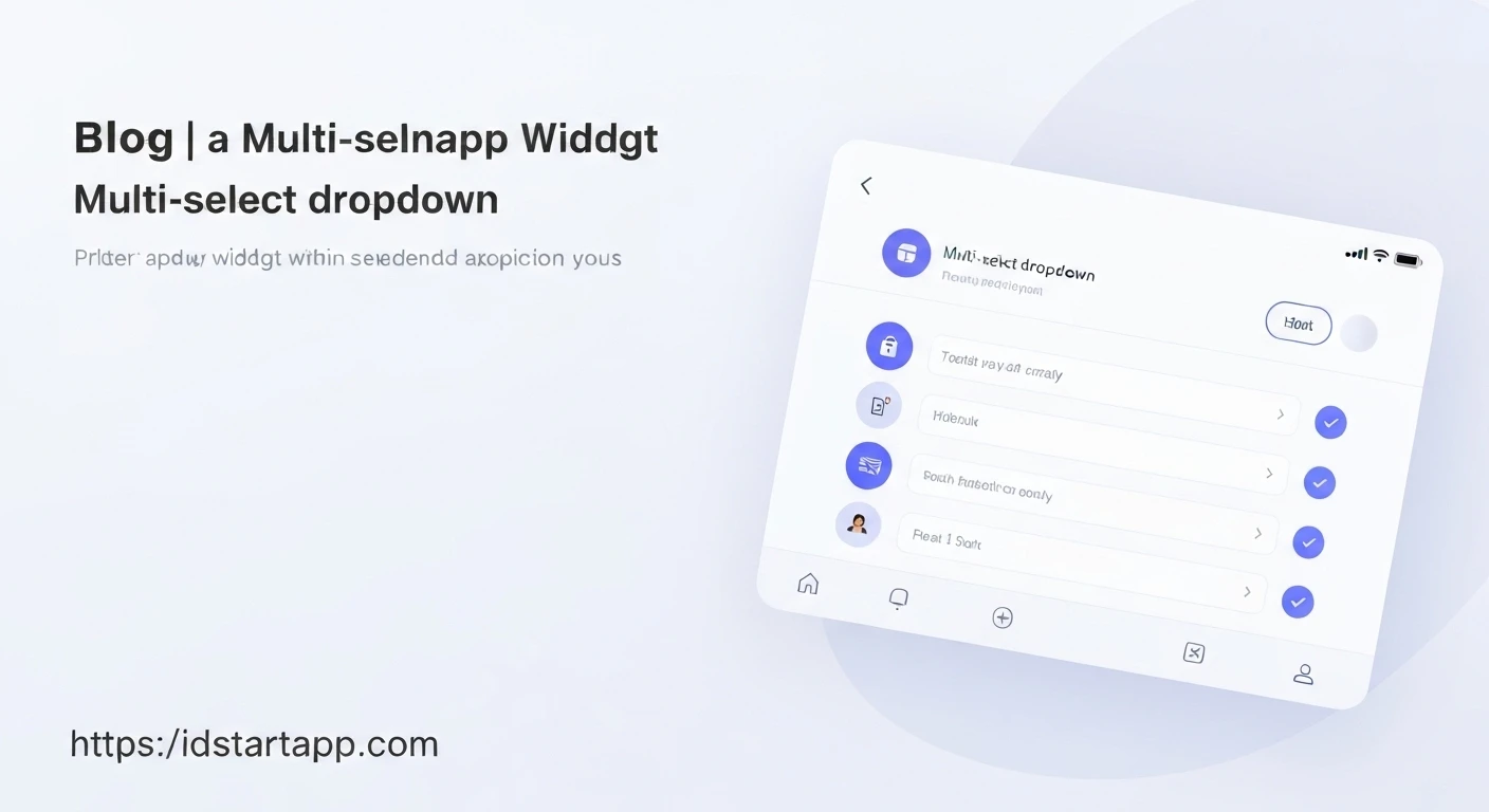

Building a Multi-Select Dropdown Widget in Flutter
User interfaces often require selecting multiple options from a predefined list. While Flutter provides a standard DropdownButton, it natively supports only single-item selection. Implementing a multi-select dropdown allows users to efficiently choose several items, enhancing form inputs, filter controls, and configuration settings. This article will guide you through building a reusable multi-select dropdown widget in Flutter.
Core Concepts
Our approach will involve a combination of Flutter widgets:
- A main "trigger" widget (e.g., a button or text field) that, when tapped, opens a selection interface.
- A dedicated selection interface, typically presented as a dialog or a bottom sheet, containing a list of items with checkboxes.
- State management to keep track of selected items and update the UI accordingly.
Step-by-Step Implementation
1. Define the Data Model
First, let's create a simple data model for our selectable options. Each option will have an ID, a name, and a boolean to track its selection status.
// lib/models/option_item.dart
class OptionItem {
  final String id;
  final String name;
  bool isSelected;

  OptionItem({required this.id, required this.name, this.isSelected = false});

  @override
  String toString() {
    return 'OptionItem(id: $id, name: $name, isSelected: $isSelected)';
  }
}
2. Create the Multi-Select Dialog
This dialog will be responsible for displaying the list of items with checkboxes and allowing the user to select multiple options. It will return the updated list of selected items when confirmed.
// lib/widgets/multi_select_dialog.dart
import 'package:flutter/material.dart';
import '../models/option_item.dart';

class MultiSelectDialog extends StatefulWidget {
  final List<OptionItem> items;

  const MultiSelectDialog({super.key, required this.items});

  @override
  State<MultiSelectDialog> createState() => _MultiSelectDialogState();
}

class _MultiSelectDialogState extends State<MultiSelectDialog> {
  late List<OptionItem> _tempSelectedItems;

  @override
  void initState() {
    super.initState();
    // Initialize a temporary list to hold changes within the dialog.
    // Deep copy items to avoid modifying the original list directly.
    _tempSelectedItems = List<OptionItem>.from(widget.items.map((item) =>
      OptionItem(id: item.id, name: item.name, isSelected: item.isSelected)
    ));
  }

  @override
  Widget build(BuildContext context) {
    return AlertDialog(
      title: const Text('Select Items'),
      contentPadding: EdgeInsets.zero,
      content: SingleChildScrollView(
        child: ListBody(
          children: _tempSelectedItems.map((item) {
            return CheckboxListTile(
              controlAffinity: ListTileControlAffinity.leading,
              value: item.isSelected,
              title: Text(item.name),
              onChanged: (bool? value) {
                setState(() {
                  item.isSelected = value!;
                });
              },
            );
          }).toList(),
        ),
      ),
      actions: <Widget>[
        TextButton(
          onPressed: () {
            Navigator.pop(context); // Dismiss dialog without saving
          },
          child: const Text('CANCEL'),
        ),
        ElevatedButton(
          onPressed: () {
            // Return the updated list of items to the caller
            Navigator.pop(context, _tempSelectedItems);
          },
          child: const Text('OK'),
        ),
      ],
    );
  }
}
3. Build the Multi-Select Dropdown Widget
This widget will serve as the entry point for our multi-select functionality. It will display the currently selected items and trigger the MultiSelectDialog when tapped.
// lib/widgets/multi_select_dropdown.dart
import 'package:flutter/material.dart';
import '../models/option_item.dart';
import 'multi_select_dialog.dart';

class MultiSelectDropdown extends StatefulWidget {
  final List<OptionItem> initialOptions;
  final ValueChanged<List<OptionItem>> onSelectionChanged;

  const MultiSelectDropdown({
    super.key,
    required this.initialOptions,
    required this.onSelectionChanged,
  });

  @override
  State<MultiSelectDropdown> createState() => _MultiSelectDropdownState();
}

class _MultiSelectDropdownState extends State<MultiSelectDropdown> {
  late List<OptionItem> _selectedOptions;

  @override
  void initState() {
    super.initState();
    // Initialize with a deep copy of initial options to ensure independent state.
    _selectedOptions = List<OptionItem>.from(widget.initialOptions.map((item) =>
      OptionItem(id: item.id, name: item.name, isSelected: item.isSelected)
    ));
  }

  // Function to display the selected items text
  String _getSelectedItemsText() {
    final selectedNames = _selectedOptions
        .where((item) => item.isSelected)
        .map((item) => item.name)
        .toList();

    if (selectedNames.isEmpty) {
      return 'Select items';
    } else if (selectedNames.length == _selectedOptions.length) {
      return 'All items selected';
    } else if (selectedNames.length == 1) {
      return selectedNames.first;
    } else {
      return '${selectedNames.length} items selected';
    }
  }

  Future<void> _showMultiSelectDialog() async {
    final List<OptionItem>? updatedItems = await showDialog<List<OptionItem>>(
      context: context,
      builder: (BuildContext context) {
        // Pass a deep copy of the current state of options to the dialog
        return MultiSelectDialog(
          items: List<OptionItem>.from(_selectedOptions.map((item) =>
            OptionItem(id: item.id, name: item.name, isSelected: item.isSelected)
          )),
        );
      },
    );

    if (updatedItems != null) {
      setState(() {
        _selectedOptions = updatedItems;
      });
      widget.onSelectionChanged(_selectedOptions);
    }
  }

  @override
  Widget build(BuildContext context) {
    return GestureDetector(
      onTap: _showMultiSelectDialog,
      child: Container(
        padding: const EdgeInsets.symmetric(horizontal: 12.0, vertical: 8.0),
        decoration: BoxDecoration(
          border: Border.all(color: Colors.grey),
          borderRadius: BorderRadius.circular(4.0),
        ),
        child: Row(
          mainAxisAlignment: MainAxisAlignment.spaceBetween,
          children: <Widget>[
            Flexible(
              child: Text(
                _getSelectedItemsText(),
                overflow: TextOverflow.ellipsis,
              ),
            ),
            const Icon(Icons.arrow_drop_down),
          ],
        ),
      ),
    );
  }
}
4. Integrate into Your Application
Finally, let's put it all together in a sample Flutter application. In your main.dart, you can define your list of options and display the MultiSelectDropdown.
// lib/main.dart
import 'package:flutter/material.dart';
import 'models/option_item.dart';
import 'widgets/multi_select_dropdown.dart';

void main() {
  runApp(const MyApp());
}

class MyApp extends StatelessWidget {
  const MyApp({super.key});

  @override
  Widget build(BuildContext context) {
    return MaterialApp(
      title: 'Multi-Select Dropdown Demo',
      theme: ThemeData(
        primarySwatch: Colors.blue,
      ),
      home: const MyHomePage(),
    );
  }
}

class MyHomePage extends StatefulWidget {
  const MyHomePage({super.key});

  @override
  State<MyHomePage> createState() => _MyHomePageState();
}

class _MyHomePageState extends State<MyHomePage> {
  List<OptionItem> _availableOptions = [
    OptionItem(id: '1', name: 'Apple', isSelected: false),
    OptionItem(id: '2', name: 'Banana', isSelected: false),
    OptionItem(id: '3', name: 'Cherry', isSelected: true), // Pre-selected example
    OptionItem(id: '4', name: 'Date', isSelected: false),
    OptionItem(id: '5', name: 'Elderberry', isSelected: false),
  ];

  List<OptionItem> _currentSelectedItems = [];

  @override
  void initState() {
    super.initState();
    // Initialize _currentSelectedItems from _availableOptions.
    // This creates a separate list to manage selections.
    _currentSelectedItems = List<OptionItem>.from(_availableOptions.map((item) =>
      OptionItem(id: item.id, name: item.name, isSelected: item.isSelected)
    ));
  }

  void _handleSelectionChanged(List<OptionItem> updatedOptions) {
    setState(() {
      _currentSelectedItems = updatedOptions;
      // You can also update _availableOptions here if you want persistent changes
      // to the master list of options, otherwise _currentSelectedItems is sufficient
      // for displaying and using the selected data.
    });
    print('Selected items updated:');
    for (var item in _currentSelectedItems.where((item) => item.isSelected)) {
      print('- ${item.name}');
    }
  }

  @override
  Widget build(BuildContext context) {
    return Scaffold(
      appBar: AppBar(
        title: const Text('Multi-Select Dropdown Demo'),
      ),
      body: Center(
        child: Padding(
          padding: const EdgeInsets.all(20.0),
          child: Column(
            mainAxisAlignment: MainAxisAlignment.start,
            crossAxisAlignment: CrossAxisAlignment.stretch,
            children: <Widget>[
              const Text(
                'Select your favorite fruits:',
                style: TextStyle(fontSize: 18),
              ),
              const SizedBox(height: 20),
              MultiSelectDropdown(
                initialOptions: _availableOptions,
                onSelectionChanged: _handleSelectionChanged,
              ),
              const SizedBox(height: 20),
              // Display current selected items
              Text(
                'Currently selected: ${_currentSelectedItems.where((item) => item.isSelected).map((e) => e.name).join(', ')}',
                style: const TextStyle(fontSize: 16),
              ),
            ],
          ),
        ),
      ),
    );
  }
}
Conclusion
By combining a stateful dialog with a custom trigger widget, we've successfully implemented a flexible and reusable multi-select dropdown in Flutter. This pattern can be adapted for various data selection needs, providing a richer user experience than single-selection dropdowns. You can further enhance this widget by adding search functionality to the dialog, custom styling, or integrating with more advanced state management solutions.


