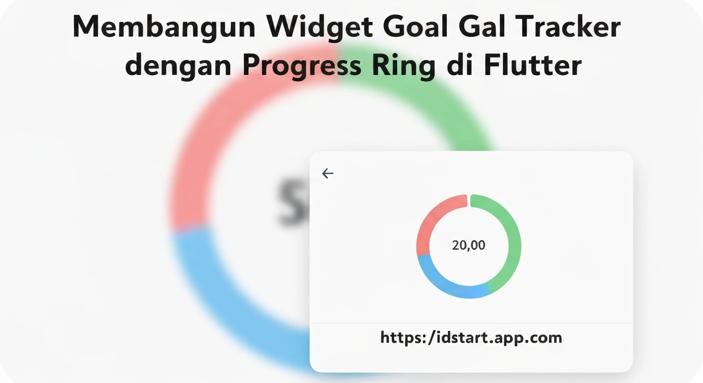

Building a Goal Tracker Widget with Progress Ring in Flutter
Creating engaging and informative user interfaces is crucial for any application, especially those designed to motivate users. A common and highly effective UI element for this purpose is a progress tracker, often visualized as a ring or circle. This article will guide you through building a professional and reusable "Goal Tracker Widget" in Flutter, complete with a visually appealing progress ring that updates dynamically.
Our goal tracker widget will feature:
- A customizable progress ring built using Flutter's
CustomPainter. - Smooth animation for the progress ring using
AnimationControllerandAnimatedBuilder. - Text overlays for displaying goal title, current progress, and target value.
- A clean, modular structure for easy integration and reusability.
Why a Goal Tracker Widget?
Goal tracking widgets are invaluable in various applications, from fitness apps monitoring daily steps, to productivity tools tracking task completion, or finance apps visualizing savings targets. They provide immediate visual feedback, enhance user engagement, and serve as a constant reminder of progress towards a desired outcome.
Understanding the Core Components
To construct our goal tracker, we'll leverage several fundamental Flutter concepts:
1. The Progress Ring with CustomPainter
The core of our visual progress indicator will be a custom-drawn arc. Flutter's CustomPainter is the perfect tool for drawing custom graphics directly onto the canvas. We'll use it to draw a background ring and a foreground arc representing the progress.
2. Animation with AnimationController and AnimatedBuilder
To make the progress ring visually appealing and dynamic, we'll animate its fill. AnimationController manages the animation's state, while a Tween defines the range of values to animate. AnimatedBuilder will then rebuild the widget whenever the animation value changes, ensuring a smooth update of the progress ring.
3. Integrating Text and Layout
Beyond the progress ring, the widget needs to display crucial information like the goal title, current value, and target value. We'll use standard Flutter widgets like Text, Column, and Stack to arrange these elements cleanly around and within the progress ring.
Step-by-Step Implementation
Let's dive into the code. We'll break down the implementation into logical files.
1. Defining the Goal Data Model
First, let's define a simple data model for our goal. This will make it easy to pass goal-related information to our widget.
// lib/models/goal.dart
class Goal {
  final String title;
  final double currentValue;
  final double targetValue;

  Goal({
    required this.title,
    required this.currentValue,
    required this.targetValue,
  });

  double get progressPercentage => (currentValue / targetValue);
}
2. Creating the Progress Ring Painter
This class extends CustomPainter and is responsible for drawing the background ring and the progress arc.
// lib/widgets/progress_ring_painter.dart
import 'package:flutter/material.dart';
import 'dart:math' as math;

class ProgressRingPainter extends CustomPainter {
  final double progress; // Value between 0.0 and 1.0
  final Color backgroundColor;
  final Color foregroundColor;
  final double strokeWidth;

  ProgressRingPainter({
    required this.progress,
    required this.backgroundColor,
    required this.foregroundColor,
    required this.strokeWidth,
  });

  @override
  void paint(Canvas canvas, Size size) {
    // Define the center of the ring
    Offset center = Offset(size.width / 2, size.height / 2);
    // Define the radius of the ring
    double radius = math.min(size.width / 2, size.height / 2) - strokeWidth / 2;

    // Paint for the background ring
    Paint backgroundPaint = Paint()
      ..color = backgroundColor
      ..strokeWidth = strokeWidth
      ..style = PaintingStyle.stroke
      ..strokeCap = StrokeCap.round; // Optional: round caps

    // Paint for the foreground progress arc
    Paint foregroundPaint = Paint()
      ..color = foregroundColor
      ..strokeWidth = strokeWidth
      ..style = PaintingStyle.stroke
      ..strokeCap = StrokeCap.round;

    // Draw background ring
    canvas.drawCircle(center, radius, backgroundPaint);

    // Draw foreground arc
    double sweepAngle = 2 * math.pi * progress;
    canvas.drawArc(
      Rect.fromCircle(center: center, radius: radius),
      -math.pi / 2, // Start from the top (12 o'clock)
      sweepAngle,
      false,
      foregroundPaint,
    );
  }

  @override
  bool shouldRepaint(covariant ProgressRingPainter oldDelegate) {
    // Only repaint if progress, colors, or strokeWidth have changed
    return oldDelegate.progress != progress ||
           oldDelegate.backgroundColor != backgroundColor ||
           oldDelegate.foregroundColor != foregroundColor ||
           oldDelegate.strokeWidth != strokeWidth;
  }
}
3. Building the Animated Progress Ring Widget
This widget uses the ProgressRingPainter and adds animation capabilities. It's a StatefulWidget to manage the AnimationController.
// lib/widgets/animated_progress_ring.dart
import 'package:flutter/material.dart';
import 'package:your_app_name/widgets/progress_ring_painter.dart'; // Adjust import path

class AnimatedProgressRing extends StatefulWidget {
  final double progress; // Target progress (0.0 to 1.0)
  final double size;
  final double strokeWidth;
  final Color backgroundColor;
  final Color foregroundColor;
  final Duration animationDuration;

  const AnimatedProgressRing({
    Key? key,
    required this.progress,
    this.size = 100,
    this.strokeWidth = 10,
    this.backgroundColor = Colors.grey,
    this.foregroundColor = Colors.blue,
    this.animationDuration = const Duration(milliseconds: 800),
  }) : super(key: key);

  @override
  _AnimatedProgressRingState createState() => _AnimatedProgressRingState();
}

class _AnimatedProgressRingState extends State
    with SingleTickerProviderStateMixin {
  late AnimationController _controller;
  late Animation _animation;

  @override
  void initState() {
    super.initState();
    _controller = AnimationController(
      vsync: this,
      duration: widget.animationDuration,
    );
    _animation = Tween(begin: 0.0, end: widget.progress).animate(
      CurvedAnimation(
        parent: _controller,
        curve: Curves.easeOut,
      ),
    );
    _controller.forward();
  }

  @override
  void didUpdateWidget(covariant AnimatedProgressRing oldWidget) {
    super.didUpdateWidget(oldWidget);
    if (widget.progress != oldWidget.progress) {
      _animation = Tween(begin: oldWidget.progress, end: widget.progress).animate(
        CurvedAnimation(
          parent: _controller,
          curve: Curves.easeOut,
        ),
      );
      _controller
        ..reset()
        ..forward();
    }
  }

  @override
  void dispose() {
    _controller.dispose();
    super.dispose();
  }

  @override
  Widget build(BuildContext context) {
    return SizedBox(
      width: widget.size,
      height: widget.size,
      child: AnimatedBuilder(
        animation: _animation,
        builder: (context, child) {
          return CustomPaint(
            painter: ProgressRingPainter(
              progress: _animation.value,
              backgroundColor: widget.backgroundColor,
              foregroundColor: widget.foregroundColor,
              strokeWidth: widget.strokeWidth,
            ),
            child: child,
          );
        },
      ),
    );
  }
}
4. Assembling the Full Goal Tracker Widget
This widget combines the animated progress ring with text elements to display all the goal information.
// lib/widgets/goal_tracker_widget.dart
import 'package:flutter/material.dart';
import 'package:your_app_name/models/goal.dart'; // Adjust import path
import 'package:your_app_name/widgets/animated_progress_ring.dart'; // Adjust import path

class GoalTrackerWidget extends StatelessWidget {
  final Goal goal;
  final double ringSize;
  final double strokeWidth;
  final Color backgroundColor;
  final Color foregroundColor;
  final Duration animationDuration;

  const GoalTrackerWidget({
    Key? key,
    required this.goal,
    this.ringSize = 150,
    this.strokeWidth = 15,
    this.backgroundColor = const Color(0xFFE0E0E0),
    this.foregroundColor = const Color(0xFF4CAF50), // Green for success
    this.animationDuration = const Duration(milliseconds: 1000),
  }) : super(key: key);

  @override
  Widget build(BuildContext context) {
    return Container(
      padding: const EdgeInsets.all(16.0),
      decoration: BoxDecoration(
        color: Colors.white,
        borderRadius: BorderRadius.circular(15.0),
        boxShadow: [
          BoxShadow(
            color: Colors.grey.withOpacity(0.2),
            spreadRadius: 2,
            blurRadius: 5,
            offset: const Offset(0, 3),
          ),
        ],
      ),
      child: Column(
        mainAxisSize: MainAxisSize.min,
        children: [
          Text(
            goal.title,
            style: const TextStyle(
              fontSize: 20,
              fontWeight: FontWeight.bold,
              color: Color(0xFF333333),
            ),
            textAlign: TextAlign.center,
          ),
          const SizedBox(height: 15),
          Stack(
            alignment: Alignment.center,
            children: [
              AnimatedProgressRing(
                progress: goal.progressPercentage.clamp(0.0, 1.0), // Ensure progress is between 0 and 1
                size: ringSize,
                strokeWidth: strokeWidth,
                backgroundColor: backgroundColor,
                foregroundColor: foregroundColor,
                animationDuration: animationDuration,
              ),
              Column(
                mainAxisAlignment: MainAxisAlignment.center,
                children: [
                  Text(
                    '${(goal.progressPercentage * 100).toStringAsFixed(0)}%',
                    style: const TextStyle(
                      fontSize: 28,
                      fontWeight: FontWeight.bold,
                      color: Color(0xFF333333),
                    ),
                  ),
                  Text(
                    '${goal.currentValue.toStringAsFixed(0)} / ${goal.targetValue.toStringAsFixed(0)}',
                    style: TextStyle(
                      fontSize: 14,
                      color: Colors.grey[600],
                    ),
                  ),
                ],
              ),
            ],
          ),
          const SizedBox(height: 15),
          LinearProgressIndicator(
            value: goal.progressPercentage.clamp(0.0, 1.0),
            backgroundColor: backgroundColor.withOpacity(0.5),
            valueColor: AlwaysStoppedAnimation(foregroundColor),
            minHeight: 8,
            borderRadius: BorderRadius.circular(5),
          ),
        ],
      ),
    );
  }
}
5. Demonstrating Usage
Finally, let's put it all together in our main.dart file to see the goal tracker in action.
// lib/main.dart
import 'package:flutter/material.dart';
import 'package:your_app_name/models/goal.dart'; // Adjust import path
import 'package:your_app_name/widgets/goal_tracker_widget.dart'; // Adjust import path

void main() {
  runApp(const MyApp());
}

class MyApp extends StatelessWidget {
  const MyApp({Key? key}) : super(key: key);

  @override
  Widget build(BuildContext context) {
    return MaterialApp(
      title: 'Goal Tracker Demo',
      theme: ThemeData(
        primarySwatch: Colors.blue,
      ),
      home: const GoalTrackerHomePage(),
    );
  }
}

class GoalTrackerHomePage extends StatefulWidget {
  const GoalTrackerHomePage({Key? key}) : super(key: key);

  @override
  State createState() => _GoalTrackerHomePageState();
}

class _GoalTrackerHomePageState extends State {
  Goal _dailyStepsGoal = Goal(title: "Daily Steps", currentValue: 3000, targetValue: 10000);
  Goal _readPagesGoal = Goal(title: "Read Pages", currentValue: 50, targetValue: 200);
  Goal _savingsGoal = Goal(title: "Savings Fund", currentValue: 750, targetValue: 2500);

  void _updateProgress(Goal goal) {
    setState(() {
      if (goal == _dailyStepsGoal) {
        _dailyStepsGoal = Goal(
          title: _dailyStepsGoal.title,
          currentValue: (_dailyStepsGoal.currentValue + 500).clamp(0, _dailyStepsGoal.targetValue),
          targetValue: _dailyStepsGoal.targetValue,
        );
      } else if (goal == _readPagesGoal) {
        _readPagesGoal = Goal(
          title: _readPagesGoal.title,
          currentValue: (_readPagesGoal.currentValue + 10).clamp(0, _readPagesGoal.targetValue),
          targetValue: _readPagesGoal.targetValue,
        );
      } else if (goal == _savingsGoal) {
        _savingsGoal = Goal(
          title: _savingsGoal.title,
          currentValue: (_savingsGoal.currentValue + 100).clamp(0, _savingsGoal.targetValue),
          targetValue: _savingsGoal.targetValue,
        );
      }
    });
  }

  @override
  Widget build(BuildContext context) {
    return Scaffold(
      appBar: AppBar(
        title: const Text('My Goals'),
      ),
      body: SingleChildScrollView(
        padding: const EdgeInsets.all(20.0),
        child: Center(
          child: Column(
            crossAxisAlignment: CrossAxisAlignment.center,
            children: [
              GoalTrackerWidget(goal: _dailyStepsGoal),
              const SizedBox(height: 25),
              ElevatedButton(
                onPressed: () => _updateProgress(_dailyStepsGoal),
                child: const Text('Add 500 Steps'),
              ),
              const SizedBox(height: 30),

              GoalTrackerWidget(
                goal: _readPagesGoal,
                foregroundColor: Colors.deepPurpleAccent,
              ),
              const SizedBox(height: 25),
              ElevatedButton(
                onPressed: () => _updateProgress(_readPagesGoal),
                child: const Text('Read 10 Pages'),
              ),
              const SizedBox(height: 30),

              GoalTrackerWidget(
                goal: _savingsGoal,
                foregroundColor: Colors.orange,
              ),
              const SizedBox(height: 25),
              ElevatedButton(
                onPressed: () => _updateProgress(_savingsGoal),
                child: const Text('Add \$100 to Savings'),
              ),
            ],
          ),
        ),
      ),
    );
  }
}
Key Concepts Highlighted
CustomPainter: Provides direct access to the drawing canvas, allowing for highly customizable and performant rendering of shapes like our progress ring.AnimationController&Tween: The backbone of explicit animations in Flutter.AnimationControllermanages the animation's timeline, whileTweendefines the start and end values for the animation.AnimatedBuilder: A powerful widget for integrating animations into your UI. It rebuilds only the animated part of the widget tree when the animation value changes, optimizing performance.StackLayout: Essential for layering widgets on top of each other, allowing us to place the progress text directly in the center of the progress ring.StatefulWidget&didUpdateWidget: Used to manage the lifecycle of ourAnimationControllerand ensure the animation correctly updates when the target progress changes.
Conclusion
You have successfully built a flexible and animated Goal Tracker Widget with a progress ring in Flutter! By combining CustomPainter for drawing, AnimationController and AnimatedBuilder for smooth transitions, and standard layout widgets, you can create highly engaging and informative UI components. This widget is fully customizable in terms of size, colors, stroke width, and animation duration, making it a versatile addition to any Flutter application aiming to visualize progress effectively.
Feel free to expand upon this foundation by adding more features such as tap gestures, different animation curves, or more complex goal tracking functionalities.


