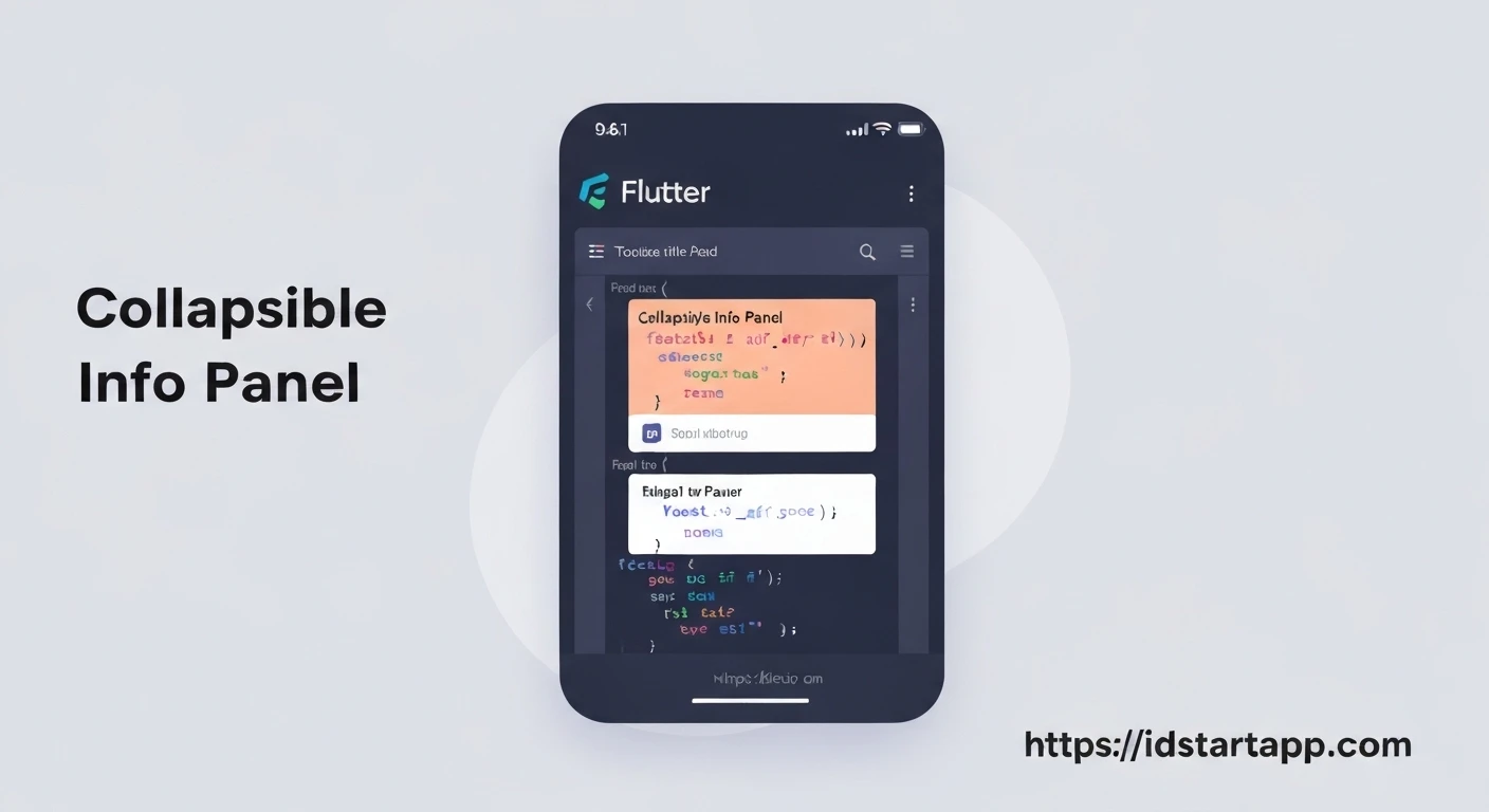

Building a Collapsible Info Panel Widget in Flutter
Introduction
In modern user interfaces, efficiently managing screen real estate while providing access to detailed information is crucial. Collapsible info panels are an elegant solution, allowing users to expand or collapse sections of content as needed. This pattern is commonly seen in FAQs, "read more" sections, or detailed product descriptions. In Flutter, building such a widget not only enhances user experience by decluttering the UI but also provides a great opportunity to explore state management and animation concepts.
This article will guide you through creating a reusable, custom collapsible info panel widget in Flutter, complete with smooth animations for a polished look.
Prerequisites
To follow along with this tutorial, you should have:
- Basic understanding of Flutter and Dart.
- Flutter SDK installed and configured.
- A text editor or IDE (VS Code, Android Studio).
Understanding the Core Components
To create a collapsible panel, we'll leverage several key Flutter features:
- StatefulWidget: To manage the expanded/collapsed state of the panel.
- AnimationController: To control the duration and progress of the animation.
- CurvedAnimation: To apply a non-linear animation curve for a more natural feel.
- Tween: To define the range of values for animation (e.g., 0.0 to 1.0 for expansion, or 0 to π/2 for icon rotation).
- SizeTransition: A widget that animates its child's size along a given axis, perfect for height changes.
- RotationTransition: A widget that animates the rotation of its child, ideal for animating the expansion icon.
- GestureDetector: To detect taps on the header and toggle the panel's state.
Step 1: The Basic Widget Structure
We'll start by defining our CollapsibleInfoPanel as a StatefulWidget, as it needs to manage its internal state (whether it's expanded or not) and control animations.
import 'package:flutter/material.dart';

class CollapsibleInfoPanel extends StatefulWidget {
  final String title;
  final Widget content;
  final bool initiallyExpanded;
  final Duration animationDuration;

  const CollapsibleInfoPanel({
    Key? key,
    required this.title,
    required this.content,
    this.initiallyExpanded = false,
    this.animationDuration = const Duration(milliseconds: 300),
  }) : super(key: key);

  @override
  _CollapsibleInfoPanelState createState() => _CollapsibleInfoPanelState();
}

class _CollapsibleInfoPanelState extends State with SingleTickerProviderStateMixin {
  late AnimationController _animationController;
  late Animation _heightFactor;
  late Animation _iconTurns;

  bool _isExpanded = false;

  @override
  void initState() {
    super.initState();
    _isExpanded = widget.initiallyExpanded;

    _animationController = AnimationController(
      duration: widget.animationDuration,
      vsync: this,
    );

    _heightFactor = CurvedAnimation(
      parent: _animationController,
      curve: Curves.easeOut,
    );

    _iconTurns = Tween(begin: 0.0, end: 0.5).animate(
      CurvedAnimation(
        parent: _animationController,
        curve: Curves.easeOut,
      ),
    );

    if (_isExpanded) {
      _animationController.value = 1.0;
    }
  }

  @override
  void dispose() {
    _animationController.dispose();
    super.dispose();
  }

  void _togglePanel() {
    setState(() {
      _isExpanded = !_isExpanded;
      if (_isExpanded) {
        _animationController.forward();
      } else {
        _animationController.reverse();
      }
    });
  }

  @override
  Widget build(BuildContext context) {
    // UI implementation will go here
    return Container(); // Placeholder for now
  }
}
Step 2: Managing State and Animation
In the _CollapsibleInfoPanelState, we initialize our AnimationController and define two `Animation` objects:
_heightFactor: Controls the expansion/collapse of the content body using `SizeTransition`._iconTurns: Controls the rotation of the expansion icon (e.g., an arrow) using `RotationTransition`.
The SingleTickerProviderStateMixin is essential here, as it provides the ticker needed by the AnimationController to run animations.
The _togglePanel method updates the `_isExpanded` state and triggers the animation controller to `forward()` (expand) or `reverse()` (collapse).
Step 3: Building the UI Layout
Now, let's implement the build method. Our panel will consist of two main parts:
- Header: A `GestureDetector` containing the title and the rotating icon. This part is always visible.
- Content Body: The actual collapsible content, wrapped in a `SizeTransition` to animate its height.
@override
Widget build(BuildContext context) {
  return Column(
    mainAxisSize: MainAxisSize.min,
    children: [
      GestureDetector(
        onTap: _togglePanel,
        child: Container(
          decoration: BoxDecoration(
            color: Colors.blueGrey[50],
            borderRadius: BorderRadius.circular(8.0),
          ),
          padding: const EdgeInsets.symmetric(horizontal: 16.0, vertical: 12.0),
          child: Row(
            mainAxisAlignment: MainAxisAlignment.spaceBetween,
            children: [
              Expanded(
                child: Text(
                  widget.title,
                  style: const TextStyle(
                    fontSize: 18.0,
                    fontWeight: FontWeight.bold,
                    color: Colors.black87,
                  ),
                ),
              ),
              RotationTransition(
                turns: _iconTurns,
                child: const Icon(Icons.expand_more, size: 24.0, color: Colors.black54),
              ),
            ],
          ),
        ),
      ),
      ClipRect( // ClipRect prevents overflow during animation
        child: Align(
          alignment: Alignment.topCenter,
          heightFactor: _heightFactor.value,
          child: SizeTransition(
            axisAlignment: 0.0,
            sizeFactor: _heightFactor,
            child: Padding(
              padding: const EdgeInsets.fromLTRB(16.0, 8.0, 16.0, 16.0),
              child: widget.content,
            ),
          ),
        ),
      ),
    ],
  );
}
A few notes on the UI:
- We use
ClipRectaround the content body to ensure that the content is clipped as its height changes, preventing visual artifacts during the animation. AlignwithheightFactoris used in conjunction with `SizeTransition`. Although `SizeTransition` itself handles the size animation, `Align` ensures the content is aligned correctly and helps manage the layout during transitions.- The `Padding` around `widget.content` ensures the content isn't flush against the edges.
- The `RotationTransition` for the icon uses a `Tween
(begin: 0.0, end: 0.5)` which means it will rotate from 0 degrees (0.0 turns) to 180 degrees (0.5 turns).
Step 4: Putting It All Together (Full Widget Code)
Here is the complete code for our CollapsibleInfoPanel widget:
import 'package:flutter/material.dart';

class CollapsibleInfoPanel extends StatefulWidget {
  final String title;
  final Widget content;
  final bool initiallyExpanded;
  final Duration animationDuration;

  const CollapsibleInfoPanel({
    Key? key,
    required this.title,
    required this.content,
    this.initiallyExpanded = false,
    this.animationDuration = const Duration(milliseconds: 300),
  }) : super(key: key);

  @override
  _CollapsibleInfoPanelState createState() => _CollapsibleInfoPanelState();
}

class _CollapsibleInfoPanelState extends State with SingleTickerProviderStateMixin {
  late AnimationController _animationController;
  late Animation _heightFactor;
  late Animation _iconTurns;

  bool _isExpanded = false;

  @override
  void initState() {
    super.initState();
    _isExpanded = widget.initiallyExpanded;

    _animationController = AnimationController(
      duration: widget.animationDuration,
      vsync: this,
    );

    _heightFactor = CurvedAnimation(
      parent: _animationController,
      curve: Curves.easeOut,
    );

    _iconTurns = Tween(begin: 0.0, end: 0.5).animate(
      CurvedAnimation(
        parent: _animationController,
        curve: Curves.easeOut,
      ),
    );

    if (_isExpanded) {
      _animationController.value = 1.0;
    }
  }

  @override
  void dispose() {
    _animationController.dispose();
    super.dispose();
  }

  void _togglePanel() {
    setState(() {
      _isExpanded = !_isExpanded;
      if (_isExpanded) {
        _animationController.forward();
      } else {
        _animationController.reverse();
      }
    });
  }

  @override
  Widget build(BuildContext context) {
    return Column(
      mainAxisSize: MainAxisSize.min,
      children: [
        GestureDetector(
          onTap: _togglePanel,
          child: Container(
            decoration: BoxDecoration(
              color: Colors.blueGrey[50],
              borderRadius: BorderRadius.circular(8.0),
              boxShadow: [
                BoxShadow(
                  color: Colors.grey.withOpacity(0.1),
                  spreadRadius: 1,
                  blurRadius: 3,
                  offset: const Offset(0, 1), // changes position of shadow
                ),
              ],
            ),
            padding: const EdgeInsets.symmetric(horizontal: 16.0, vertical: 12.0),
            child: Row(
              mainAxisAlignment: MainAxisAlignment.spaceBetween,
              children: [
                Expanded(
                  child: Text(
                    widget.title,
                    style: const TextStyle(
                      fontSize: 18.0,
                      fontWeight: FontWeight.bold,
                      color: Colors.black87,
                    ),
                  ),
                ),
                RotationTransition(
                  turns: _iconTurns,
                  child: const Icon(Icons.expand_more, size: 24.0, color: Colors.black54),
                ),
              ],
            ),
          ),
        ),
        // The content area with animation
        ClipRect( // ClipRect prevents content from overflowing during animation
          child: Align(
            alignment: Alignment.topCenter,
            heightFactor: _heightFactor.value, // This is key for instant height update on state change
            child: SizeTransition(
              axisAlignment: 0.0,
              sizeFactor: _heightFactor,
              child: Padding(
                padding: const EdgeInsets.fromLTRB(16.0, 8.0, 16.0, 16.0),
                child: widget.content,
              ),
            ),
          ),
        ),
      ],
    );
  }
}
Step 5: Example Usage
To use this widget, simply import it and place it anywhere in your Flutter application. Here's an example of how you might integrate it into a `HomePage`:
import 'package:flutter/material.dart';
// Assuming your CollapsibleInfoPanel is in 'collapsible_info_panel.dart'
import 'collapsible_info_panel.dart';

void main() {
  runApp(const MyApp());
}

class MyApp extends StatelessWidget {
  const MyApp({Key? key}) : super(key: key);

  @override
  Widget build(BuildContext context) {
    return MaterialApp(
      title: 'Collapsible Panel Demo',
      theme: ThemeData(
        primarySwatch: Colors.blue,
      ),
      home: const HomePage(),
    );
  }
}

class HomePage extends StatelessWidget {
  const HomePage({Key? key}) : super(key: key);

  @override
  Widget build(BuildContext context) {
    return Scaffold(
      appBar: AppBar(
        title: const Text('Collapsible Panels'),
      ),
      body: SingleChildScrollView(
        padding: const EdgeInsets.all(16.0),
        child: Column(
          children: [
            CollapsibleInfoPanel(
              title: 'What is Flutter?',
              content: const Text(
                'Flutter is an open-source UI software development kit created by Google. It is used to develop cross-platform applications for Android, iOS, Linux, macOS, Windows, Google Fuchsia, and the web from a single codebase.',
                style: TextStyle(fontSize: 16.0),
              ),
              initiallyExpanded: true,
            ),
            const SizedBox(height: 16.0),
            CollapsibleInfoPanel(
              title: 'How to install Flutter?',
              content: Column(
                crossAxisAlignment: CrossAxisAlignment.start,
                children: const [
                  Text(
                    '1. Download the Flutter SDK.',
                    style: TextStyle(fontSize: 16.0),
                  ),
                  Text(
                    '2. Extract the zip file and place the contained flutter in the desired installation location.',
                    style: TextStyle(fontSize: 16.0),
                  ),
                  Text(
                    '3. Add the flutter tool to your path.',
                    style: TextStyle(fontSize: 16.0),
                  ),
                  Text(
                    '4. Run `flutter doctor`.',
                    style: TextStyle(fontSize: 16.0),
                  ),
                ],
              ),
            ),
            const SizedBox(height: 16.0),
            CollapsibleInfoPanel(
              title: 'Learn more about widgets',
              content: RichText(
                text: TextSpan(
                  style: const TextStyle(fontSize: 16.0, color: Colors.black87),
                  children: [
                    const TextSpan(text: 'Flutter is all about widgets. Everything in Flutter is a widget. From buttons and text to layout components like rows and columns, they are all widgets. Learn more at the official '),
                    TextSpan(
                      text: 'Flutter documentation',
                      style: const TextStyle(color: Colors.blue, decoration: TextDecoration.underline),
                      // You can add onTap to open a URL here
                      // recognizer: TapGestureRecognizer()..onTap = () { /* launch URL */ },
                    ),
                    const TextSpan(text: '.'),
                  ],
                ),
              ),
            ),
          ],
        ),
      ),
    );
  }
}
Conclusion
You have successfully built a flexible and animated collapsible info panel widget in Flutter! This custom widget demonstrates how to combine state management, explicit animations, and various layout widgets to create a rich and interactive UI component. You can further enhance this widget by adding more customization options for colors, padding, border styles, or even different animation curves and durations. Mastering such custom widgets is a significant step towards building complex and visually appealing Flutter applications.


