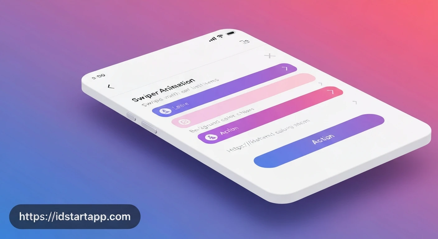

Flutter Animated Swipe List Item with Background Color Change and Action Button
Creating interactive and intuitive user interfaces is key to a great mobile app experience. One common pattern is the swipe-to-reveal action for list items, allowing users to perform quick actions like deleting, archiving, or marking an item. This article will guide you through implementing a Flutter animated swipe list item that reveals action buttons and changes its background color dynamically based on the swipe direction.
Key Widgets and Concepts
To achieve this effect, we'll primarily utilize the following Flutter widgets and concepts:
Dismissible: The cornerstone for implementing swipe-to-dismiss behavior. It allows a widget to be dragged in a specific direction, revealing a background. It also provides callbacks for when the swipe begins and when the item is fully dismissed.AnimatedContainer: Used to smoothly animate changes to its properties, such as color. We'll use this for the background behind the swiped item to provide a visual transition.ListView.builder: Efficiently builds scrollable lists of widgets. Each list item will be wrapped in aDismissiblewidget.StatefulWidgetandsetState: Essential for managing the state of our list, such as adding or removing items.DismissDirection: An enum that specifies the directions in which aDismissiblewidget can be swiped (e.g.,startToEnd,endToStart,horizontal).
Step-by-Step Implementation
1. Project Setup and Data Model
First, let's set up a basic Flutter project and define a simple data model for our list items.
// lib/main.dart
import 'package:flutter/material.dart';

void main() {
  runApp(const MyApp());
}

class MyApp extends StatelessWidget {
  const MyApp({super.key});

  @override
  Widget build(BuildContext context) {
    return MaterialApp(
      title: 'Swipe List Demo',
      theme: ThemeData(
        primarySwatch: Colors.blue,
      ),
      home: const MyListPage(),
    );
  }
}

class MyItem {
  final String id;
  final String title;
  final String subtitle;

  MyItem({required this.id, required this.title, required this.subtitle});
}
2. Basic ListView
Next, we'll create a StatefulWidget that holds a list of MyItem objects and displays them using ListView.builder.
class MyListPage extends StatefulWidget {
  const MyListPage({super.key});

  @override
  State createState() => _MyListPageState();
}

class _MyListPageState extends State {
  final List _items = List.generate(
    20,
    (index) => MyItem(
      id: 'item_${index + 1}',
      title: 'Item ${index + 1}',
      subtitle: 'Details for item ${index + 1}',
    ),
  );

  @override
  Widget build(BuildContext context) {
    return Scaffold(
      appBar: AppBar(
        title: const Text('Swipe List Animation'),
      ),
      body: ListView.builder(
        itemCount: _items.length,
        itemBuilder: (context, index) {
          final item = _items[index];
          return Card(
            margin: const EdgeInsets.symmetric(horizontal: 10, vertical: 5),
            elevation: 2,
            child: ListTile(
              title: Text(item.title),
              subtitle: Text(item.subtitle),
              leading: CircleAvatar(child: Text(item.id.split('_')[1])),
            ),
          );
        },
      ),
    );
  }
}
3. Integrating Dismissible
Now, let's wrap each Card with a Dismissible widget. The key property is crucial for Dismissible to uniquely identify the item.
// Inside _MyListPageState's build method, replace the Card with Dismissible
// ...
          return Dismissible(
            key: Key(item.id), // Unique key for Dismissible
            direction: DismissDirection.horizontal, // Allow swipe in both directions
            onDismissed: (direction) {
              // This will be handled in a later step
            },
            child: Card(
              margin: const EdgeInsets.symmetric(horizontal: 10, vertical: 5),
              elevation: 2,
              child: ListTile(
                title: Text(item.title),
                subtitle: Text(item.subtitle),
                leading: CircleAvatar(child: Text(item.id.split('_')[1])),
              ),
            ),
          );
// ...
4. Dynamic Background Color Change and Action Buttons
The Dismissible widget has background and secondaryBackground properties. These widgets are shown behind the child when it's being swiped. We'll use AnimatedContainer for a smooth background color transition and place Rows of action buttons inside them.
// ...
          return Dismissible(
            key: Key(item.id),
            direction: DismissDirection.horizontal,
            // Background for swipe from start to end (left to right)
            background: AnimatedContainer(
              color: Colors.green, // Archive color
              alignment: Alignment.centerLeft,
              padding: const EdgeInsets.symmetric(horizontal: 20),
              duration: const Duration(milliseconds: 300),
              child: const Row(
                children: [
                  Icon(Icons.archive, color: Colors.white),
                  SizedBox(width: 8),
                  Text('Archive', style: TextStyle(color: Colors.white, fontWeight: FontWeight.bold)),
                ],
              ),
            ),
            // Secondary background for swipe from end to start (right to left)
            secondaryBackground: AnimatedContainer(
              color: Colors.red, // Delete color
              alignment: Alignment.centerRight,
              padding: const EdgeInsets.symmetric(horizontal: 20),
              duration: const Duration(milliseconds: 300),
              child: const Row(
                mainAxisAlignment: MainAxisAlignment.end,
                children: [
                  Icon(Icons.delete_forever, color: Colors.white),
                  SizedBox(width: 8),
                  Text('Delete', style: TextStyle(color: Colors.white, fontWeight: FontWeight.bold)),
                ],
              ),
            ),
            onDismissed: (direction) {
              // ... will be handled in the next step
            },
            child: Card(
              margin: const EdgeInsets.symmetric(horizontal: 10, vertical: 5),
              elevation: 2,
              child: ListTile(
                title: Text(item.title),
                subtitle: Text(item.subtitle),
                leading: CircleAvatar(child: Text(item.id.split('_')[1])),
              ),
            ),
          );
// ...
5. Handling Dismissal
Finally, we implement the onDismissed callback. When an item is fully swiped away, this callback is triggered. Inside it, we remove the item from our _items list and update the UI using setState. It's also good practice to show a SnackBar as feedback to the user.
// ...
            onDismissed: (direction) {
              // Remove the item from the data source
              setState(() {
                _items.removeAt(index);
              });

              // Show a SnackBar to provide feedback
              ScaffoldMessenger.of(context).showSnackBar(
                SnackBar(
                  content: Text(
                    direction == DismissDirection.startToEnd
                        ? '${item.title} archived!'
                        : '${item.title} deleted!',
                  ),
                  backgroundColor: direction == DismissDirection.startToEnd ? Colors.green : Colors.red,
                ),
              );
            },
            child: Card(
              // ...
            ),
          );
// ...
Complete Code Example
Here's the full code for a practical implementation:
import 'package:flutter/material.dart';

void main() {
  runApp(const MyApp());
}

class MyApp extends StatelessWidget {
  const MyApp({super.key});

  @override
  Widget build(BuildContext context) {
    return MaterialApp(
      title: 'Swipe List Demo',
      theme: ThemeData(
        primarySwatch: Colors.blue,
        visualDensity: VisualDensity.adaptivePlatformDensity,
      ),
      home: const MyListPage(),
    );
  }
}

class MyItem {
  final String id;
  final String title;
  final String subtitle;

  MyItem({required this.id, required this.title, required this.subtitle});
}

class MyListPage extends StatefulWidget {
  const MyListPage({super.key});

  @override
  State createState() => _MyListPageState();
}

class _MyListPageState extends State {
  final List _items = List.generate(
    20,
    (index) => MyItem(
      id: 'item_${index + 1}',
      title: 'Item ${index + 1}',
      subtitle: 'Details for item ${index + 1}',
    ),
  );

  @override
  Widget build(BuildContext context) {
    return Scaffold(
      appBar: AppBar(
        title: const Text('Swipe List Animation'),
      ),
      body: ListView.builder(
        itemCount: _items.length,
        itemBuilder: (context, index) {
          // It's important to use the item's unique key for Dismissible
          final item = _items[index];
          return Dismissible(
            key: Key(item.id), // Unique key for Dismissible
            direction: DismissDirection.horizontal, // Allow swipe in both directions

            // Background for swipe from start to end (left to right)
            background: AnimatedContainer(
              color: Colors.green, // Archive color
              alignment: Alignment.centerLeft,
              padding: const EdgeInsets.symmetric(horizontal: 20),
              duration: const Duration(milliseconds: 300),
              child: const Row(
                children: [
                  Icon(Icons.archive, color: Colors.white),
                  SizedBox(width: 8),
                  Text('Archive', style: TextStyle(color: Colors.white, fontWeight: FontWeight.bold)),
                ],
              ),
            ),

            // Secondary background for swipe from end to start (right to left)
            secondaryBackground: AnimatedContainer(
              color: Colors.red, // Delete color
              alignment: Alignment.centerRight,
              padding: const EdgeInsets.symmetric(horizontal: 20),
              duration: const Duration(milliseconds: 300),
              child: const Row(
                mainAxisAlignment: MainAxisAlignment.end,
                children: [
                  Icon(Icons.delete_forever, color: Colors.white),
                  SizedBox(width: 8),
                  Text('Delete', style: TextStyle(color: Colors.white, fontWeight: FontWeight.bold)),
                ],
              ),
            ),

            // Callback when the item is dismissed
            onDismissed: (direction) {
              // Remove the item from the data source
              setState(() {
                _items.removeAt(index);
              });

              // Show a SnackBar to provide user feedback
              ScaffoldMessenger.of(context).showSnackBar(
                SnackBar(
                  content: Text(
                    direction == DismissDirection.startToEnd
                        ? '${item.title} archived!'
                        : '${item.title} deleted!',
                  ),
                  backgroundColor: direction == DismissDirection.startToEnd ? Colors.green : Colors.red,
                  duration: const Duration(seconds: 2),
                ),
              );
            },

            // The actual list item content
            child: Card(
              margin: const EdgeInsets.symmetric(horizontal: 10, vertical: 5),
              elevation: 2,
              child: ListTile(
                title: Text(item.title),
                subtitle: Text(item.subtitle),
                leading: CircleAvatar(child: Text(item.id.split('_')[1])),
                onTap: () {
                  // Optional: Handle tap on the list item itself
                  ScaffoldMessenger.of(context).showSnackBar(
                    SnackBar(content: Text('Tapped on ${item.title}')),
                  );
                },
              ),
            ),
          );
        },
      ),
    );
  }
}
Conclusion
By leveraging Flutter's Dismissible widget in conjunction with AnimatedContainer, you can create highly interactive and visually appealing swipeable list items. This pattern significantly enhances the user experience by making common actions like archiving or deleting items intuitive and efficient. Remember to always provide visual feedback (like color changes) and textual feedback (like a SnackBar) to guide the user effectively.


