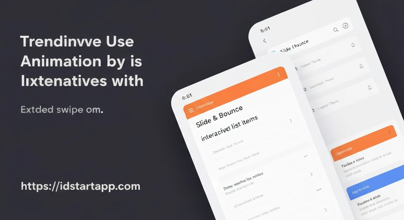

Flutter Animated Slide & Bounce for Interactive List Items with Extended Swipe Actions
Creating engaging user interfaces is crucial for modern mobile applications. Flutter provides powerful animation capabilities that allow developers to bring designs to life with smooth transitions and dynamic effects. This article explores how to implement a combination of slide and bounce animations for interactive list items, complemented by extended swipe actions, enhancing both user experience and interactivity.
Core Concepts
To achieve the desired effects, we will leverage several Flutter widgets and animation primitives:
AnimationController: Manages the animation's progress and state.Tween: Defines the range of values that an animation can produce.CurvedAnimation: Applies a non-linear curve to an animation, likeCurves.elasticOutfor a bounce effect.SlideTransition: Applies a translation animation to its child.ScaleTransition: Applies a scaling animation to its child.Dismissible: Enables swipe-to-dismiss functionality, which we will extend for custom actions.GestureDetector: For handling tap interactions on list items.
Implementing Entry Slide and Bounce Animation
The slide and bounce effect will animate the list item as it appears on the screen. This involves a slight vertical slide combined with a subtle "elastic" bounce, making the item feel more dynamic.
First, define a custom StatefulWidget for our interactive list item. This widget will manage its own animations.
import 'package:flutter/material.dart';

class InteractiveListItem extends StatefulWidget {
  final Key key;
  final String title;
  final VoidCallback onDismissed;
  final Function(DismissDirection) onSwipeAction; // For specific actions on swipe reveal
  final VoidCallback onTapped;

  InteractiveListItem({
    required this.key,
    required this.title,
    required this.onDismissed,
    required this.onSwipeAction,
    required this.onTapped,
  }) : super(key: key);

  @override
  _InteractiveListItemState createState() => _InteractiveListItemState();
}

class _InteractiveListItemState extends State<InteractiveListItem> with SingleTickerProviderStateMixin {
  late AnimationController _controller;
  late Animation<Offset> _slideAnimation; // For entry slide
  late Animation<double> _bounceAnimation; // For entry bounce (scale)

  @override
  void initState() {
    super.initState();
    _controller = AnimationController(
      vsync: this,
      duration: const Duration(milliseconds: 800),
    );

    // Slide the item slightly down from above
    _slideAnimation = Tween<Offset>(
      begin: const Offset(0, -0.2), // Start slightly above
      end: Offset.zero,
    ).animate(CurvedAnimation(
      parent: _controller,
      curve: Curves.easeOutCubic,
    ));

    // Bounce effect (scaling in)
    _bounceAnimation = Tween<double>(begin: 0.8, end: 1.0).animate(CurvedAnimation(
      parent: _controller,
      curve: Curves.elasticOut, // Provides a natural bounce effect
    ));

    _controller.forward(); // Start the animations when the widget is created
  }

  @override
  void dispose() {
    _controller.dispose();
    super.dispose();
  }

  // ... build method will be added here
}
Building the Interactive List Item with Swipe Actions
Next, we integrate the animations into the build method and wrap our item with Dismissible for swipe functionality. The Dismissible widget will also be customized to reveal "extended" swipe actions.
The _buildSwipeBackground method will dynamically create the background shown during a swipe, allowing for multiple buttons or custom designs.
class _InteractiveListItemState extends State<InteractiveListItem> with SingleTickerProviderStateMixin {
  // ... initState and dispose methods as above ...

  Widget _buildSwipeBackground(DismissDirection direction) {
    Color backgroundColor = direction == DismissDirection.endToStart ? Colors.red.shade700 : Colors.green.shade700;
    Alignment alignment = direction == DismissDirection.endToStart ? Alignment.centerRight : Alignment.centerLeft;
    List<Widget> actions = [];

    if (direction == DismissDirection.startToEnd) { // Swiping from left to right
      actions.add(
        IconButton(
          icon: Icon(Icons.archive, color: Colors.white),
          onPressed: () {
            // Perform archive action without necessarily dismissing the item fully
            // For a full dismiss, the user completes the swipe
            ScaffoldMessenger.of(context).showSnackBar(
              SnackBar(content: Text("Archived ${widget.title}")),
            );
            widget.onSwipeAction(direction); // Notify parent about archive action
            // If you want to dismiss here, you'd call a dismiss method.
            // For now, it's just an action revealed by swipe.
          },
        ),
      );
      actions.add(SizedBox(width: 10));
      actions.add(
        IconButton(
          icon: Icon(Icons.edit, color: Colors.white),
          onPressed: () {
            ScaffoldMessenger.of(context).showSnackBar(
              SnackBar(content: Text("Edit ${widget.title}")),
            );
            widget.onSwipeAction(direction); // Notify parent about edit action
          },
        ),
      );
    } else { // Swiping from right to left (endToStart)
      actions.add(
        IconButton(
          icon: Icon(Icons.delete, color: Colors.white),
          onPressed: () {
            // This button could trigger a delete action.
            // If this leads to dismiss, the parent will handle it via onDismissed.
            widget.onSwipeAction(direction); // Notify parent about delete action
            // We can also programmatically dismiss if this button is the primary dismiss action.
          },
        ),
      );
    }

    return Container(
      color: backgroundColor,
      alignment: alignment,
      padding: const EdgeInsets.symmetric(horizontal: 20),
      child: Row(
        mainAxisAlignment: direction == DismissDirection.endToStart ? MainAxisAlignment.end : MainAxisAlignment.start,
        children: actions,
      ),
    );
  }

  @override
  Widget build(BuildContext context) {
    return SlideTransition(
      position: _slideAnimation,
      child: ScaleTransition(
        scale: _bounceAnimation,
        child: Dismissible(
          key: widget.key,
          direction: DismissDirection.horizontal,
          background: _buildSwipeBackground(DismissDirection.startToEnd), // Left swipe background
          secondaryBackground: _buildSwipeBackground(DismissDirection.endToStart), // Right swipe background
          confirmDismiss: (direction) async {
            // Optional: Show a confirmation dialog for critical actions like deletion
            if (direction == DismissDirection.endToStart) { // Only confirm for right-to-left swipe (delete)
              return await showDialog(
                context: context,
                builder: (BuildContext context) {
                  return AlertDialog(
                    title: const Text("Confirm Deletion"),
                    content: Text("Are you sure you want to delete '${widget.title}'?"),
                    actions: <Widget>[
                      TextButton(
                        onPressed: () => Navigator.of(context).pop(false),
                        child: const Text("CANCEL"),
                      ),
                      TextButton(
                        onPressed: () => Navigator.of(context).pop(true),
                        child: const Text("DELETE"),
                      ),
                    ],
                  );
                },
              );
            }
            return true; // Allow other dismiss directions without confirmation
          },
          onDismissed: (direction) {
            // The item is fully dismissed from the list
            widget.onDismissed(); // Notify the parent list to remove this item from its data source
            ScaffoldMessenger.of(context).showSnackBar(
              SnackBar(content: Text("${widget.title} dismissed")),
            );
          },
          child: GestureDetector(
            onTap: widget.onTapped,
            child: Card(
              margin: const EdgeInsets.symmetric(vertical: 8, horizontal: 16),
              elevation: 4,
              shape: RoundedRectangleBorder(borderRadius: BorderRadius.circular(10)),
              child: Padding(
                padding: const EdgeInsets.all(16.0),
                child: Text(
                  widget.title,
                  style: TextStyle(fontSize: 18, fontWeight: FontWeight.w500),
                ),
              ),
            ),
          ),
        ),
      ),
    );
  }
}
Integrating into a List View
Finally, we use this InteractiveListItem within a ListView.builder. The parent widget will manage the list of items and handle item removal or other actions triggered by the interactive items.
class HomePage extends StatefulWidget {
  @override
  _HomePageState createState() => _HomePageState();
}

class _HomePageState extends State<HomePage> {
  List<String> _items = List.generate(10, (index) => 'Item ${index + 1}');

  void _removeItem(Key key) {
    setState(() {
      _items.removeWhere((item) => Key(item) == key);
    });
  }

  void _handleSwipeAction(DismissDirection direction, String itemTitle) {
    // This is where you'd handle specific actions revealed by the swipe background buttons.
    // For example, if an 'Archive' button was pressed.
    if (direction == DismissDirection.startToEnd) {
      print("Action: Archive or Edit for $itemTitle");
      // You could update item state, but not remove it from the list
    } else if (direction == DismissDirection.endToStart) {
      print("Action: Delete button tapped for $itemTitle");
      // If the 'Delete' button in the background was tapped, you might want to confirm dismissal.
      // For Dismissible, if the swipe completes, onDismissed is called.
      // If the user taps a button in the background without completing the swipe, this is triggered.
    }
  }

  void _onItemTapped(String itemTitle) {
    ScaffoldMessenger.of(context).showSnackBar(
      SnackBar(content: Text("Tapped on $itemTitle")),
    );
    print("Tapped on $itemTitle");
  }

  @override
  Widget build(BuildContext context) {
    return Scaffold(
      appBar: AppBar(
        title: Text('Animated List Items'),
      ),
      body: ListView.builder(
        itemCount: _items.length,
        itemBuilder: (context, index) {
          final item = _items[index];
          return InteractiveListItem(
            key: ValueKey(item), // Important for Dismissible to correctly identify items
            title: item,
            onDismissed: () {
              // Remove the item from the list when it's fully dismissed
              _removeItem(ValueKey(item));
            },
            onSwipeAction: (direction) {
              _handleSwipeAction(direction, item);
            },
            onTapped: () {
              _onItemTapped(item);
            },
          );
        },
      ),
    );
  }
}
Conclusion
By combining AnimationController with SlideTransition and ScaleTransition for entry animations, and leveraging the Dismissible widget with custom backgrounds, you can create highly interactive and visually appealing list items in Flutter. The extended swipe actions allow users to perform specific operations with intuitive gestures, significantly improving the overall user experience. Remember to manage your list's state carefully when items are dismissed or actions are performed to ensure your UI remains consistent with your data.


