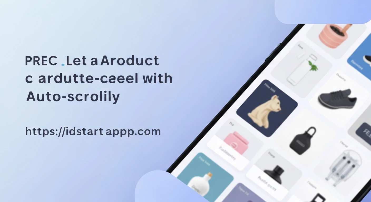

Creating a Product Carousel Widget with Auto Scroll in Flutter
Product carousels are a ubiquitous UI element in modern e-commerce and content-rich applications. They efficiently showcase multiple products or content items in a limited screen space, enhancing user engagement and discoverability. This article will guide you through building a dynamic product carousel in Flutter, complete with automatic scrolling functionality, using a professional and clean approach.
Why Flutter for Product Carousels?
Flutter's declarative UI framework and powerful animation capabilities make it an excellent choice for creating smooth and performant carousels. Its widget-based architecture allows for highly customizable and reusable components, ensuring a consistent user experience across platforms.
Core Components
Our product carousel will primarily rely on the following Flutter widgets and concepts:
PageView: For displaying scrollable pages of widgets, perfect for a carousel.PageController: To programmatically control thePageView, enabling auto-scrolling.Timer: Fromdart:async, used to trigger the automatic page transitions at regular intervals.Listof Product Models: To hold the data for the items displayed in the carousel.
Step-by-Step Implementation
Let's break down the process into manageable steps, starting with a basic product model and building up to the complete carousel.
1. Define the Product Model
First, we'll create a simple data model for our products. This will make it easier to manage product information.
class Product {
  final String id;
  final String name;
  final String imageUrl;
  final double price;

  Product({
    required this.id,
    required this.name,
    required this.imageUrl,
    required this.price,
  });
}
2. Create the Product Carousel Widget
We'll build a StatefulWidget to manage the state of our carousel, including the current page index, the PageController, and the Timer for auto-scrolling.
import 'dart:async';
import 'package:flutter/material.dart';

// Assuming Product model is defined as above

class ProductCarousel extends StatefulWidget {
  final List products;
  final Duration scrollInterval;
  final Duration scrollDuration;

  ProductCarousel({
    Key? key,
    required this.products,
    this.scrollInterval = const Duration(seconds: 3),
    this.scrollDuration = const Duration(milliseconds: 400),
  }) : super(key: key);

  @override
  _ProductCarouselState createState() => _ProductCarouselState();
}

class _ProductCarouselState extends State {
  late PageController _pageController;
  Timer? _timer;
  int _currentPage = 0;

  @override
  void initState() {
    super.initState();
    _pageController = PageController(initialPage: _currentPage);
    _startAutoScroll();
  }

  @override
  void dispose() {
    _timer?.cancel();
    _pageController.dispose();
    super.dispose();
  }

  void _startAutoScroll() {
    if (widget.products.isEmpty) return;

    _timer = Timer.periodic(widget.scrollInterval, (timer) {
      if (_pageController.hasClients) {
        int nextPage = (_currentPage + 1) % widget.products.length;
        _pageController.animateToPage(
          nextPage,
          duration: widget.scrollDuration,
          curve: Curves.easeIn,
        ).then((_) {
          setState(() {
            _currentPage = nextPage;
          });
        });
      }
    });
  }

  void _onPageChanged(int index) {
    setState(() {
      _currentPage = index;
    });
    // Reset timer when user manually scrolls
    _timer?.cancel();
    _startAutoScroll();
  }

  @override
  Widget build(BuildContext context) {
    if (widget.products.isEmpty) {
      return const Center(child: Text("No products available."));
    }

    return Column(
      children: [
        SizedBox(
          height: 200, // Adjust height as needed
          child: PageView.builder(
            controller: _pageController,
            itemCount: widget.products.length,
            onPageChanged: _onPageChanged,
            itemBuilder: (context, index) {
              final product = widget.products[index];
              return _ProductCard(product: product);
            },
          ),
        ),
        // Optional: Page indicators
        Padding(
          padding: const EdgeInsets.all(8.0),
          child: Row(
            mainAxisAlignment: MainAxisAlignment.center,
            children: List.generate(widget.products.length, (index) {
              return Container(
                width: 8.0,
                height: 8.0,
                margin: const EdgeInsets.symmetric(horizontal: 4.0),
                decoration: BoxDecoration(
                  shape: BoxShape.circle,
                  color: _currentPage == index ? Colors.blue : Colors.grey.withOpacity(0.5),
                ),
              );
            }),
          ),
        ),
      ],
    );
  }
}
3. Create the Product Card Widget
To keep our carousel widget clean, we'll extract the individual product display into a separate stateless widget called _ProductCard.
class _ProductCard extends StatelessWidget {
  final Product product;

  const _ProductCard({Key? key, required this.product}) : super(key: key);

  @override
  Widget build(BuildContext context) {
    return Card(
      margin: const EdgeInsets.symmetric(horizontal: 10, vertical: 5),
      elevation: 4,
      shape: RoundedRectangleBorder(borderRadius: BorderRadius.circular(10)),
      child: Padding(
        padding: const EdgeInsets.all(8.0),
        child: Column(
          children: [
            Expanded(
              child: Image.network(
                product.imageUrl,
                fit: BoxFit.cover,
                errorBuilder: (context, error, stackTrace) =>
                    const Icon(Icons.broken_image, size: 50),
              ),
            ),
            const SizedBox(height: 8),
            Text(
              product.name,
              style: const TextStyle(
                fontSize: 16,
                fontWeight: FontWeight.bold,
              ),
              textAlign: TextAlign.center,
              maxLines: 1,
              overflow: TextOverflow.ellipsis,
            ),
            const SizedBox(height: 4),
            Text(
              '\$${product.price.toStringAsFixed(2)}',
              style: TextStyle(
                fontSize: 14,
                color: Colors.green[700],
                fontWeight: FontWeight.w600,
              ),
            ),
          ],
        ),
      ),
    );
  }
}
4. Integrate into Your Application
Finally, you can integrate the ProductCarousel into any part of your Flutter application. Here's an example of how to use it with some dummy data.
void main() {
  runApp(const MyApp());
}

class MyApp extends StatelessWidget {
  const MyApp({Key? key}) : super(key: key);

  @override
  Widget build(BuildContext context) {
    final List dummyProducts = [
      Product(
        id: '1',
        name: 'Smartwatch Series 7',
        imageUrl: 'https://picsum.photos/id/10/200/300',
        price: 399.99,
      ),
      Product(
        id: '2',
        name: 'Wireless Bluetooth Headphones',
        imageUrl: 'https://picsum.photos/id/16/200/300',
        price: 129.50,
      ),
      Product(
        id: '3',
        name: '4K Ultra HD Smart TV',
        imageUrl: 'https://picsum.photos/id/21/200/300',
        price: 749.00,
      ),
      Product(
        id: '4',
        name: 'Gaming Laptop Pro',
        imageUrl: 'https://picsum.photos/id/25/200/300',
        price: 1499.99,
      ),
      Product(
        id: '5',
        name: 'Professional Camera DSLR',
        imageUrl: 'https://picsum.photos/id/36/200/300',
        price: 1100.00,
      ),
    ];

    return MaterialApp(
      title: 'Product Carousel Demo',
      theme: ThemeData(
        primarySwatch: Colors.blue,
      ),
      home: Scaffold(
        appBar: AppBar(
          title: const Text('Featured Products'),
        ),
        body: SingleChildScrollView( // Use SingleChildScrollView if content can exceed screen height
          child: Column(
            crossAxisAlignment: CrossAxisAlignment.start,
            children: [
              const Padding(
                padding: EdgeInsets.all(16.0),
                child: Text(
                  'Explore our latest collection:',
                  style: TextStyle(fontSize: 20, fontWeight: FontWeight.bold),
                ),
              ),
              ProductCarousel(products: dummyProducts),
              const SizedBox(height: 20),
              const Padding(
                padding: EdgeInsets.all(16.0),
                child: Text(
                  'More content below...',
                  style: TextStyle(fontSize: 18),
                ),
              ),
              // Add more widgets here
            ],
          ),
        ),
      ),
    );
  }
}
Conclusion
You have successfully built a professional product carousel widget in Flutter with auto-scrolling capabilities and page indicators. This component is highly customizable and can be adapted to various design requirements by modifying the _ProductCard widget or the carousel's styling. Remember to manage the PageController and Timer life cycles properly in initState and dispose to prevent memory leaks and ensure smooth performance.


