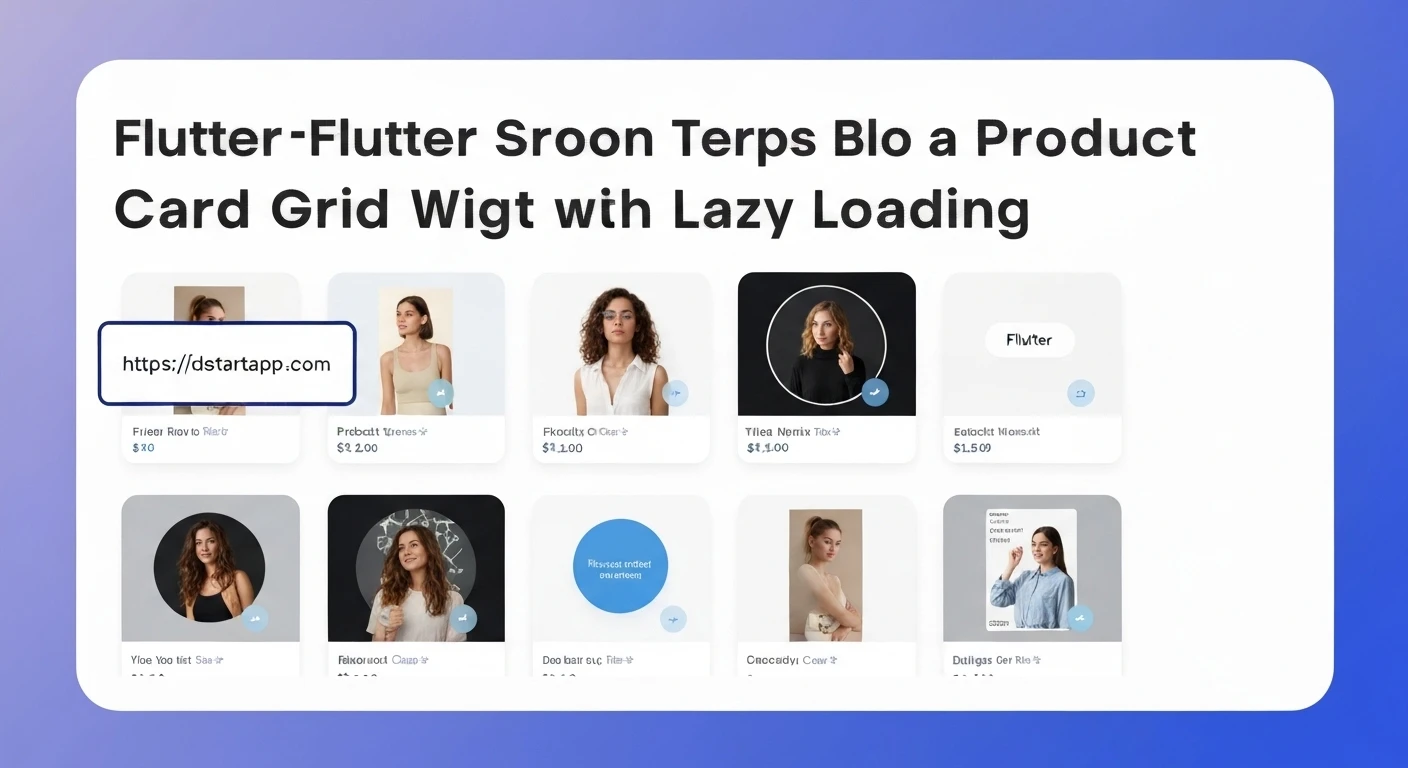

Creating a Product Card Grid Widget with Lazy Loading in Flutter
In modern e-commerce and content-rich applications, displaying a large collection of items efficiently is paramount for a good user experience. A common pattern for this is a product card grid. However, loading all product data at once can lead to performance issues, slow initial load times, and increased resource consumption. This is where lazy loading comes in—a technique that defers the initialization of an object until it is actually needed.
This article will guide you through building a dynamic product card grid widget in Flutter, incorporating lazy loading to enhance performance and user experience by fetching data incrementally as the user scrolls.
Why Lazy Loading?
- Improved Performance: Reduces the amount of data loaded at startup, making the app feel faster and more responsive.
- Optimized Resource Usage: Minimizes memory and network usage by only fetching and rendering what's visible or about to be visible on screen.
- Enhanced User Experience: Users can interact with the initial set of data quickly, and subsequent data loads seamlessly in the background without blocking the UI.
Core Components
- Product Model: A simple data structure to represent individual product items.
- Product Card Widget: A reusable UI component to display a single product's details.
- Product Grid Screen: The main widget responsible for displaying the grid, managing the scroll listener, and implementing the lazy loading logic.
- ScrollController: Flutter's mechanism to listen to scroll events and determine when new data needs to be fetched.
Step-by-Step Implementation
1. Define the Product Model
First, let's create a simple Dart class to represent our product. This model will hold essential product information such as ID, name, image URL, and price.
Create a file named product_model.dart (e.g., in lib/models/):
class Product {
  final String id;
  final String name;
  final String imageUrl;
  final double price;

  Product({
    required this.id,
    required this.name,
    required this.imageUrl,
    required this.price,
  });
}
2. Build the Product Card Widget
Next, we'll create a reusable widget for displaying a single product. This widget will take a Product object and render its details within a card layout.
Create a file named product_card.dart (e.g., in lib/widgets/):
import 'package:flutter/material.dart';
import 'package:your_app_name/models/product_model.dart'; // Adjust the import path

class ProductCard extends StatelessWidget {
  final Product product;

  const ProductCard({Key? key, required this.product}) : super(key: key);

  @override
  Widget build(BuildContext context) {
    return Card(
      elevation: 2,
      margin: const EdgeInsets.all(8),
      shape: RoundedRectangleBorder(borderRadius: BorderRadius.circular(8)),
      clipBehavior: Clip.antiAlias, // Ensures image corners are rounded
      child: Column(
        crossAxisAlignment: CrossAxisAlignment.start,
        children: [
          Expanded(
            child: Image.network(
              product.imageUrl,
              fit: BoxFit.cover,
              width: double.infinity,
              loadingBuilder: (BuildContext context, Widget child, ImageChunkEvent? loadingProgress) {
                if (loadingProgress == null) return child;
                return Center(
                  child: CircularProgressIndicator(
                    value: loadingProgress.expectedTotalBytes != null
                        ? loadingProgress.cumulativeBytesLoaded / loadingProgress.expectedTotalBytes!
                        : null,
                  ),
                );
              },
              errorBuilder: (context, error, stackTrace) => const Center(
                child: Icon(Icons.broken_image, size: 50, color: Colors.grey),
              ),
            ),
          ),
          Padding(
            padding: const EdgeInsets.all(8.0),
            child: Text(
              product.name,
              style: const TextStyle(
                fontWeight: FontWeight.bold,
                fontSize: 16,
              ),
              maxLines: 1,
              overflow: TextOverflow.ellipsis,
            ),
          ),
          Padding(
            padding: const EdgeInsets.symmetric(horizontal: 8.0, bottom: 8.0),
            child: Text(
              '\$${product.price.toStringAsFixed(2)}',
              style: TextStyle(
                color: Theme.of(context).primaryColor,
                fontSize: 14,
                fontWeight: FontWeight.w600,
              ),
            ),
          ),
        ],
      ),
    );
  }
}
3. Implement the Product Grid with Lazy Loading
Now, let's create the main screen that will display the grid and handle the lazy loading logic. We'll use a StatefulWidget to manage the list of products, the loading state, and the ScrollController.
Create a file named product_grid_screen.dart (e.g., in lib/screens/):
import 'package:flutter/material.dart';
import 'package:your_app_name/models/product_model.dart'; // Adjust the import path
import 'package:your_app_name/widgets/product_card.dart'; // Adjust the import path

class ProductGridScreen extends StatefulWidget {
  const ProductGridScreen({Key? key}) : super(key: key);

  @override
  State createState() => _ProductGridScreenState();
}

class _ProductGridScreenState extends State {
  final ScrollController _scrollController = ScrollController();
  final List _products = [];
  bool _isLoading = false;
  bool _hasMore = true; // Indicates if there are more products to load
  int _page = 0;
  final int _pageSize = 10; // Number of items to fetch per page

  @override
  void initState() {
    super.initState();
    _fetchProducts(); // Fetch initial products
    _scrollController.addListener(_scrollListener); // Add scroll listener
  }

  @override
  void dispose() {
    _scrollController.dispose(); // Dispose the controller to prevent memory leaks
    super.dispose();
  }

  // Listener for scroll events
  void _scrollListener() {
    // Check if the user has scrolled to the bottom of the list
    if (_scrollController.position.pixels == _scrollController.position.maxScrollExtent &&
        !_isLoading && // Ensure we're not already loading
        _hasMore) {   // Ensure there's potentially more data
      _fetchProducts(); // Fetch more products
    }
  }

  // Asynchronous method to simulate fetching products from an API
  Future _fetchProducts() async {
    if (_isLoading) return; // Prevent multiple simultaneous fetches

    setState(() {
      _isLoading = true; // Set loading state to true
    });

    // Simulate an API call with a delay
    await Future.delayed(const Duration(seconds: 2));

    // Generate a list of mock products. In a real app, this would be an API call.
    List newProducts = List.generate(
      _pageSize,
      (index) {
        final id = (_page * _pageSize + index + 1).toString();
        return Product(
          id: id,
          name: 'Stylish Gadget $id',
          imageUrl: 'https://picsum.photos/id/${50 + int.parse(id)}/200/200', // Unique placeholder images
          price: 10.0 + int.parse(id) / 10,
        );
      },
    );

    setState(() {
      _products.addAll(newProducts); // Add new products to the list
      _isLoading = false;          // Reset loading state
      _page++;                     // Increment page number
      // For demonstration, let's assume we have a limited number of "pages"
      // In a real app, this would come from the API response (e.g., total_pages, next_page_url)
      if (_page >= 5) { // Stop fetching after 5 pages of mock data
        _hasMore = false;
      }
    });
  }

  @override
  Widget build(BuildContext context) {
    return Scaffold(
      appBar: AppBar(
        title: const Text('Product Grid with Lazy Loading'),
        elevation: 0,
      ),
      body: _products.isEmpty && _isLoading // Show initial loading indicator if no products and loading
          ? const Center(child: CircularProgressIndicator())
          : Column(
              children: [
                Expanded(
                  child: GridView.builder(
                    controller: _scrollController, // Assign the scroll controller
                    gridDelegate: const SliverGridDelegateWithFixedCrossAxisCount(
                      crossAxisCount: 2, // Display 2 cards per row
                      childAspectRatio: 0.75, // Adjust item aspect ratio as needed
                      crossAxisSpacing: 10,
                      mainAxisSpacing: 10,
                    ),
                    itemCount: _products.length + (_hasMore ? 1 : 0), // Add 1 for the loading indicator if more data is expected
                    itemBuilder: (context, index) {
                      if (index == _products.length) {
                        // This is the loading indicator slot at the end of the list
                        return _hasMore
                            ? const Center(
                                child: Padding(
                                  padding: EdgeInsets.all(8.0),
                                  child: CircularProgressIndicator(),
                                ),
                              )
                            : const SizedBox.shrink(); // Hide if no more data
                      }
                      return ProductCard(product: _products[index]);
                    },
                  ),
                ),
                // Optionally, if you want a loading indicator below the grid (not recommended with GridView.builder item count trick)
                // if (_isLoading && _hasMore && _products.isNotEmpty)
                //   const Padding(
                //     padding: EdgeInsets.all(8.0),
                //     child: CircularProgressIndicator(),
                //   ),
              ],
            ),
    );
  }
}
4. Integrate into Your Application (e.g., main.dart)
Finally, set up your main.dart to display the ProductGridScreen.
import 'package:flutter/material.dart';
import 'package:your_app_name/screens/product_grid_screen.dart'; // Adjust the import path

void main() {
  runApp(const MyApp());
}

class MyApp extends StatelessWidget {
  const MyApp({Key? key}) : super(key: key);

  @override
  Widget build(BuildContext context) {
    return MaterialApp(
      title: 'Flutter Lazy Loading Grid',
      theme: ThemeData(
        primarySwatch: Colors.deepPurple,
        visualDensity: VisualDensity.adaptivePlatformDensity,
      ),
      home: const ProductGridScreen(),
    );
  }
}
Conclusion
By implementing a product card grid with lazy loading in Flutter, you significantly improve your application's performance and provide a smoother, more engaging user experience. This pattern is essential for applications dealing with large datasets, ensuring that resources are utilized efficiently and users are not left waiting for content to load.
This implementation provides a solid foundation. You can further enhance it by:
- Adding error handling for network requests.
- Implementing pull-to-refresh functionality.
- Integrating with a real API endpoint for dynamic data fetching.
- Optimizing image loading with caching solutions like
cached_network_image. - Adding custom loading indicators or skeleton loaders for a more polished look.
Embracing lazy loading is a best practice for building scalable and high-performance Flutter applications.


