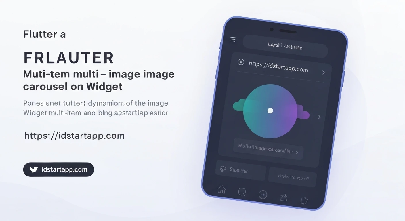

Creating a Multi-Item Image Carousel Widget in Flutter
Image carousels are a common UI pattern used to display multiple images or cards in a compact, scrollable format. They are highly effective for showcasing products, highlighting features, or presenting a gallery of images in a visually engaging way. In Flutter, creating such a widget is straightforward, especially when leveraging community packages.
This article will guide you through the process of building a dynamic, multi-item image carousel using the popular carousel_slider package. This package simplifies the implementation of complex carousel behaviors, including auto-play, infinite scroll, and custom item layouts.
Prerequisites
- Basic understanding of Flutter development.
- A Flutter development environment set up.
Step 1: Add the Dependency
First, you need to add the carousel_slider package to your Flutter project. Open your pubspec.yaml file and add the dependency under dependencies:
dependencies:
  flutter:
    sdk: flutter
  carousel_slider: ^4.2.1 # Use the latest version
After adding, run flutter pub get in your terminal to fetch the new package.
Step 2: Prepare Your Data
For this example, we'll use a simple list of image URLs. In a real-world application, this data might come from an API or a local asset folder.
final List imgList = [
  'https://images.unsplash.com/photo-1520342868574-5fa3804e551c?ixlib=rb-0.3.5&ixid=eyJhcHBfaWQiOjEyMDd9&s=6ff92caf5590b05be217c60c708cdb6fa&auto=format&fit=crop&w=1950&q=80',
  'https://images.unsplash.com/photo-1522205408450-fdc7d036c87f?ixlib=rb-0.3.5&ixid=eyJhcHBfaWQiOjEyMDd9&s=7dce60ae46422ce4435809756b1bc32e&auto=format&fit=crop&w=1950&q=80',
  'https://images.unsplash.com/photo-1519985176271-adfd5a3b999b?ixlib=rb-0.3.5&ixid=eyJhcHBfaWQiOjEyMDd9&s=2a8e3d08dd8a3e742e1cc7186106e232&auto=format&fit=crop&w=1950&q=80',
  'https://images.unsplash.com/photo-1523205771715-94f38ca-a20d?ixlib=rb-0.3.5&ixid=eyJhcHBfaWQiOjEyMDd9&s=3f8974a40d5859d2822a10f9b699a221&auto=format&fit=crop&w=1950&q=80',
  'https://images.unsplash.com/photo-1508704019882-f9cf1416e1c1?ixlib=rb-0.3.5&ixid=eyJhcHBfaWQiOjEyMDd9&s=86c0c2a5c43d22b005e834882143497d&auto=format&fit=crop&w=1950&q=80',
  'https://images.unsplash.com/photo-1519985176271-adfd5a3b999b?ixlib=rb-0.3.5&ixid=eyJhcHBfaWQiOjEyMDd9&s=2a8e3d08dd8a3e742e1cc7186106e232&auto=format&fit=crop&w=1950&q=80'
];
Step 3: Create the Carousel Widget
We'll create a StatefulWidget to manage the current page index for the indicators. The core of our carousel will be the CarouselSlider.builder.
import 'package:flutter/material.dart';
import 'package:carousel_slider/carousel_slider.dart';

class MultiItemImageCarousel extends StatefulWidget {
  const MultiItemImageCarousel({super.key});

  @override
  State createState() => _MultiItemImageCarouselState();
}

class _MultiItemImageCarouselState extends State {
  int _current = 0;
  final CarouselController _controller = CarouselController();

  final List imgList = [
    'https://images.unsplash.com/photo-1520342868574-5fa3804e551c?ixlib=rb-0.3.5&ixid=eyJhcHBfaWQiOjEyMDd9&s=6ff92caf5590b05be217c60c708cdb6fa&auto=format&fit=crop&w=1950&q=80',
    'https://images.unsplash.com/photo-1522205408450-fdc7d036c87f?ixlib=rb-0.3.5&ixid=eyJhcHBfaWQiOjEyMDd9&s=7dce60ae46422ce4435809756b1bc32e&auto=format&fit=crop&w=1950&q=80',
    'https://images.unsplash.com/photo-1519985176271-adfd5a3b999b?ixlib=rb-0.3.5&ixid=eyJhcHBfaWQiOjEyMDd9&s=2a8e3d08dd8a3e742e1cc7186106e232&auto=format&fit=crop&w=1950&q=80',
    'https://images.unsplash.com/photo-1523205771715-94f38ca-a20d?ixlib=rb-0.3.5&ixid=eyJhcHBfaWQiOjEyMDd9&s=3f8974a40d5859d2822a10f9b699a221&auto=format&fit=crop&w=1950&q=80',
    'https://images.unsplash.com/photo-1508704019882-f9cf1416e1c1?ixlib=rb-0.3.5&ixid=eyJhcHBfaWQiOjEyMDd9&s=86c0c2a5c43d22b005e834882143497d&auto=format&fit=crop&w=1950&q=80',
    'https://images.unsplash.com/photo-1519985176271-adfd5a3b999b?ixlib=rb-0.3.5&ixid=eyJhcHBfaWQiOjEyMDd9&s=2a8e3d08dd8a3e742e1cc7186106e232&auto=format&fit=crop&w=1950&q=80'
  ];

  @override
  Widget build(BuildContext context) {
    return Column(
      children: [
        CarouselSlider.builder(
          itemCount: imgList.length,
          carouselController: _controller,
          itemBuilder: (BuildContext context, int index, int realIndex) {
            return Builder(
              builder: (BuildContext context) {
                return Container(
                  width: MediaQuery.of(context).size.width,
                  margin: const EdgeInsets.symmetric(horizontal: 5.0),
                  decoration: BoxDecoration(
                    color: Colors.grey,
                    borderRadius: BorderRadius.circular(8.0),
                  ),
                  child: ClipRRect(
                    borderRadius: BorderRadius.circular(8.0),
                    child: Image.network(
                      imgList[index],
                      fit: BoxFit.cover,
                      errorBuilder: (context, error, stackTrace) => const Center(
                        child: Icon(Icons.broken_image, size: 50, color: Colors.white),
                      ),
                    ),
                  ),
                );
              },
            );
          },
          options: CarouselOptions(
            height: 200.0,
            autoPlay: true,
            enlargeCenterPage: true,
            aspectRatio: 16 / 9,
            autoPlayCurve: Curves.fastOutSlowIn,
            enableInfiniteScroll: true,
            autoPlayAnimationDuration: const Duration(milliseconds: 800),
            viewportFraction: 0.8, // This is key for showing multiple items
            onPageChanged: (index, reason) {
              setState(() {
                _current = index;
              });
            },
          ),
        ),
        Row(
          mainAxisAlignment: MainAxisAlignment.center,
          children: imgList.asMap().entries.map((entry) {
            return GestureDetector(
              onTap: () => _controller.animateToPage(entry.key),
              child: Container(
                width: 12.0,
                height: 12.0,
                margin: const EdgeInsets.symmetric(vertical: 8.0, horizontal: 4.0),
                decoration: BoxDecoration(
                  shape: BoxShape.circle,
                  color: (Theme.of(context).brightness == Brightness.dark
                          ? Colors.white
                          : Colors.black)
                      .withOpacity(_current == entry.key ? 0.9 : 0.4),
                ),
              ),
            );
          }).toList(),
        ),
      ],
    );
  }
}
Explanation of Key Options:
itemCount: The total number of items in the carousel.carouselController: An optional controller to programmatically control the carousel (e.g., jump to a specific page).itemBuilder: A function that builds each item in the carousel. Here, we display anImage.networkwrapped in aContainerwith rounded corners.height: Defines the height of the carousel.autoPlay: If set totrue, the carousel will automatically advance.enlargeCenterPage: Makes the current item larger than others, giving it more prominence.viewportFraction: This is crucial for a "multi-item" display. A value less than 1.0 (e.g., 0.8) means that only 80% of the viewport width is taken by the current item, allowing parts of the previous and next items to be visible.onPageChanged: A callback that fires when the page changes, allowing us to update the_currentindex for the indicators.
Step 4: Adding Page Indicators
To enhance user experience, we'll add a row of dots below the carousel to indicate the current active page. These dots will also be tappable to navigate directly to a page.
Inside the Column, after the CarouselSlider, add the following code:
        Row(
          mainAxisAlignment: MainAxisAlignment.center,
          children: imgList.asMap().entries.map((entry) {
            return GestureDetector(
              onTap: () => _controller.animateToPage(entry.key),
              child: Container(
                width: 12.0,
                height: 12.0,
                margin: const EdgeInsets.symmetric(vertical: 8.0, horizontal: 4.0),
                decoration: BoxDecoration(
                  shape: BoxShape.circle,
                  color: (Theme.of(context).brightness == Brightness.dark
                          ? Colors.white
                          : Colors.black)
                      .withOpacity(_current == entry.key ? 0.9 : 0.4),
                ),
              ),
            );
          }).toList(),
        ),
This code iterates through the image list, creating a circular Container for each image. The color of the dot changes based on whether its index matches the _current active page. Tapping a dot uses the CarouselController to animate to the corresponding page.
Step 5: Integrate into Your App
Finally, you can integrate your MultiItemImageCarousel widget into your main.dart or any other screen in your application:
import 'package:flutter/material.dart';
import 'package:your_app_name/multi_item_image_carousel.dart'; // Adjust import path

void main() {
  runApp(const MyApp());
}

class MyApp extends StatelessWidget {
  const MyApp({super.key});

  @override
  Widget build(BuildContext context) {
    return MaterialApp(
      title: 'Flutter Carousel Demo',
      theme: ThemeData(
        primarySwatch: Colors.blue,
      ),
      home: Scaffold(
        appBar: AppBar(
          title: const Text('Multi-Item Image Carousel'),
        ),
        body: const Center(
          child: MultiItemImageCarousel(),
        ),
      ),
    );
  }
}
Conclusion
You have successfully created a multi-item image carousel in Flutter. The carousel_slider package provides a robust and flexible solution for implementing various carousel designs with minimal code. By adjusting options like viewportFraction, enlargeCenterPage, and customizing the itemBuilder, you can tailor the carousel to perfectly fit your application's aesthetic and functional requirements.
Experiment with different settings and styling to create truly unique and engaging user interfaces.


