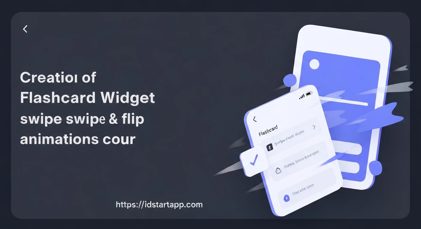

Creating a Flashcard Widget with Swipe & Flip Animations in Flutter
Flashcards are a timeless and effective learning tool, aiding in memorization and recall through active engagement. In the digital age, creating interactive flashcards offers even greater flexibility and a richer user experience. This article will guide you through building a dynamic flashcard widget in Flutter, complete with satisfying swipe-to-dismiss and flip animations.
Flutter, with its declarative UI and powerful animation framework, is an excellent choice for crafting such an interactive component. We'll leverage Flutter's widgets and animation capabilities to bring our flashcards to life.
Core Concepts & Technologies
Before diving into the code, let's briefly touch upon the key Flutter concepts we'll be using:
StatefulWidget: Essential for managing the mutable state of our flashcard, such as whether it's flipped or its current position during a swipe.AnimationController&Tween: The backbone of explicit animations in Flutter. AnAnimationControllermanages the animation's progress, while aTweendefines the range of values an animation can produce (e.g., rotation angles, position offsets).GestureDetector: Crucial for detecting user interactions like taps (for flipping) and drags (for swiping).Transform: A powerful widget for applying 2D and 3D transformations (translation, rotation, scaling) to its child. This will be central to both our flip and swipe effects.Stack: Useful for layering widgets, allowing us to display the front and back of a card in the same space, and to manage multiple cards in a deck.
I. Implementing the Flip Animation
The flip animation gives the flashcard a realistic 3D effect as it turns to reveal its other side. We'll achieve this using a Y-axis rotation.
1. Flashcard Data Model
First, let's define a simple data model for our flashcard.
class Flashcard {
  final String front;
  final String back;

  Flashcard({required this.front, required this.back});
}
2. The Flip Mechanism
We'll create a FlashcardWidget that manages its own flip state.
import 'dart:math' as math;
import 'package:flutter/material.dart';

class FlashcardWidget extends StatefulWidget {
  final Flashcard card;

  const FlashcardWidget({Key? key, required this.card}) : super(key: key);

  @override
  State createState() => _FlashcardWidgetState();
}

class _FlashcardWidgetState extends State with SingleTickerProviderStateMixin {
  late AnimationController _controller;
  late Animation _animation;
  bool _isFrontVisible = true;

  @override
  void initState() {
    super.initState();
    _controller = AnimationController(
      vsync: this,
      duration: const Duration(milliseconds: 500),
    );
    _animation = Tween(begin: 0, end: math.pi).animate(_controller)
      ..addListener(() {
        setState(() {
          // Rebuilds the widget during animation
        });
      });
  }

  @override
  void dispose() {
    _controller.dispose();
    super.dispose();
  }

  void _doFlip() {
    if (_isFrontVisible) {
      _controller.forward();
    } else {
      _controller.reverse();
    }
    _isFrontVisible = !_isFrontVisible;
  }

  @override
  Widget build(BuildContext context) {
    return GestureDetector(
      onTap: _doFlip,
      child: Transform(
        alignment: Alignment.center,
        transform: Matrix4.identity()..rotateY(_animation.value),
        child: _isFrontVisible
            ? _buildCardSide(widget.card.front, isFront: true)
            : Transform( // Apply an inverted rotation for the back side
                alignment: Alignment.center,
                transform: Matrix4.identity()..rotateY(math.pi),
                child: _buildCardSide(widget.card.back, isFront: false),
              ),
      ),
    );
  }

  Widget _buildCardSide(String text, {required bool isFront}) {
    return Card(
      elevation: 8,
      shape: RoundedRectangleBorder(borderRadius: BorderRadius.circular(16)),
      child: Container(
        width: 300,
        height: 200,
        alignment: Alignment.center,
        padding: const EdgeInsets.all(16),
        child: Text(
          text,
          style: TextStyle(
            fontSize: 24,
            fontWeight: FontWeight.bold,
            color: isFront ? Colors.blueAccent : Colors.greenAccent,
          ),
          textAlign: TextAlign.center,
        ),
      ),
    );
  }
}
Explanation:
- The
_FlashcardWidgetStatemixes inSingleTickerProviderStateMixinto provide a ticker for theAnimationController. _controlleranimates for 500ms._animationinterpolates values from0tomath.pi(180 degrees).addListenercallssetStateto rebuild the widget on every animation tick._doFliptoggles the animation direction (forward/reverse) and updates_isFrontVisible.- In
build,GestureDetectorcaptures taps. Transformapplies the Y-axis rotation usingMatrix4.identity()..rotateY(_animation.value).- Crucially, to prevent the back side text from appearing mirrored, we apply an additional
rotateY(math.pi)transformation to the back side content itself. This flips it again, making it readable.
II. Implementing the Swipe Animation
The swipe animation allows users to dismiss cards by dragging them off-screen. This involves tracking drag gestures and animating the card's position.
1. Adding Swipe Logic to FlashcardWidget
We'll extend our FlashcardWidget to include swipe functionality. We need to track the card's current offset and apply a slight rotation during the swipe for a more dynamic feel.
import 'dart:math' as math;
import 'package:flutter/material.dart';

// Assuming Flashcard model is defined as before

class FlashcardWidget extends StatefulWidget {
  final Flashcard card;
  final Function(bool isCorrect)? onSwiped; // Callback for swipe action

  const FlashcardWidget({Key? key, required this.card, this.onSwiped}) : super(key: key);

  @override
  State createState() => _FlashcardWidgetState();
}

class _FlashcardWidgetState extends State with TickerProviderStateMixin { // Changed to TickerProviderStateMixin for multiple controllers
  // Flip Animation related
  late AnimationController _flipController;
  late Animation _flipAnimation;
  bool _isFrontVisible = true;

  // Swipe Animation related
  late AnimationController _swipeController;
  late Animation _swipeAnimation;
  Offset _cardOffset = Offset.zero;
  double _rotationAngle = 0;

  @override
  void initState() {
    super.initState();
    // Flip Controller
    _flipController = AnimationController(
      vsync: this,
      duration: const Duration(milliseconds: 500),
    );
    _flipAnimation = Tween(begin: 0, end: math.pi).animate(_flipController);

    // Swipe Controller
    _swipeController = AnimationController(
      vsync: this,
      duration: const Duration(milliseconds: 300),
    )..addListener(() {
        setState(() {
          // Rebuild during swipe animation (e.g., returning to center)
        });
      });

    // Reset card position after animation completes
    _swipeController.addStatusListener((status) {
      if (status == AnimationStatus.completed && _cardOffset != Offset.zero) {
        // If swiped off-screen, reset _cardOffset might not be needed here
        // as the parent will remove it. If returning to center, it's needed.
      }
    });
  }

  @override
  void dispose() {
    _flipController.dispose();
    _swipeController.dispose();
    super.dispose();
  }

  void _doFlip() {
    if (_isFrontVisible) {
      _flipController.forward();
    } else {
      _flipController.reverse();
    }
    setState(() {
      _isFrontVisible = !_isFrontVisible;
    });
  }

  // Handle pan (drag) gestures for swiping
  void _onPanUpdate(DragUpdateDetails details) {
    setState(() {
      _cardOffset += details.delta;
      _rotationAngle = _cardOffset.dx / 1000; // Adjust for sensitivity
    });
  }

  void _onPanEnd(DragEndDetails details) {
    final double screenWidth = MediaQuery.of(context).size.width;
    final double dragThreshold = screenWidth * 0.4; // 40% of screen width

    if (_cardOffset.dx.abs() > dragThreshold) {
      // Card swiped off-screen
      bool isCorrect = _cardOffset.dx > 0; // Example: swipe right for correct
      widget.onSwiped?.call(isCorrect);
    } else {
      // Return card to center
      _swipeAnimation = Tween(
        begin: _cardOffset,
        end: Offset.zero,
      ).animate(
        CurvedAnimation(parent: _swipeController, curve: Curves.easeOutBack),
      );
      _swipeController.forward(from: 0.0).then((_) {
        setState(() {
          _cardOffset = Offset.zero;
          _rotationAngle = 0;
        });
      });
    }
  }

  @override
  Widget build(BuildContext context) {
    return GestureDetector(
      onTap: _doFlip,
      onPanUpdate: _onPanUpdate,
      onPanEnd: _onPanEnd,
      child: AnimatedBuilder(
        animation: Listenable.merge([_flipController, _swipeController]), // Listen to both controllers
        builder: (context, child) {
          final swipeOffset = _swipeController.isAnimating ? _swipeAnimation.value : _cardOffset;
          final currentRotationAngle = _swipeController.isAnimating ? _rotationAngle * (1 - _swipeController.value) : _rotationAngle;

          Matrix4 transformMatrix = Matrix4.identity()
            ..translate(swipeOffset.dx, swipeOffset.dy)
            ..rotateZ(currentRotationAngle) // Slight tilt during swipe
            ..rotateY(_flipAnimation.value); // Apply flip rotation

          return Transform(
            alignment: Alignment.center,
            transform: transformMatrix,
            child: _isFrontVisible
                ? _buildCardSide(widget.card.front, isFront: true)
                : Transform(
                    alignment: Alignment.center,
                    transform: Matrix4.identity()..rotateY(math.pi),
                    child: _buildCardSide(widget.card.back, isFront: false),
                  ),
          );
        },
      ),
    );
  }

  Widget _buildCardSide(String text, {required bool isFront}) {
    return Card(
      elevation: 8,
      shape: RoundedRectangleBorder(borderRadius: BorderRadius.circular(16)),
      child: Container(
        width: 300,
        height: 200,
        alignment: Alignment.center,
        padding: const EdgeInsets.all(16),
        child: Text(
          text,
          style: TextStyle(
            fontSize: 24,
            fontWeight: FontWeight.bold,
            color: isFront ? Colors.blueAccent : Colors.greenAccent,
          ),
          textAlign: TextAlign.center,
        ),
      ),
    );
  }
}
Explanation for Swipe Integration:
- We now use
TickerProviderStateMixinbecause we have twoAnimationControllers. _cardOffsetstores the current translation applied by the user's drag._rotationAngleadds a subtle tilt based on the horizontal drag._onPanUpdateupdates_cardOffsetand_rotationAngleinsetState, making the card follow the finger._onPanEnddetermines if the swipe threshold is met.- If yes,
widget.onSwiped?.call(isCorrect)is invoked, signaling to a parent widget that the card should be removed. - If no,
_swipeControlleranimates the card back to its originalOffset.zeroposition using aTween.
- If yes,
- The
AnimatedBuildernow listens to both_flipControllerand_swipeController. - The
transformMatrixcombines translation (for swipe), Z-axis rotation (for tilt during swipe), and Y-axis rotation (for flip). The order of transformations matters.
III. Managing Multiple Flashcards (The Deck)
To create a full flashcard experience, we need a "deck" widget that manages a list of FlashcardWidgets, handling their presentation and removal after swiping.
import 'package:flutter/material.dart';
// Import Flashcard and FlashcardWidget from previous code

class FlashcardDeck extends StatefulWidget {
  const FlashcardDeck({Key? key}) : super(key: key);

  @override
  State createState() => _FlashcardDeckState();
}

class _FlashcardDeckState extends State {
  List _flashcards = [];
  int _currentIndex = 0;

  @override
  void initState() {
    super.initState();
    _flashcards = [
      Flashcard(front: 'What is Flutter?', back: 'A UI toolkit for building natively compiled applications for mobile, web, and desktop from a single codebase.'),
      Flashcard(front: 'What is a Widget?', back: 'The basic building block of a Flutter app, describing how a part of the UI should look and behave.'),
      Flashcard(front: 'Dart is used for...', back: 'Programming Flutter applications.'),
      Flashcard(front: 'StatefulWidget vs StatelessWidget', back: 'StatefulWidget can change its state during its lifetime, while StatelessWidget is immutable.'),
      Flashcard(front: 'Hot Reload', back: 'Allows you to inject updated source code into a running app.'),
    ];
  }

  void _onCardSwiped(bool isCorrect) {
    setState(() {
      if (_currentIndex < _flashcards.length - 1) {
        _currentIndex++;
      } else {
        // Handle end of deck, e.g., show a completion message or loop
        _currentIndex = 0; // For demonstration, loop back to start
      }
    });
    // In a real app, you might want to save progress, move to a 'learned' pile, etc.
    print('Card swiped! Correct: $isCorrect. Moving to next card.');
  }

  @override
  Widget build(BuildContext context) {
    return Scaffold(
      appBar: AppBar(
        title: const Text('Flutter Flashcards'),
      ),
      body: Center(
        child: _flashcards.isEmpty || _currentIndex >= _flashcards.length
            ? const Text(
                'No more flashcards!',
                style: TextStyle(fontSize: 24),
              )
            : Stack(
                alignment: Alignment.center,
                children: _buildFlashcardStack(),
              ),
      ),
    );
  }

  List _buildFlashcardStack() {
    List cardWidgets = [];
    // Display only the current card and maybe a few behind it for depth
    for (int i = _currentIndex; i < math.min(_currentIndex + 3, _flashcards.length); i++) {
      double scale = 1.0 - (i - _currentIndex) * 0.05; // Smaller scale for cards behind
      double offsetY = (i - _currentIndex) * 20.0;     // Offset y for cards behind

      cardWidgets.add(
        Positioned(
          top: 50 + offsetY, // Adjust position
          child: Transform.scale(
            scale: scale,
            child: FlashcardWidget(
              key: ValueKey(_flashcards[i].front), // Important for widget identity
              card: _flashcards[i],
              onSwiped: _currentIndex == i ? _onCardSwiped : null, // Only top card can be swiped
            ),
          ),
        ),
      );
    }
    // Reverse the list so the current card is on top
    return cardWidgets.reversed.toList();
  }
}
Explanation:
FlashcardDeckholds a list of_flashcardsand tracks the_currentIndex._onCardSwipedis passed as a callback to the currentFlashcardWidget. When triggered, it increments_currentIndex, effectively showing the next card.- The
Stackwidget is used to layer multiple cards. We generate a few cards behind the current one, applying slight scaling and vertical offset to create a "deck" visual effect. ValueKey(_flashcards[i].front)is crucial for Flutter to correctly identify and update widgets when the list changes. Without it, the sameFlashcardWidgetinstance might be reused for different card data.- Only the topmost card (
_currentIndex == i) receives theonSwipedcallback, ensuring only it responds to swipe gestures.
Integrating and Running the App
Finally, to run this, you would place your FlashcardDeck into your main.dart file.
import 'package:flutter/material.dart';
// Import FlashcardDeck from your widgets folder

void main() {
  runApp(const MyApp());
}

class MyApp extends StatelessWidget {
  const MyApp({Key? key}) : super(key: key);

  @override
  Widget build(BuildContext context) {
    return MaterialApp(
      title: 'Flashcard App',
      theme: ThemeData(
        primarySwatch: Colors.deepPurple,
        visualDensity: VisualDensity.adaptivePlatformDensity,
      ),
      home: const FlashcardDeck(),
    );
  }
}
Conclusion
You've now built a sophisticated flashcard widget in Flutter, incorporating both beautiful flip and interactive swipe animations. This article covered the essential techniques for handling gestures, managing state, and orchestrating complex transformations and animations.
From here, you can expand upon this foundation by adding features like:
- Different swipe directions for "correct" and "incorrect" answers.
- Persistence of card data.
- Customization options for card appearance.
- More elaborate deck management (e.g., shuffling, spaced repetition algorithms).
Flutter's rich widget set and powerful animation framework make it incredibly capable for creating engaging and highly interactive user interfaces. Happy coding!


