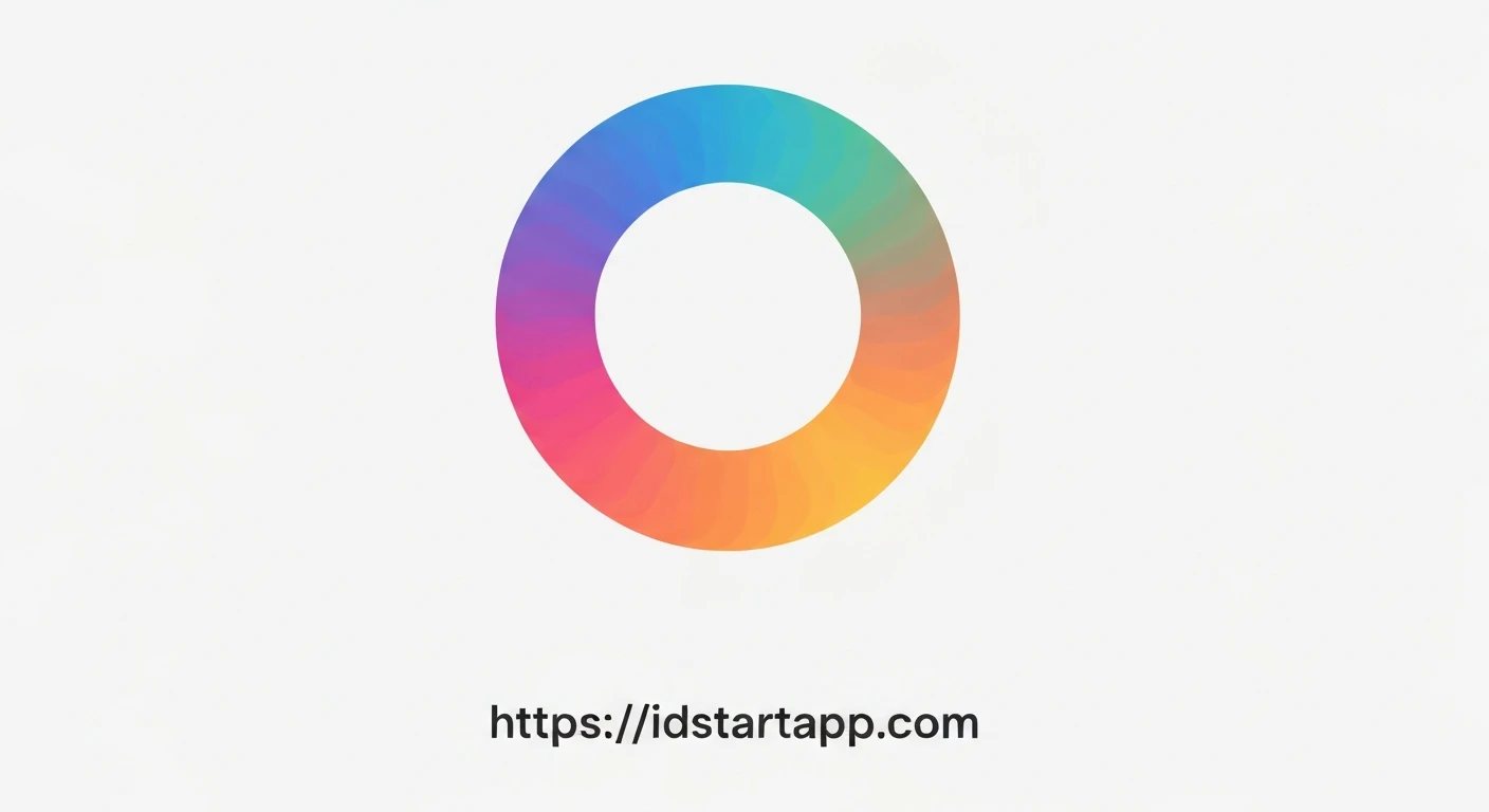

Crafting a Dynamic Gradient Rotating Loader in Flutter
Creating engaging user interfaces is crucial for a positive user experience. While Flutter provides excellent default progress indicators, custom loaders can significantly enhance the visual appeal and brand identity of an application. This article will guide you through building a beautiful, animated rotating loader with a gradient color effect using Flutter's custom painting and animation capabilities.
Understanding the Core Components
To achieve our gradient rotating loader, we'll leverage three primary Flutter features:
CustomPainter: This allows us to draw custom shapes and paths directly onto the canvas, forming the basis of our loader's arc.ShaderMask: An incredibly powerful widget that applies a shader (like a gradient) to its child. This is how we'll introduce the vibrant gradient colors to our loader.AnimationControllerandRotationTransition: These are Flutter's tools for creating and managing animations.AnimationControllerdrives the animation, andRotationTransitionprovides an easy way to apply continuous rotation to a widget.
Step-by-Step Implementation
1. The Loader Arc with CustomPainter
First, we need a custom painter to draw the basic arc shape of our loader. This painter will draw a simple arc, and its color will later be masked by our gradient.
import 'package:flutter/material.dart';
import 'dart:math' as math;

class MyArcPainter extends CustomPainter {
  final double sweepAngle;
  final double strokeWidth;

  MyArcPainter({this.sweepAngle = math.pi * 1.5, this.strokeWidth = 10.0});

  @override
  void paint(Canvas canvas, Size size) {
    final rect = Rect.fromLTWH(0, 0, size.width, size.height);
    final paint = Paint()
      ..color = Colors.white // This color will be masked by ShaderMask
      ..strokeWidth = strokeWidth
      ..style = PaintingStyle.stroke
      ..strokeCap = StrokeCap.round;

    // Draw the arc, starting from the top (-math.pi / 2)
    canvas.drawArc(rect, -math.pi / 2, sweepAngle, false, paint);
  }

  @override
  bool shouldRepaint(covariant MyArcPainter oldDelegate) {
    return oldDelegate.sweepAngle != sweepAngle || oldDelegate.strokeWidth != strokeWidth;
  }
}
2. Applying Gradient Colors with ShaderMask
ShaderMask will wrap our CustomPaint widget. It takes a shaderCallback which provides the bounds of the widget, allowing us to create a LinearGradient that fills those bounds.
// Inside the build method of our main loader widget...
ShaderMask(
  shaderCallback: (bounds) {
    return LinearGradient(
      colors: widget.gradientColors, // Colors passed to the widget
      tileMode: TileMode.mirror,
    ).createShader(bounds);
  },
  child: CustomPaint(
    painter: MyArcPainter(
      sweepAngle: math.pi * 1.5, // A 270-degree arc
      strokeWidth: widget.strokeWidth,
    ),
  ),
)
3. Animating the Rotation
We'll use an AnimationController to drive a continuous rotation. The RotationTransition widget takes this controller and applies a rotation transformation to its child.
// In a StatefulWidget's State class
class _GradientRotatingLoaderState extends State
    with SingleTickerProviderStateMixin {
  late AnimationController _controller;

  @override
  void initState() {
    super.initState();
    _controller = AnimationController(
      vsync: this,
      duration: widget.duration, // Duration passed to the widget
    )..repeat(); // Make the animation repeat indefinitely
  }

  @override
  void dispose() {
    _controller.dispose();
    super.dispose();
  }

  @override
  Widget build(BuildContext context) {
    return RotationTransition(
      turns: _controller, // Uses the controller for rotation
      child: // ... our ShaderMask and CustomPaint here
    );
  }
}
4. Assembling the GradientRotatingLoader Widget
Now, let's combine all these pieces into a reusable StatefulWidget called GradientRotatingLoader.
import 'package:flutter/material.dart';
import 'dart:math' as math;

// MyArcPainter class goes here (from step 1)

class GradientRotatingLoader extends StatefulWidget {
  final double size;
  final double strokeWidth;
  final Duration duration;
  final List gradientColors;

  const GradientRotatingLoader({
    Key? key,
    this.size = 100.0,
    this.strokeWidth = 10.0,
    this.duration = const Duration(seconds: 2),
    this.gradientColors = const [Colors.blue, Colors.cyan],
  }) : super(key: key);

  @override
  _GradientRotatingLoaderState createState() => _GradientRotatingLoaderState();
}

class _GradientRotatingLoaderState extends State
    with SingleTickerProviderStateMixin {
  late AnimationController _controller;

  @override
  void initState() {
    super.initState();
    _controller = AnimationController(
      vsync: this,
      duration: widget.duration,
    )..repeat(); // Repeat indefinitely
  }

  @override
  void dispose() {
    _controller.dispose();
    super.dispose();
  }

  @override
  Widget build(BuildContext context) {
    return RotationTransition(
      turns: _controller,
      child: SizedBox(
        width: widget.size,
        height: widget.size,
        child: ShaderMask(
          shaderCallback: (bounds) {
            return LinearGradient(
              colors: widget.gradientColors,
              tileMode: TileMode.mirror,
            ).createShader(bounds);
          },
          child: CustomPaint(
            painter: MyArcPainter(
              sweepAngle: math.pi * 1.5, // 270 degrees arc
              strokeWidth: widget.strokeWidth,
            ),
          ),
        ),
      ),
    );
  }
}
Complete Example Code
Here's the full code for a basic Flutter application demonstrating our GradientRotatingLoader:
import 'package:flutter/material.dart';
import 'dart:math' as math;

void main() {
  runApp(MyApp());
}

class MyApp extends StatelessWidget {
  @override
  Widget build(BuildContext context) {
    return MaterialApp(
      home: Scaffold(
        backgroundColor: Colors.blueGrey[900],
        appBar: AppBar(
          title: const Text('Gradient Rotating Loader'),
          backgroundColor: Colors.blueGrey[800],
        ),
        body: Center(
          child: GradientRotatingLoader(
            size: 100,
            strokeWidth: 10,
            duration: const Duration(seconds: 2),
            gradientColors: const [
              Colors.purple,
              Colors.red,
              Colors.orange,
              Colors.yellow,
              Colors.green,
              Colors.blue,
              Colors.indigo,
            ],
          ),
        ),
      ),
    );
  }
}

class MyArcPainter extends CustomPainter {
  final double sweepAngle;
  final double strokeWidth;

  MyArcPainter({this.sweepAngle = math.pi * 1.5, this.strokeWidth = 10.0});

  @override
  void paint(Canvas canvas, Size size) {
    final rect = Rect.fromLTWH(0, 0, size.width, size.height);
    final paint = Paint()
      ..color = Colors.white // This color will be masked by ShaderMask
      ..strokeWidth = strokeWidth
      ..style = PaintingStyle.stroke
      ..strokeCap = StrokeCap.round;

    // Draw the arc, starting from the top (-math.pi / 2)
    canvas.drawArc(rect, -math.pi / 2, sweepAngle, false, paint);
  }

  @override
  bool shouldRepaint(covariant MyArcPainter oldDelegate) {
    return oldDelegate.sweepAngle != sweepAngle || oldDelegate.strokeWidth != strokeWidth;
  }
}

class GradientRotatingLoader extends StatefulWidget {
  final double size;
  final double strokeWidth;
  final Duration duration;
  final List gradientColors;

  const GradientRotatingLoader({
    Key? key,
    this.size = 100.0,
    this.strokeWidth = 10.0,
    this.duration = const Duration(seconds: 2),
    this.gradientColors = const [Colors.blue, Colors.cyan],
  }) : super(key: key);

  @override
  _GradientRotatingLoaderState createState() => _GradientRotatingLoaderState();
}

class _GradientRotatingLoaderState extends State
    with SingleTickerProviderStateMixin {
  late AnimationController _controller;

  @override
  void initState() {
    super.initState();
    _controller = AnimationController(
      vsync: this,
      duration: widget.duration,
    )..repeat(); // Repeat indefinitely
  }

  @override
  void dispose() {
    _controller.dispose();
    super.dispose();
  }

  @override
  Widget build(BuildContext context) {
    return RotationTransition(
      turns: _controller,
      child: SizedBox(
        width: widget.size,
        height: widget.size,
        child: ShaderMask(
          shaderCallback: (bounds) {
            return LinearGradient(
              colors: widget.gradientColors,
              tileMode: TileMode.mirror,
            ).createShader(bounds);
          },
          child: CustomPaint(
            painter: MyArcPainter(
              sweepAngle: math.pi * 1.5, // 270 degrees arc
              strokeWidth: widget.strokeWidth,
            ),
          ),
        ),
      ),
    );
  }
}
Code Breakdown
-
MyArcPainterThis class extends
CustomPainterand is responsible for drawing a partial circle (an arc). It takessweepAngleto define the length of the arc andstrokeWidthfor its thickness. Thepaintmethod usescanvas.drawArcto render the arc. We set thePaintcolor toColors.white, which acts as a placeholder that will be overridden by theShaderMask. -
GradientRotatingLoaderWidgetThis is a
StatefulWidgetbecause it manages anAnimationController. It takes parameters likesize,strokeWidth,duration(for animation speed), andgradientColorsto make it highly customizable. -
_GradientRotatingLoaderStateSingleTickerProviderStateMixin: This mixin is essential for `AnimationController` to prevent animations from consuming unnecessary resources when off-screen._controller: An `AnimationController` is initialized in `initState` with the specified `duration` and `vsync`. `..repeat()` ensures the animation loops continuously.dispose(): It's crucial to `dispose` of the `AnimationController` when the widget is removed from the widget tree to prevent memory leaks.build():RotationTransition: This widget wraps the entire loader, using `_controller` to continuously rotate its child. The `turns` property takes an `Animation`, which our `AnimationController` provides directly. SizedBox: Used to define the fixed dimensions (`size`) of our loader.ShaderMask: This widget is the magic behind the gradient. The `shaderCallback` method receives the `bounds` of the widget and returns a `LinearGradient`'s shader. The gradient's colors are taken from `widget.gradientColors`.CustomPaint: This is the child of `ShaderMask` and uses our `MyArcPainter` to draw the arc shape.
Conclusion
By combining CustomPainter for drawing, ShaderMask for vibrant gradients, and AnimationController with RotationTransition for smooth motion, you can create a highly customizable and visually appealing rotating loader in Flutter. This approach offers flexibility to change the arc shape, gradient colors, rotation speed, and even incorporate other animations, providing a unique touch to your application's user experience.


