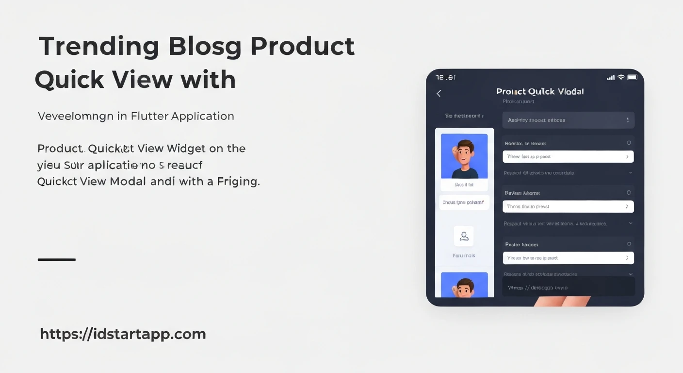

Building a Product Quick View Widget with Modal in Flutter
In the realm of e-commerce applications, user experience is paramount. One feature that significantly enhances the shopping journey is the "Quick View" functionality. It allows users to get essential product information, such as images, price, and a brief description, in a modal overlay without navigating away from the current product listing page. This article will guide you through creating a professional Product Quick View widget using a modal in Flutter.
Why Implement a Quick View Feature?
- Improved User Experience: Users can preview product details without interrupting their browsing flow.
- Faster Decision Making: Quick access to key information helps users make purchase decisions more efficiently.
- Reduced Navigation: Minimizes page loads and keeps users on the product listing, making it easier to compare items.
- Engagement: Provides a smooth and interactive interface that keeps users engaged with your application.
Prerequisites
To follow along with this tutorial, you should have a basic understanding of Flutter development and have the Flutter SDK installed and configured on your machine.
Core Components
Our Quick View solution will primarily consist of three main parts:
- Product Model: A simple data structure to represent a product.
- Product Card Widget: Displays a product in a grid or list, featuring a "Quick View" button.
- Product Quick View Modal Widget: The content displayed within the modal overlay, showing detailed product information.
Step-by-Step Implementation
1. Define the Product Model
First, let's create a simple Product class to hold our product data. Create a file named product.dart.
// product.dart
class Product {
  final String id;
  final String name;
  final String imageUrl;
  final double price;
  final String description;

  Product({
    required this.id,
    required this.name,
    required this.imageUrl,
    required this.price,
    required this.description,
  });
}
2. Create the Product Card Widget
This widget will represent a single product item in your product listing. It will include a button to trigger the quick view modal. Create a file named product_card.dart.
// product_card.dart
import 'package:flutter/material.dart';
import 'package:your_app_name/product.dart'; // Adjust import based on your project structure

class ProductCard extends StatelessWidget {
  final Product product;
  final VoidCallback onQuickViewPressed;

  const ProductCard({
    Key? key,
    required this.product,
    required this.onQuickViewPressed,
  }) : super(key: key);

  @override
  Widget build(BuildContext context) {
    return Card(
      elevation: 2.0,
      margin: const EdgeInsets.all(8.0),
      child: Column(
        crossAxisAlignment: CrossAxisAlignment.stretch,
        children: [
          Expanded(
            child: Image.network(
              product.imageUrl,
              fit: BoxFit.cover,
            ),
          ),
          Padding(
            padding: const EdgeInsets.all(8.0),
            child: Text(
              product.name,
              style: const TextStyle(
                fontSize: 16.0,
                fontWeight: FontWeight.bold,
              ),
              maxLines: 1,
              overflow: TextOverflow.ellipsis,
            ),
          ),
          Padding(
            padding: const EdgeInsets.symmetric(horizontal: 8.0),
            child: Text(
              '\$${product.price.toStringAsFixed(2)}',
              style: TextStyle(
                fontSize: 14.0,
                color: Colors.green[700],
                fontWeight: FontWeight.w600,
              ),
            ),
          ),
          Padding(
            padding: const EdgeInsets.all(8.0),
            child: ElevatedButton(
              onPressed: onQuickViewPressed,
              child: const Text('Quick View'),
            ),
          ),
        ],
      ),
    );
  }
}
3. Build the Product Quick View Modal Widget
This widget will display the detailed product information within the modal. We'll use showModalBottomSheet for a common quick view experience, but showDialog could also be used depending on your UI preference. Create a file named product_quick_view_modal.dart.
// product_quick_view_modal.dart
import 'package:flutter/material.dart';
import 'package:your_app_name/product.dart'; // Adjust import based on your project structure

class ProductQuickViewModal extends StatelessWidget {
  final Product product;

  const ProductQuickViewModal({
    Key? key,
    required this.product,
  }) : super(key: key);

  @override
  Widget build(BuildContext context) {
    return Container(
      padding: const EdgeInsets.all(16.0),
      decoration: const BoxDecoration(
        color: Colors.white,
        borderRadius: BorderRadius.vertical(top: Radius.circular(16.0)),
      ),
      child: SingleChildScrollView(
        child: Column(
          mainAxisSize: MainAxisSize.min,
          crossAxisAlignment: CrossAxisAlignment.start,
          children: [
            Align(
              alignment: Alignment.topRight,
              child: IconButton(
                icon: const Icon(Icons.close),
                onPressed: () => Navigator.of(context).pop(),
              ),
            ),
            Center(
              child: Image.network(
                product.imageUrl,
                height: 200,
                fit: BoxFit.contain,
              ),
            ),
            const SizedBox(height: 16.0),
            Text(
              product.name,
              style: const TextStyle(
                fontSize: 24.0,
                fontWeight: FontWeight.bold,
              ),
            ),
            const SizedBox(height: 8.0),
            Text(
              '\$${product.price.toStringAsFixed(2)}',
              style: TextStyle(
                fontSize: 22.0,
                color: Colors.green[700],
                fontWeight: FontWeight.w800,
              ),
            ),
            const SizedBox(height: 16.0),
            Text(
              product.description,
              style: const TextStyle(fontSize: 16.0),
            ),
            const SizedBox(height: 24.0),
            SizedBox(
              width: double.infinity,
              child: ElevatedButton.icon(
                onPressed: () {
                  // TODO: Implement "Add to Cart" or "View Details" logic
                  ScaffoldMessenger.of(context).showSnackBar(
                    SnackBar(content: Text('Added ${product.name} to cart!')),
                  );
                  Navigator.of(context).pop(); // Close modal after action
                },
                icon: const Icon(Icons.shopping_cart),
                label: const Text(
                  'Add to Cart',
                  style: TextStyle(fontSize: 18.0),
                ),
                style: ElevatedButton.styleFrom(
                  padding: const EdgeInsets.symmetric(vertical: 12.0),
                ),
              ),
            ),
          ],
        ),
      ),
    );
  }
}
4. Integrate and Show the Modal in main.dart
Now, let's put all the pieces together in your main.dart file. We'll create a list of dummy products and display them using a GridView.
// main.dart
import 'package:flutter/material.dart';
import 'package:your_app_name/product.dart'; // Adjust import
import 'package:your_app_name/product_card.dart'; // Adjust import
import 'package:your_app_name/product_quick_view_modal.dart'; // Adjust import

void main() {
  runApp(const MyApp());
}

class MyApp extends StatelessWidget {
  const MyApp({Key? key}) : super(key: key);

  @override
  Widget build(BuildContext context) {
    return MaterialApp(
      title: 'Flutter Quick View',
      theme: ThemeData(
        primarySwatch: Colors.blue,
      ),
      home: const ProductListingPage(),
    );
  }
}

class ProductListingPage extends StatefulWidget {
  const ProductListingPage({Key? key}) : super(key: key);

  @override
  State createState() => _ProductListingPageState();
}

class _ProductListingPageState extends State {
  final List<Product> products = [
    Product(
      id: 'p1',
      name: 'Stylish Watch',
      imageUrl: 'https://images.unsplash.com/photo-1523275371097-b67de199e4b3?q=80&w=1780&auto=format&fit=crop&ixlib=rb-4.0.3&ixid=M3wxMjA3fDB8MHxwaG90by1wYWdlfHx8fGVufDB8fHx8fA%3D%3D',
      price: 129.99,
      description: 'A sleek and modern watch perfect for any occasion. Water-resistant with a durable strap.',
    ),
    Product(
      id: 'p2',
      name: 'Wireless Headphones',
      imageUrl: 'https://images.unsplash.com/photo-1505740420928-5e560c06f304?q=80&w=1770&auto=format&fit=crop&ixlib=rb-4.0.3&ixid=M3wxMjA3fDB8MHxwaG90by1wYWdlfHx8fGVufDB8fHx8fA%3D%3D',
      price: 89.99,
      description: 'Experience immersive sound with these comfortable, noise-cancelling wireless headphones. Up to 20 hours of battery life.',
    ),
    Product(
      id: 'p3',
      name: 'Smart Coffee Mug',
      imageUrl: 'https://images.unsplash.com/photo-1541706689893-9c8a946d4a58?q=80&w=1770&auto=format&fit=crop&ixlib=rb-4.0.3&ixid=M3wxMjA3fDB8MHxwaG90by1wYWdlfHx8fGVufDB8fHx8fA%3D%3D',
      price: 45.00,
      description: 'Keep your beverage at the perfect temperature all day. App-controlled and made from high-quality ceramic.',
    ),
    Product(
      id: 'p4',
      name: 'Portable Bluetooth Speaker',
      imageUrl: 'https://images.unsplash.com/photo-1546435770-a3e9c68097d7?q=80&w=1770&auto=format&fit=crop&ixlib=rb-4.0.3&ixid=M3wxMjA3fDB8MHxwaG90by1wYWdlfHx8fGVufDB8fHx8fA%3D%3D',
      price: 59.99,
      description: 'Compact and powerful speaker with rich bass. Perfect for outdoor adventures and home use. Waterproof design.',
    ),
  ];

  void _showProductQuickView(BuildContext context, Product product) {
    showModalBottomSheet(
      context: context,
      isScrollControlled: true, // Allows the modal to take full height if content requires
      backgroundColor: Colors.transparent, // Make background transparent to show custom shape
      builder: (BuildContext context) {
        return ProductQuickViewModal(product: product);
      },
    );
  }

  @override
  Widget build(BuildContext context) {
    return Scaffold(
      appBar: AppBar(
        title: const Text('Product Listing'),
      ),
      body: GridView.builder(
        padding: const EdgeInsets.all(10.0),
        gridDelegate: const SliverGridDelegateWithFixedCrossAxisCount(
          crossAxisCount: 2,
          childAspectRatio: 0.75, // Adjust aspect ratio for better card display
          crossAxisSpacing: 10.0,
          mainAxisSpacing: 10.0,
        ),
        itemCount: products.length,
        itemBuilder: (ctx, i) => ProductCard(
          product: products[i],
          onQuickViewPressed: () => _showProductQuickView(ctx, products[i]),
        ),
      ),
    );
  }
}
Enhancements and Best Practices
- State Management: For more complex scenarios (e.g., adding to cart from quick view, fetching dynamic data), consider using state management solutions like Provider, BLoC, or Riverpod.
- Loading States: If product details for the quick view are fetched dynamically, show a loading indicator within the modal.
- Animations: Flutter's
showModalBottomSheetalready provides a smooth slide-up animation. For custom dialogs, consider usingshowGeneralDialogfor more control over transitions. - Accessibility: Ensure that the quick view modal is accessible to users with disabilities, including proper focus management and screen reader support.
- Theming: Integrate your quick view modal with your app's overall theme for a consistent look and feel.
- Error Handling: Implement robust error handling for network requests if your product data is fetched from an API.
- Navigation: Consider adding a "View Full Details" button in the quick view modal that navigates to a dedicated product detail page.
Conclusion
Implementing a Product Quick View widget with a modal in Flutter is a straightforward process that significantly enhances the user experience in e-commerce applications. By following the steps outlined above, you can create an intuitive and interactive way for users to explore product details without disrupting their browsing flow. This feature not only improves aesthetics but also contributes to a more efficient and enjoyable shopping journey for your users.


