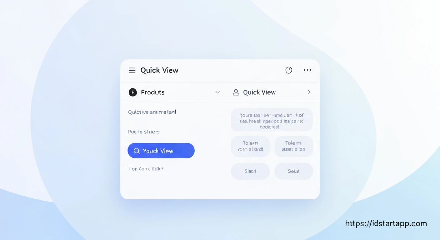

Building a Product Quick View Modal Widget with Animation in Flutter
In modern e-commerce applications, providing a seamless and efficient user experience is paramount. A "Product Quick View" modal is a powerful feature that allows users to get a snapshot of product details, such as images, price, and a brief description, without navigating away from the main product listing page. This minimizes friction, enhances browsing, and can significantly improve conversion rates. This article will guide you through building a dynamic and animated Product Quick View modal in Flutter, leveraging its robust UI and animation capabilities.
Why a Quick View Modal?
The primary goal of a quick view modal is to improve the user's browsing experience. Instead of forcing a user to click into a product's dedicated detail page and then navigate back to continue browsing, a quick view provides immediate access to essential information. Key benefits include:
- Enhanced User Experience: Faster access to product details.
- Reduced Friction: Users can quickly compare products without losing their place.
- Increased Engagement: Encourages users to explore more products.
- Potential for Higher Conversions: Streamlined user journey can lead to more purchases.
Core Concepts for Implementation
To build our quick view modal, we'll rely on a few fundamental Flutter concepts:
- Widgets: Everything in Flutter is a widget. We'll create custom widgets for our product card and the modal itself.
- State Management: While a complex app might use BLoC or Provider, for this example, we'll manage the modal's visibility and data simply.
showGeneralDialog: A versatile function that allows displaying a dialog with custom transition animations, perfect for our use case.- Animations: We'll use
AnimationControllerandTweenin conjunction withFadeTransitionandSlideTransitionto create smooth entry and exit animations for the modal.
Step 1: Project Setup and Data Model
First, ensure you have a basic Flutter project set up. We'll start by defining a simple Product data model.
import 'package:flutter/material.dart';

class Product {
  final String id;
  final String name;
  final String imageUrl;
  final double price;
  final String description;

  Product({
    required this.id,
    required this.name,
    required this.imageUrl,
    required this.price,
    required this.description,
  });
}

// Dummy product data for demonstration
final List<Product> dummyProducts = [
  Product(
    id: 'p1',
    name: 'Elegant Watch',
    description: 'A stylish watch for every occasion, made with premium materials.',
    price: 129.99,
    imageUrl: 'https://images.unsplash.com/photo-1523275371097-f584742e46d2?ixlib=rb-4.0.3&ixid=M3wxMjA3fDB8MHxwaG90by1wYWdlfHx8fGVufDB8fHx8fA%3D%3D&auto=format&fit=crop&w=1770&q=80',
  ),
  Product(
    id: 'p2',
    name: 'Wireless Headphones',
    description: 'Immersive sound experience with noise-cancelling technology.',
    price: 99.50,
    imageUrl: 'https://images.unsplash.com/photo-1546435300-df33a598c92a?ixlib=rb-4.0.3&ixid=M3wxMjA3fDB8MHxwaG90by1wYWdlfHx8fGVufDB8fHx8fA%3D%3D&auto=format&fit=crop&w=1770&q=80',
  ),
  Product(
    id: 'p3',
    name: 'Smart Backpack',
    description: 'Durable and smart backpack with integrated charging port.',
    price: 75.00,
    imageUrl: 'https://images.unsplash.com/photo-1549645999-f2f2f2f2f2f2?ixlib=rb-4.0.3&ixid=M3wxMjA3fDB8MHxwaG90by1wYWdlfHx8fGVufDB8fHx8fA%3D%3D&auto=format&fit=crop&w=1770&q=80',
  ),
];
Step 2: Creating the Product Listing
Next, we'll create a simple widget to display a list of products. Each product card will have a "Quick View" button.
// product_card_widget.dart
import 'package:flutter/material.dart';
import 'package:your_app_name/models/product.dart'; // Adjust path as needed

class ProductCard extends StatelessWidget {
  final Product product;
  final VoidCallback onQuickViewPressed;

  const ProductCard({
    Key? key,
    required this.product,
    required this.onQuickViewPressed,
  }) : super(key: key);

  @override
  Widget build(BuildContext context) {
    return Card(
      elevation: 4,
      margin: const EdgeInsets.all(8.0),
      child: Column(
        crossAxisAlignment: CrossAxisAlignment.stretch,
        children: [
          Expanded(
            child: Image.network(
              product.imageUrl,
              fit: BoxFit.cover,
            ),
          ),
          Padding(
            padding: const EdgeInsets.all(8.0),
            child: Column(
              crossAxisAlignment: CrossAxisAlignment.start,
              children: [
                Text(
                  product.name,
                  style: const TextStyle(
                    fontWeight: FontWeight.bold,
                    fontSize: 16,
                  ),
                ),
                const SizedBox(height: 4),
                Text(
                  '\$${product.price.toStringAsFixed(2)}',
                  style: TextStyle(
                    color: Colors.grey[700],
                    fontSize: 14,
                  ),
                ),
                const SizedBox(height: 8),
                SizedBox(
                  width: double.infinity,
                  child: ElevatedButton(
                    onPressed: onQuickViewPressed,
                    child: const Text('Quick View'),
                  ),
                ),
              ],
            ),
          ),
        ],
      ),
    );
  }
}
// product_list_screen.dart
import 'package:flutter/material.dart';
import 'package:your_app_name/models/product.dart'; // Adjust path as needed
import 'package:your_app_name/widgets/product_card_widget.dart'; // Adjust path as needed
import 'package:your_app_name/widgets/quick_view_modal.dart'; // We will create this next

class ProductListScreen extends StatelessWidget {
  const ProductListScreen({Key? key}) : super(key: key);

  @override
  Widget build(BuildContext context) {
    return Scaffold(
      appBar: AppBar(
        title: const Text('Our Products'),
      ),
      body: GridView.builder(
        padding: const EdgeInsets.all(10.0),
        gridDelegate: const SliverGridDelegateWithFixedCrossAxisCount(
          crossAxisCount: 2,
          childAspectRatio: 0.7,
          crossAxisSpacing: 10,
          mainAxisSpacing: 10,
        ),
        itemCount: dummyProducts.length,
        itemBuilder: (ctx, i) {
          return ProductCard(
            product: dummyProducts[i],
            onQuickViewPressed: () {
              // This is where we'll show our Quick View Modal
              showQuickViewModal(context, dummyProducts[i]);
            },
          );
        },
      ),
    );
  }
}
Step 3: Designing the Quick View Modal Widget
This widget will contain the actual content of our quick view modal. It will be a simple stateless widget as its appearance will be controlled by the dialog that displays it.
// quick_view_modal_content.dart
import 'package:flutter/material.dart';
import 'package:your_app_name/models/product.dart'; // Adjust path as needed

class QuickViewModalContent extends StatelessWidget {
  final Product product;

  const QuickViewModalContent({Key? key, required this.product}) : super(key: key);

  @override
  Widget build(BuildContext context) {
    return Material( // Wrap in Material to give it a "material" look and feel (e.g., elevation, InkWell)
      borderRadius: BorderRadius.circular(15.0),
      child: Container(
        padding: const EdgeInsets.all(16.0),
        decoration: BoxDecoration(
          color: Colors.white,
          borderRadius: BorderRadius.circular(15.0),
        ),
        child: Column(
          mainAxisSize: MainAxisSize.min,
          children: [
            Align(
              alignment: Alignment.topRight,
              child: IconButton(
                icon: const Icon(Icons.close),
                onPressed: () => Navigator.of(context).pop(),
              ),
            ),
            ClipRRect(
              borderRadius: BorderRadius.circular(10.0),
              child: Image.network(
                product.imageUrl,
                height: 200,
                width: double.infinity,
                fit: BoxFit.cover,
              ),
            ),
            const SizedBox(height: 16),
            Text(
              product.name,
              style: const TextStyle(
                fontSize: 24,
                fontWeight: FontWeight.bold,
              ),
              textAlign: TextAlign.center,
            ),
            const SizedBox(height: 8),
            Text(
              '\$${product.price.toStringAsFixed(2)}',
              style: const TextStyle(
                fontSize: 20,
                color: Colors.deepOrange,
                fontWeight: FontWeight.bold,
              ),
            ),
            const SizedBox(height: 12),
            Text(
              product.description,
              textAlign: TextAlign.center,
              style: const TextStyle(fontSize: 16),
            ),
            const SizedBox(height: 20),
            SizedBox(
              width: double.infinity,
              child: ElevatedButton.icon(
                onPressed: () {
                  // Implement Add to Cart logic
                  Navigator.of(context).pop(); // Close modal after action
                  ScaffoldMessenger.of(context).showSnackBar(
                    SnackBar(content: Text('${product.name} added to cart!')),
                  );
                },
                icon: const Icon(Icons.shopping_cart),
                label: const Text('Add to Cart'),
                style: ElevatedButton.styleFrom(
                  padding: const EdgeInsets.symmetric(vertical: 12),
                  shape: RoundedRectangleBorder(
                    borderRadius: BorderRadius.circular(10),
                  ),
                ),
              ),
            ),
          ],
        ),
      ),
    );
  }
}
Step 4: Implementing Animated Modal Display with showGeneralDialog
Now, let's create the function that displays our modal with animations. We'll use showGeneralDialog because it provides a transitionBuilder, which is crucial for custom entry and exit animations.
// quick_view_modal.dart (This file will contain the showQuickViewModal function)
import 'package:flutter/material.dart';
import 'package:your_app_name/models/product.dart'; // Adjust path as needed
import 'package:your_app_name/widgets/quick_view_modal_content.dart'; // Adjust path as needed

void showQuickViewModal(BuildContext context, Product product) {
  showGeneralDialog(
    context: context,
    pageBuilder: (ctx, anim1, anim2) {
      // The content of the dialog. This is what's being animated.
      return Center(
        child: Padding(
          padding: const EdgeInsets.all(24.0),
          child: QuickViewModalContent(product: product),
        ),
      );
    },
    barrierDismissible: true, // Allows dismissal by tapping outside
    barrierLabel: MaterialLocalizations.of(context).modalBarrierDismissLabel,
    barrierColor: Colors.black54, // The background overlay color
    transitionDuration: const Duration(milliseconds: 300), // How long the animation lasts
    transitionBuilder: (ctx, a1, a2, child) {
      // a1: primary animation for entry/exit
      // a2: secondary animation (not used in this simple example)
      // child: the widget returned by pageBuilder (QuickViewModalContent)

      // We'll combine a slide transition (from bottom) and a fade transition
      return SlideTransition(
        position: Tween<Offset>(
          begin: const Offset(0, 1), // Start from bottom
          end: Offset.zero, // End at original position
        ).animate(CurvedAnimation(
          parent: a1,
          curve: Curves.easeOutBack, // A nice bouncy curve for entry
        )),
        child: FadeTransition(
          opacity: Tween<double>(
            begin: 0.0,
            end: 1.0,
          ).animate(a1), // Fade in/out with the primary animation
          child: child, // The QuickViewModalContent
        ),
      );
    },
  );
}
Step 5: Integrating and Testing
Finally, let's put it all together in our main.dart and ensure it runs correctly.
// main.dart
import 'package:flutter/material.dart';
import 'package:your_app_name/screens/product_list_screen.dart'; // Adjust path as needed

void main() {
  runApp(const MyApp());
}

class MyApp extends StatelessWidget {
  const MyApp({Key? key}) : super(key: key);

  @override
  Widget build(BuildContext context) {
    return MaterialApp(
      title: 'Flutter Quick View Demo',
      theme: ThemeData(
        primarySwatch: Colors.deepOrange,
        visualDensity: VisualDensity.adaptivePlatformDensity,
      ),
      home: const ProductListScreen(),
    );
  }
}
Make sure to replace 'package:your_app_name/' with the actual path to your files if you've structured your project differently. Create the necessary folders like lib/models, lib/widgets, and lib/screens.
Now, when you run your application, tapping the "Quick View" button on any product card will display an animated modal that slides in from the bottom and fades into view, providing a rich product overview. Tapping outside the modal or on the close button will dismiss it with a reverse animation.
Conclusion
Building an animated product quick view modal in Flutter is an effective way to enhance the user experience in e-commerce applications. By utilizing showGeneralDialog with custom transitionBuilder and combining SlideTransition and FadeTransition, we can create a smooth and professional-looking interaction. This pattern is highly reusable and can be adapted for various types of modals and overlays requiring custom animations in your Flutter projects.
Further enhancements could include:
- Adding a loading spinner while product details are fetched (if coming from an API).
- Implementing a gallery for multiple product images within the modal.
- Integrating state management solutions for complex "add to cart" logic.
- Customizing animation curves and durations for different effects.
Experiment with these concepts to create even more engaging and user-friendly Flutter applications!


