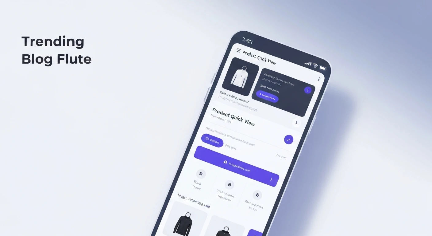

Building a Product Quick View Modal Widget with Animation and Product Info in Flutter
In modern e-commerce applications, providing a seamless and efficient user experience is paramount. A "Product Quick View" modal is a powerful UI pattern that allows users to get essential product information and make quick decisions without navigating away from the current product listing page. This not only enhances user engagement but also streamlines the shopping process. This article will guide you through building a dynamic Product Quick View modal in Flutter, complete with smooth animations and comprehensive product information.
What is a Product Quick View Modal?
A Product Quick View modal is a small, overlay window that pops up when a user interacts with a product on a listing page (e.g., by clicking a "Quick View" button or hovering over the item). It typically displays key product details like images, name, price, short description, and an "Add to Cart" button, allowing users to perform common actions without needing to visit the full product detail page. The addition of animations makes the interaction feel more natural and responsive.
Core Concepts for Implementation
To build our Quick View modal in Flutter, we'll leverage several key concepts:
OverlayEntry: This allows us to insert a widget subtree into the FlutterOverlay, placing it above all other widgets in the navigation stack. It's ideal for modals, pop-ups, and tooltips.AnimationControllerandTween: These are fundamental to creating explicit animations in Flutter. We'll use them to control the modal's opacity, scale, or slide-in motion.GestureDetector: To dismiss the modal when the user taps outside of it, providing an intuitive closing mechanism.- State Management: While a full-fledged state management solution isn't strictly necessary for a simple modal, understanding how to pass product data to the modal is crucial.
Step-by-Step Implementation
1. Define Your Product Model
First, let's create a simple data model for our product.
class Product {
  final String id;
  final String name;
  final String imageUrl;
  final double price;
  final String description;

  Product({
    required this.id,
    required this.name,
    required this.imageUrl,
    required this.price,
    required this.description,
  });
}
2. Create the Product Card Widget
This widget will display a single product and have a button to trigger the Quick View modal.
import 'package:flutter/material.dart';

// Assuming Product model is defined as above

class ProductCard extends StatelessWidget {
  final Product product;
  final VoidCallback onQuickViewPressed;

  const ProductCard({
    Key? key,
    required this.product,
    required this.onQuickViewPressed,
  }) : super(key: key);

  @override
  Widget build(BuildContext context) {
    return Card(
      margin: const EdgeInsets.all(8.0),
      child: Column(
        crossAxisAlignment: CrossAxisAlignment.start,
        children: [
          Image.network(
            product.imageUrl,
            height: 120,
            width: double.infinity,
            fit: BoxFit.cover,
          ),
          Padding(
            padding: const EdgeInsets.all(8.0),
            child: Text(
              product.name,
              style: const TextStyle(fontWeight: FontWeight.bold),
              maxLines: 1,
              overflow: TextOverflow.ellipsis,
            ),
          ),
          Padding(
            padding: const EdgeInsets.symmetric(horizontal: 8.0),
            child: Text('\$${product.price.toStringAsFixed(2)}'),
          ),
          Align(
            alignment: Alignment.bottomRight,
            child: TextButton(
              onPressed: onQuickViewPressed,
              child: const Text('Quick View'),
            ),
          ),
        ],
      ),
    );
  }
}
3. Build the Quick View Modal Widget
This will be the core of our modal. It will receive product data and include animation logic.
import 'package:flutter/material.dart';

// Assuming Product model is defined

class QuickViewModal extends StatefulWidget {
  final Product product;
  final VoidCallback onClose;

  const QuickViewModal({
    Key? key,
    required this.product,
    required this.onClose,
  }) : super(key: key);

  @override
  _QuickViewModalState createState() => _QuickViewModalState();
}

class _QuickViewModalState extends State<QuickViewModal>
    with SingleTickerProviderStateMixin {
  late AnimationController _controller;
  late Animation<double> _opacityAnimation;
  late Animation<Offset> _slideAnimation;

  @override
  void initState() {
    super.initState();
    _controller = AnimationController(
      vsync: this,
      duration: const Duration(milliseconds: 300),
    );

    _opacityAnimation = Tween<double>(begin: 0.0, end: 1.0).animate(
      CurvedAnimation(parent: _controller, curve: Curves.easeOut),
    );

    _slideAnimation = Tween<Offset>(
      begin: const Offset(0, 0.2), // Starts slightly below
      end: Offset.zero,
    ).animate(
      CurvedAnimation(parent: _controller, curve: Curves.easeOut),
    );

    _controller.forward(); // Start animation when the modal appears
  }

  @override
  void dispose() {
    _controller.dispose();
    super.dispose();
  }

  @override
  Widget build(BuildContext context) {
    return FadeTransition(
      opacity: _opacityAnimation,
      child: SlideTransition(
        position: _slideAnimation,
        child: Material( // Wrap with Material to provide elevation and shape
          color: Colors.transparent, // Make background transparent to show overlay dimmer
          child: Center(
            child: Container(
              margin: const EdgeInsets.symmetric(horizontal: 24),
              padding: const EdgeInsets.all(16.0),
              decoration: BoxDecoration(
                color: Colors.white,
                borderRadius: BorderRadius.circular(16.0),
                boxShadow: const [
                  BoxShadow(
                    color: Colors.black26,
                    blurRadius: 10.0,
                    offset: Offset(0, 5),
                  ),
                ],
              ),
              child: Stack(
                children: [
                  Column(
                    mainAxisSize: MainAxisSize.min,
                    children: [
                      ClipRRect(
                        borderRadius: BorderRadius.circular(8.0),
                        child: Image.network(
                          widget.product.imageUrl,
                          height: 200,
                          width: double.infinity,
                          fit: BoxFit.cover,
                        ),
                      ),
                      const SizedBox(height: 16),
                      Text(
                        widget.product.name,
                        style: const TextStyle(
                          fontSize: 22,
                          fontWeight: FontWeight.bold,
                        ),
                        textAlign: TextAlign.center,
                      ),
                      const SizedBox(height: 8),
                      Text(
                        '\$${widget.product.price.toStringAsFixed(2)}',
                        style: TextStyle(
                          fontSize: 18,
                          color: Colors.green[700],
                          fontWeight: FontWeight.w600,
                        ),
                      ),
                      const SizedBox(height: 12),
                      Text(
                        widget.product.description,
                        textAlign: TextAlign.center,
                        style: const TextStyle(fontSize: 14),
                        maxLines: 3,
                        overflow: TextOverflow.ellipsis,
                      ),
                      const SizedBox(height: 16),
                      ElevatedButton(
                        onPressed: () {
                          // TODO: Implement "Add to Cart" logic
                          print('Adding ${widget.product.name} to cart!');
                          widget.onClose(); // Close modal after action
                        },
                        style: ElevatedButton.styleFrom(
                          minimumSize: const Size(double.infinity, 48),
                          shape: RoundedRectangleBorder(
                            borderRadius: BorderRadius.circular(8),
                          ),
                        ),
                        child: const Text(
                          'Add to Cart',
                          style: TextStyle(fontSize: 16),
                        ),
                      ),
                    ],
                  ),
                  Positioned(
                    top: 0,
                    right: 0,
                    child: IconButton(
                      icon: const Icon(Icons.close, color: Colors.grey),
                      onPressed: widget.onClose,
                    ),
                  ),
                ],
              ),
            ),
          ),
        ),
      ),
    );
  }
}
4. Integrate the Modal into Your Product Listing Page
Now, let's create a page that displays product cards and manages the visibility of the Quick View modal using OverlayEntry.
import 'package:flutter/material.dart';

// Assuming Product, ProductCard, QuickViewModal are defined

class ProductListPage extends StatefulWidget {
  const ProductListPage({Key? key}) : super(key: key);

  @override
  _ProductListPageState createState() => _ProductListPageState();
}

class _ProductListPageState extends State<ProductListPage> {
  OverlayEntry? _overlayEntry;

  final List<Product> _products = [
    Product(
      id: '1',
      name: 'Stylish Headphones',
      imageUrl: 'https://images.unsplash.com/photo-1505740420928-5e560c06f2ae?ixlib=rb-4.0.3&ixid=M3wxMjA3fDB8MHxwaG90by1wYWdlfHx8fGVufDB8fHx8fA%3D%3D&auto=format&fit=crop&w=1770&q=80',
      price: 199.99,
      description: 'High-quality sound, comfortable design, and long-lasting battery life. Perfect for music lovers.',
    ),
    Product(
      id: '2',
      name: 'Vintage Camera',
      imageUrl: 'https://images.unsplash.com/photo-1526170967885-e6a3c102a245?ixlib=rb-4.0.3&ixid=M3wxMjA3fDB8MHxwaG90by1wYWdlfHx8fGVufDB8fHx8fA%3D%3D&auto=format&fit=crop&w=1770&q=80',
      price: 249.50,
      description: 'Capture timeless moments with this classic camera. Features manual controls and excellent optics.',
    ),
    Product(
      id: '3',
      name: 'Smartwatch Pro',
      imageUrl: 'https://images.unsplash.com/photo-1546868871-7009772ad37e?ixlib=rb-4.0.3&ixid=M3wxMjA3fDB8MHxwaG90by1wYWdlfHx8fGVufDB8fHx8fA%3D%3D&auto=format&fit=crop&w=1770&q=80',
      price: 129.00,
      description: 'Stay connected and track your fitness with this sleek and powerful smartwatch. GPS enabled.',
    ),
    // Add more products as needed
  ];

  void _showQuickViewModal(Product product) {
    _overlayEntry = OverlayEntry(
      builder: (context) {
        return GestureDetector(
          onTap: () {
            // Dismiss the modal if user taps outside of it
            _dismissQuickViewModal();
          },
          child: Container(
            color: Colors.black54, // Semi-transparent background dimmer
            alignment: Alignment.center,
            child: QuickViewModal(
              product: product,
              onClose: _dismissQuickViewModal,
            ),
          ),
        );
      },
    );

    Overlay.of(context).insert(_overlayEntry!);
  }

  void _dismissQuickViewModal() {
    _overlayEntry?.remove();
    _overlayEntry = null;
  }

  @override
  void dispose() {
    _dismissQuickViewModal(); // Ensure overlay is removed on dispose
    super.dispose();
  }

  @override
  Widget build(BuildContext context) {
    return Scaffold(
      appBar: AppBar(
        title: const Text('Product Listing'),
      ),
      body: GridView.builder(
        padding: const EdgeInsets.all(8.0),
        gridDelegate: const SliverGridDelegateWithFixedCrossAxisCount(
          crossAxisCount: 2,
          crossAxisSpacing: 8.0,
          mainAxisSpacing: 8.0,
          childAspectRatio: 0.75, // Adjust as needed
        ),
        itemCount: _products.length,
        itemBuilder: (context, index) {
          final product = _products[index];
          return ProductCard(
            product: product,
            onQuickViewPressed: () => _showQuickViewModal(product),
          );
        },
      ),
    );
  }
}
5. Integrate into your main application
Finally, ensure your main.dart file uses the ProductListPage.
import 'package:flutter/material.dart';
// import other files (product_list_page.dart, product_card.dart, quick_view_modal.dart, product_model.dart)

void main() {
  runApp(const MyApp());
}

class MyApp extends StatelessWidget {
  const MyApp({Key? key}) : super(key: key);

  @override
  Widget build(BuildContext context) {
    return MaterialApp(
      title: 'Quick View Demo',
      theme: ThemeData(
        primarySwatch: Colors.blue,
        visualDensity: VisualDensity.adaptivePlatformDensity,
      ),
      home: const ProductListPage(),
    );
  }
}
Explanation of Animation and Overlay Logic
-
OverlayEntry: When_showQuickViewModalis called, anOverlayEntryis created. This entry builds a widget (aGestureDetectorwrapping a semi-transparent background and ourQuickViewModal) and inserts it into Flutter'sOverlay. This places it on top of all other content in the current route. -
GestureDetectorfor Dismissal: The outerGestureDetectorallows tapping anywhere on the darkened background to trigger_dismissQuickViewModal, removing theOverlayEntry. -
AnimationController: In_QuickViewModalState, anAnimationControlleris initialized. It's responsible for controlling the duration and status (forward, reverse) of the animations. It's crucial to dispose of it in thedispose()method to prevent memory leaks. -
TweenandCurvedAnimation:_opacityAnimationuses aTweenfrom 0.0 to 1.0, making the modal fade in._slideAnimationuses aTweenfromOffset(0, 0.2)toOffset.zero, causing the modal to slide slightly up as it appears.CurvedAnimationis applied to both to give them a natural easing effect (Curves.easeOut).
-
FadeTransitionandSlideTransition: These widgets take anAnimationobject and apply the animated value to their child. We nest them to combine the fade and slide effects. -
Modal Content: The inner
Containerholds all the product information and styling for the modal itself. TheStackis used to position the close button independently.
Conclusion
By combining Flutter's powerful OverlayEntry for displaying content above the current route and explicit animations with AnimationController and Tween, we can create an engaging and user-friendly Product Quick View modal. This pattern significantly improves the user experience in e-commerce applications by providing quick access to essential product information without disruptive page navigations. You can further enhance this modal by adding more complex animations, product variations, quantity selectors, or integrating it with a global state management solution.


