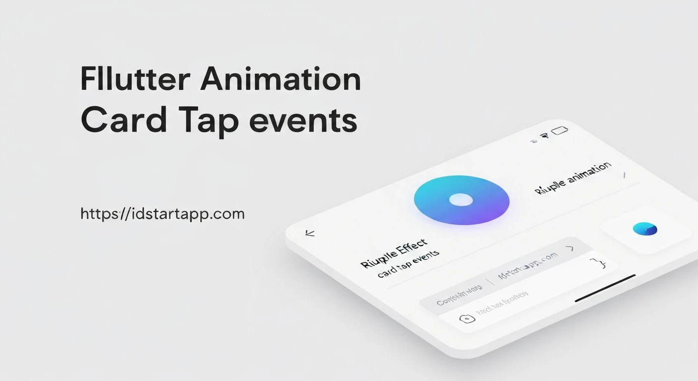

Flutter Ripple Animation Effect for Card Tap
The ripple effect is a widely recognized and appreciated UI/UX pattern, providing immediate visual feedback to users upon interaction. In Flutter, implementing this elegant animation, especially for common components like cards, is straightforward and significantly enhances user experience. This article will guide you through creating a professional ripple animation effect when a user taps on a Card widget in Flutter.
Understanding the Ripple Effect
Originating from Material Design principles, the ripple effect visually emanates from the point of touch, spreading outwards like a ripple in water. This animation serves as a crucial indicator, confirming that an interaction has been registered by the application, making the UI feel more responsive and tactile.
Flutter's Built-in Ripple Mechanism
Flutter's Material Design widgets inherently support the ripple effect. The primary widgets for integrating this behavior are InkWell and InkResponse. While InkResponse offers more granular control over various ink features, InkWell is perfectly suited and simpler for adding tap responses, including the ripple effect, to almost any widget, including Cards.
Implementing a Basic Ripple Effect with InkWell
To add a ripple effect to a Card, you simply need to wrap the Card (or its content) with an InkWell widget. The InkWell widget requires an onTap callback to be active; without it, the ink effects will not appear.
Here's a basic example:
import 'package:flutter/material.dart';

class MyCardWithRipple extends StatelessWidget {
  @override
  Widget build(BuildContext context) {
    return Card(
      margin: EdgeInsets.all(16.0),
      child: InkWell(
        onTap: () {
          print('Card tapped!');
          // Perform action on card tap
        },
        child: Padding(
          padding: const EdgeInsets.all(20.0),
          child: Column(
            mainAxisSize: MainAxisSize.min,
            children: [
              Icon(Icons.lightbulb_outline, size: 50.0),
              SizedBox(height: 10.0),
              Text(
                'Tap Me',
                style: TextStyle(fontSize: 20.0),
              ),
            ],
          ),
        ),
      ),
    );
  }
}
In this example, when the user taps anywhere within the InkWell's bounds, a standard ripple animation will appear, centered on the tap location, and the onTap callback will be executed.
Customizing the Ripple Effect
InkWell provides properties to customize the appearance of the ripple and highlight colors, allowing you to align the animation with your application's theme.
splashColor: Defines the color of the ripple effect itself.highlightColor: Defines the color that appears behind the ripple, covering theInkWell's area while it's pressed.
Let's enhance the previous example with custom colors:
import 'package:flutter/material.dart';

class MyCustomRippleCard extends StatelessWidget {
  @override
  Widget build(BuildContext context) {
    return Card(
      margin: EdgeInsets.all(16.0),
      elevation: 4.0,
      shape: RoundedRectangleBorder(borderRadius: BorderRadius.circular(12.0)),
      clipBehavior: Clip.antiAlias, // Ensures the ripple stays within card borders
      child: InkWell(
        onTap: () {
          print('Custom Card tapped!');
          // Navigate or perform other actions
        },
        splashColor: Colors.blue.withOpacity(0.3), // Light blue ripple
        highlightColor: Colors.blue.withOpacity(0.1), // Faint blue highlight
        borderRadius: BorderRadius.circular(12.0), // Match the card's border radius
        child: Padding(
          padding: const EdgeInsets.all(20.0),
          child: Column(
            mainAxisSize: MainAxisSize.min,
            children: [
              Icon(Icons.star, size: 50.0, color: Colors.blueAccent),
              SizedBox(height: 10.0),
              Text(
                'Custom Ripple',
                style: TextStyle(fontSize: 20.0, fontWeight: FontWeight.bold),
              ),
              Text(
                'Tap for a custom effect',
                style: TextStyle(fontSize: 14.0, color: Colors.grey[600]),
              ),
            ],
          ),
        ),
      ),
    );
  }
}
Important Note: For the ripple effect to correctly respect the Card's border radius, especially for rounded cards, ensure you set clipBehavior: Clip.antiAlias on the Card and set the borderRadius property on the InkWell to match the Card's borderRadius.
Complete Example Usage
To see these cards in action, you can place them within a Flutter application's build method, typically inside a Scaffold:
import 'package:flutter/material.dart';

void main() {
  runApp(MyApp());
}

class MyApp extends StatelessWidget {
  @override
  Widget build(BuildContext context) {
    return MaterialApp(
      title: 'Flutter Ripple Cards',
      theme: ThemeData(
        primarySwatch: Colors.indigo,
        visualDensity: VisualDensity.adaptivePlatformDensity,
      ),
      home: Scaffold(
        appBar: AppBar(
          title: Text('Card Ripple Effect'),
        ),
        body: Center(
          child: Column(
            mainAxisAlignment: MainAxisAlignment.center,
            children: [
              MyCardWithRipple(),
              SizedBox(height: 30),
              MyCustomRippleCard(),
            ],
          ),
        ),
      ),
    );
  }
}

// Re-include the MyCardWithRipple and MyCustomRippleCard classes here for completeness
// (As defined above)
// class MyCardWithRipple extends StatelessWidget { /* ... */ }
// class MyCustomRippleCard extends StatelessWidget { /* ... */ }
(Note: For a runnable example, ensure the definitions of MyCardWithRipple and MyCustomRippleCard are present in the same file or imported correctly.)
Conclusion
Adding a ripple animation effect to card taps in Flutter is a simple yet powerful way to enhance user interaction and provide intuitive feedback. By leveraging Flutter's InkWell widget and its customization options, developers can easily integrate polished Material Design animations that make applications feel more responsive and professional. This attention to detail significantly contributes to a superior user experience, making your Flutter applications stand out.


