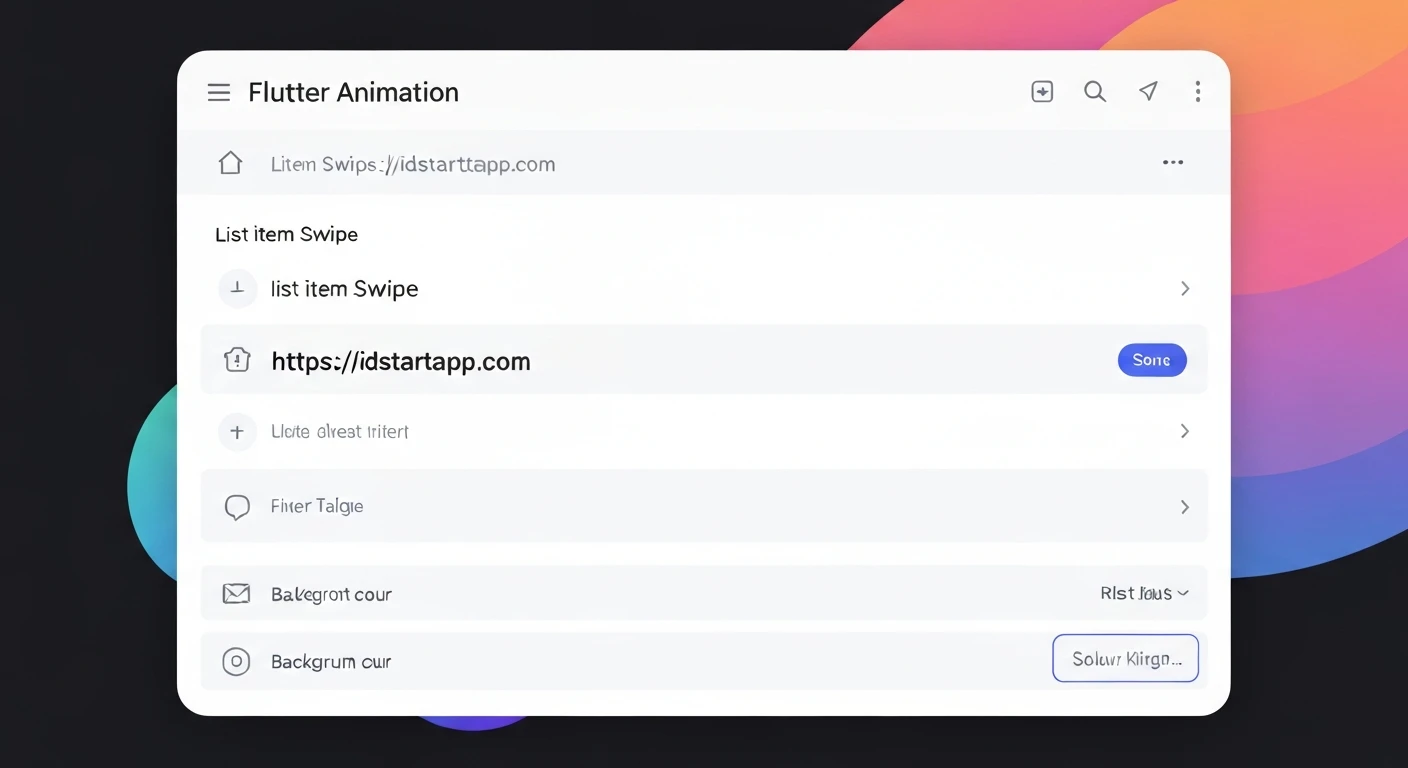

Flutter List Item Swipe Animation with Background Color Change
Enhancing user experience in mobile applications often involves intuitive gestures and visual feedback. A common pattern is swiping list items to reveal actions, accompanied by a changing background color. This article will guide you through implementing a professional-looking list item swipe animation in Flutter, complete with distinct background colors for different swipe directions.
Key Flutter Widgets for Swipe Gestures
Flutter provides powerful widgets to easily integrate swipe-to-dismiss functionality:
The Dismissible Widget
The Dismissible widget is the cornerstone for implementing swipe-to-dismiss. It allows a widget to be removed from the widget tree with an animation and can expose different backgrounds based on the swipe direction.
key: A unique key is crucial forDismissibleto correctly identify the item being dismissed, especially in a dynamic list.child: The widget that can be swiped (e.g., aListTileorCard).background: The widget shown behind the child when swiping from left to right.secondaryBackground: The widget shown behind the child when swiping from right to left.onDismissed: A callback function invoked after the item has been dismissed.confirmDismiss: An optional callback to prompt the user for confirmation before dismissing an item.
Animating Background Colors
The "background color change" effect is achieved by providing distinct background and secondaryBackground widgets to the Dismissible. As the user swipes, the child moves, revealing these background widgets, which can be simple Containers with specific colors and perhaps an icon.
Setting Up Your Flutter Project
Start by creating a new Flutter project and setting up a basic StatefulWidget to manage our list data.
import 'package:flutter/material.dart';

void main() {
  runApp(const MyApp());
}

class MyApp extends StatelessWidget {
  const MyApp({super.key});

  @override
  Widget build(BuildContext context) {
    return MaterialApp(
      title: 'Swipe Dismiss Demo',
      theme: ThemeData(
        primarySwatch: Colors.blue,
        visualDensity: VisualDensity.adaptivePlatformDensity,
      ),
      home: const HomeScreen(),
    );
  }
}

class HomeScreen extends StatefulWidget {
  const HomeScreen({super.key});

  @override
  State<HomeScreen> createState() => _HomeScreenState();
}

class _HomeScreenState extends State<HomeScreen> {
  // Our mutable list of items
  final List<String> _items = List.generate(
    20,
    (index) => 'Item ${index + 1}',
  );

  @override
  Widget build(BuildContext context) {
    return Scaffold(
      appBar: AppBar(
        title: const Text('Swipe to Dismiss List'),
        backgroundColor: Colors.blueAccent,
      ),
      body: ListView.builder(
        itemCount: _items.length,
        itemBuilder: (context, index) {
          final item = _items[index];
          // Dismissible widget will be here
          return Container(); // Placeholder for now
        },
      ),
    );
  }
}
Implementing the Swipe-to-Dismiss Logic
Now, let's integrate the Dismissible widget into our ListView.builder.
Building the Dismissible Widget
We'll wrap each ListTile with a Dismissible widget, providing different background widgets for left and right swipes.
// Inside _HomeScreenState's build method, replace the placeholder Container within ListView.builder:

        itemBuilder: (context, index) {
          final item = _items[index];
          return Dismissible(
            // A unique key for each item is crucial for Dismissible
            // Using a Key.value or UniqueKey() is recommended for dynamic lists
            key: ValueKey(item),

            // Define the direction(s) allowed for dismissal
            // DismissDirection.horizontal allows both left-to-right and right-to-left
            direction: DismissDirection.horizontal,

            // Background shown when swiping from left to right (archive action)
            background: Container(
              color: Colors.green, // Green background for archive
              alignment: Alignment.centerLeft,
              padding: const EdgeInsets.symmetric(horizontal: 20.0),
              child: const Icon(Icons.archive, color: Colors.white, size: 30),
            ),

            // Background shown when swiping from right to left (delete action)
            secondaryBackground: Container(
              color: Colors.red, // Red background for delete
              alignment: Alignment.centerRight,
              padding: const EdgeInsets.symmetric(horizontal: 20.0),
              child: const Icon(Icons.delete, color: Colors.white, size: 30),
            ),

            // The widget that will be swiped away
            child: Card(
              margin: const EdgeInsets.symmetric(horizontal: 8.0, vertical: 4.0),
              elevation: 2.0,
              child: ListTile(
                title: Text(item, style: const TextStyle(fontSize: 18.0)),
                subtitle: Text('This is a detail for $item'),
                leading: const Icon(Icons.bookmark),
                trailing: const Icon(Icons.arrow_forward_ios),
                contentPadding: const EdgeInsets.symmetric(horizontal: 16.0, vertical: 8.0),
              ),
            ),

            // Callback when the item has been dismissed
            onDismissed: (direction) {
              // Handle dismissal logic here
            },
          );
        },
Handling Dismissal and State Updates
The onDismissed callback is where you update your data source and provide user feedback. It's crucial to remove the item from your list and then show a SnackBar, potentially allowing the user to undo the action. We'll also add a confirmDismiss dialog for an enhanced user experience.
// Inside onDismissed callback (replace the placeholder):

            onDismissed: (direction) {
              // Store the dismissed item and its original index for potential undo
              final String dismissedItem = _items[index];
              setState(() {
                _items.removeAt(index);
              });

              // Show a SnackBar with an undo option
              ScaffoldMessenger.of(context).showSnackBar(
                SnackBar(
                  content: Text(
                    '$dismissedItem was ${direction == DismissDirection.endToStart ? "deleted" : "archived"}',
                  ),
                  action: SnackBarAction(
                    label: 'UNDO',
                    onPressed: () {
                      // Re-insert the item at its original position if undo is pressed
                      setState(() {
                        _items.insert(index, dismissedItem);
                      });
                    },
                  ),
                ),
              );
            },

            // Optional: confirmDismiss callback for more complex logic before dismissal
            // For example, showing a confirmation dialog
            confirmDismiss: (direction) async {
              return await showDialog(
                context: context,
                builder: (BuildContext context) {
                  return AlertDialog(
                    title: const Text("Confirm"),
                    content: Text(
                      "Are you sure you wish to ${direction == DismissDirection.endToStart ? "delete" : "archive"} this item?",
                    ),
                    actions: <Widget>[
                      TextButton(
                        onPressed: () => Navigator.of(context).pop(false),
                        child: const Text("CANCEL"),
                      ),
                      TextButton(
                        onPressed: () => Navigator.of(context).pop(true),
                        child: const Text("CONFIRM"),
                      ),
                    ],
                  );
                },
              );
            },
Complete Example Code
Here's the complete main.dart file combining all the discussed elements for a fully functional swipe-to-dismiss list.
import 'package:flutter/material.dart';

void main() {
  runApp(const MyApp());
}

class MyApp extends StatelessWidget {
  const MyApp({super.key});

  @override
  Widget build(BuildContext context) {
    return MaterialApp(
      title: 'Swipe Dismiss Demo',
      theme: ThemeData(
        primarySwatch: Colors.blue,
        visualDensity: VisualDensity.adaptivePlatformDensity,
      ),
      home: const HomeScreen(),
    );
  }
}

class HomeScreen extends StatefulWidget {
  const HomeScreen({super.key});

  @override
  State<HomeScreen> createState() => _HomeScreenState();
}

class _HomeScreenState extends State<HomeScreen> {
  // A simple list of items managed by the state
  final List<String> _items = List.generate(
    20,
    (index) => 'Item ${index + 1}',
  );

  @override
  Widget build(BuildContext context) {
    return Scaffold(
      appBar: AppBar(
        title: const Text('Swipe to Dismiss List'),
        backgroundColor: Colors.blueAccent,
        foregroundColor: Colors.white,
      ),
      body: ListView.builder(
        itemCount: _items.length,
        itemBuilder: (context, index) {
          final item = _items[index];
          return Dismissible(
            // A unique key for each item is crucial for Dismissible to work correctly.
            // Using ValueKey with the item itself is a good practice for lists.
            key: ValueKey(item),

            // Allow swiping in both horizontal directions
            direction: DismissDirection.horizontal,

            // Background widget for left-to-right swipe (e.g., Archive)
            background: Container(
              color: Colors.green, // Green background for archive
              alignment: Alignment.centerLeft,
              padding: const EdgeInsets.symmetric(horizontal: 20.0),
              child: const Icon(Icons.archive, color: Colors.white, size: 30),
            ),

            // Background widget for right-to-left swipe (e.g., Delete)
            secondaryBackground: Container(
              color: Colors.red, // Red background for delete
              alignment: Alignment.centerRight,
              padding: const EdgeInsets.symmetric(horizontal: 20.0),
              child: const Icon(Icons.delete, color: Colors.white, size: 30),
            ),

            // The actual list item widget that the user interacts with
            child: Card(
              margin: const EdgeInsets.symmetric(horizontal: 8.0, vertical: 4.0),
              elevation: 2.0,
              shape: RoundedRectangleBorder(borderRadius: BorderRadius.circular(8.0)),
              child: ListTile(
                title: Text(item, style: const TextStyle(fontSize: 18.0)),
                subtitle: Text('This is a detail for $item', style: const TextStyle(color: Colors.grey)),
                leading: CircleAvatar(
                  backgroundColor: Colors.blue.shade100,
                  child: Text('${index + 1}', style: TextStyle(color: Theme.of(context).primaryColor)),
                ),
                trailing: const Icon(Icons.arrow_forward_ios, size: 16.0, color: Colors.grey),
                contentPadding: const EdgeInsets.symmetric(horizontal: 16.0, vertical: 8.0),
              ),
            ),

            // Callback when the item has been dismissed
            onDismissed: (direction) {
              // Store the dismissed item and its original index for potential undo
              final String dismissedItem = _items[index];
              setState(() {
                _items.removeAt(index);
              });

              // Show a SnackBar to provide feedback and an undo option
              ScaffoldMessenger.of(context).showSnackBar(
                SnackBar(
                  content: Text(
                    '$dismissedItem was ${direction == DismissDirection.endToStart ? "deleted" : "archived"}',
                  ),
                  action: SnackBarAction(
                    label: 'UNDO',
                    onPressed: () {
                      // Re-insert the item at its original position if undo is pressed
                      setState(() {
                        _items.insert(index, dismissedItem);
                      });
                    },
                  ),
                ),
              );
            },

            // Optional: confirmDismiss callback to ask for user confirmation
            // before actually dismissing the item.
            confirmDismiss: (direction) async {
              return await showDialog(
                context: context,
                builder: (BuildContext context) {
                  return AlertDialog(
                    title: const Text("Confirm Action"),
                    content: Text(
                      "Are you sure you wish to ${direction == DismissDirection.endToStart ? "delete" : "archive"} this item?",
                    ),
                    actions: <Widget>[
                      TextButton(
                        onPressed: () => Navigator.of(context).pop(false), // Dismiss not confirmed
                        child: const Text("CANCEL"),
                      ),
                      TextButton(
                        onPressed: () => Navigator.of(context).pop(true),  // Dismiss confirmed
                        child: const Text("CONFIRM"),
                      ),
                    ],
                  );
                },
              );
            },
          );
        },
      ),
    );
  }
}
Conclusion
Implementing list item swipe animations with background color changes in Flutter is straightforward thanks to the Dismissible widget. By leveraging its key, background, secondaryBackground, onDismissed, and confirmDismiss properties, you can create interactive and visually appealing lists that significantly improve the user experience of your mobile applications. Remember to always update your underlying data source and provide proper feedback mechanisms like SnackBars for a robust solution.


