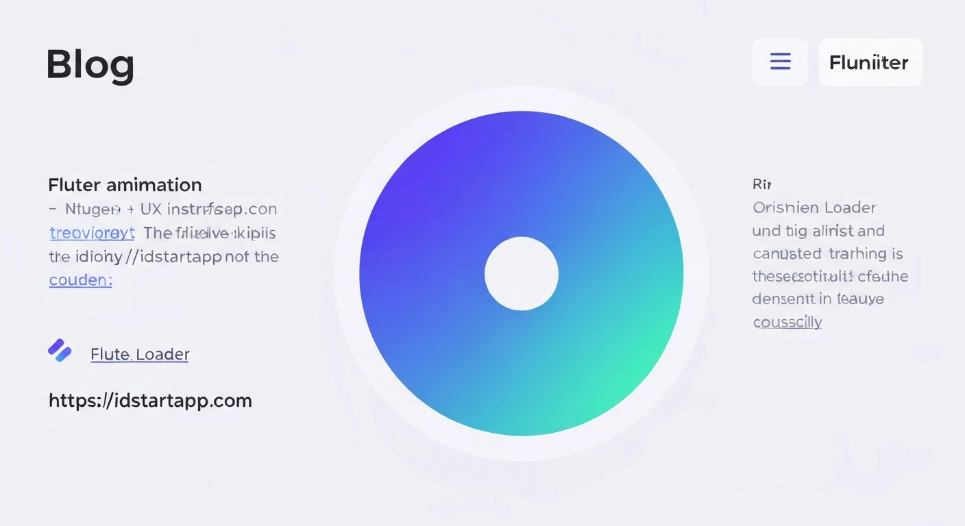

Flutter Circular Loader Animation with Gradient Color
In modern applications, user experience is paramount. A crucial element in maintaining user engagement during data fetching or intensive computations is an effective loading indicator. While standard circular progress indicators are functional, they often lack visual flair. This article will guide you through creating a custom, visually appealing circular loader in Flutter, featuring a smooth animation and a vibrant gradient color, significantly enhancing your app's UI.
The Need for Engaging Loaders
Default loading spinners can be monotonous. A custom loader with a gradient and fluid animation not only serves its functional purpose but also adds a layer of professionalism and brand identity to your application. It transforms a mundane waiting period into a more pleasant visual experience, reducing perceived loading times.
Core Concepts for Custom Drawing and Animation
To achieve our gradient circular loader, we will leverage several core Flutter concepts:
CustomPainter: This class allows us to draw custom graphics directly onto the canvas. It's perfect for creating unique shapes and applying custom styles that are not readily available through standard widgets.AnimationController: Manages the animation. It can play, stop, reverse, and repeat an animation over a specified duration.Animation<double>: Represents a value that changes over time, driven by anAnimationController. We'll use it to animate the sweep angle of our circular loader.AnimatedBuilder: A widget that rebuilds its child subtree whenever the animation it listens to changes value. This is an efficient way to update only the parts of the UI that depend on the animation.SweepGradient: A type of gradient that sweeps colors around a central point, ideal for circular progress indicators.
Step-by-Step Implementation
1. Project Setup and Widget Structure
First, let's create a new Flutter project or open an existing one. We will implement our custom loader as a StatefulWidget to manage its animation state.
import 'dart:math' as math;
import 'package:flutter/material.dart';

class GradientCircularLoader extends StatefulWidget {
  final double size;
  final double strokeWidth;
  final List gradientColors;
  final Color backgroundColor;
  final Duration duration;

  const GradientCircularLoader({
    Key? key,
    this.size = 100.0,
    this.strokeWidth = 10.0,
    this.gradientColors = const [Colors.blue, Colors.purple],
    this.backgroundColor = Colors.grey,
    this.duration = const Duration(seconds: 2),
  }) : super(key: key);

  @override
  _GradientCircularLoaderState createState() => _GradientCircularLoaderState();
}

class _GradientCircularLoaderState extends State
    with SingleTickerProviderStateMixin {
  late AnimationController _animationController;
  late Animation _animation;

  @override
  void initState() {
    super.initState();
    _animationController = AnimationController(
      vsync: this,
      duration: widget.duration,
    )..repeat(); // Loop indefinitely

    _animation = Tween(begin: 0.0, end: 1.0).animate(_animationController);
  }

  @override
  void dispose() {
    _animationController.dispose();
    super.dispose();
  }

  @override
  Widget build(BuildContext context) {
    return Center(
      child: SizedBox(
        width: widget.size,
        height: widget.size,
        // The AnimatedBuilder will go here
        child: Container(), // Placeholder for now
      ),
    );
  }
}
2. The Animation Controller
In the _GradientCircularLoaderState, we initialize an AnimationController. The vsync parameter is crucial for efficient animation, preventing animations from running when the widget is not visible. SingleTickerProviderStateMixin provides the TickerProvider needed for vsync. We use .repeat() to make the animation loop continuously.
The _animation variable is a Tween that defines the range of values (0.0 to 1.0) our animation will progress through, driven by the controller.
3. Crafting the Custom Painter
This is where the visual magic happens. We'll create a CircularLoaderPainter that extends CustomPainter. This painter will be responsible for drawing the background circle and the animating arc with a gradient.
class CircularLoaderPainter extends CustomPainter {
  final double animationValue;
  final Color backgroundColor;
  final List gradientColors;
  final double strokeWidth;

  CircularLoaderPainter({
    required this.animationValue,
    required this.backgroundColor,
    required this.gradientColors,
    required this.strokeWidth,
  });

  @override
  void paint(Canvas canvas, Size size) {
    final center = Offset(size.width / 2, size.height / 2);
    final radius = math.min(size.width, size.height) / 2 - strokeWidth / 2;

    // Background circle paint
    final backgroundPaint = Paint()
      ..color = backgroundColor
      ..style = PaintingStyle.stroke
      ..strokeWidth = strokeWidth
      ..strokeCap = StrokeCap.round;

    // Gradient arc paint
    final gradientPaint = Paint()
      ..style = PaintingStyle.stroke
      ..strokeWidth = strokeWidth
      ..strokeCap = StrokeCap.round
      ..shader = SweepGradient(
        startAngle: 0.0,
        endAngle: math.pi * 2, // Full circle for the sweep gradient
        colors: gradientColors,
        transform: GradientRotation(-math.pi / 2), // Start from the top
      ).createShader(Rect.fromCircle(center: center, radius: radius));

    // Draw background circle
    canvas.drawCircle(center, radius, backgroundPaint);

    // Draw animating arc
    final double startAngle = -math.pi / 2; // Start from the top (12 o'clock)
    final double sweepAngle = 2 * math.pi * animationValue; // Animate full circle

    canvas.drawArc(
      Rect.fromCircle(center: center, radius: radius),
      startAngle,
      sweepAngle,
      false, // UseCenter - set to false for an arc, true for a pie slice
      gradientPaint,
    );
  }

  @override
  bool shouldRepaint(covariant CircularLoaderPainter oldDelegate) {
    return oldDelegate.animationValue != animationValue ||
           oldDelegate.backgroundColor != backgroundColor ||
           oldDelegate.gradientColors != gradientColors ||
           oldDelegate.strokeWidth != strokeWidth;
  }
}
In the paint method:
- We calculate the
centerandradiusbased on the availablesize. - A
backgroundPaintdraws a static gray circle. gradientPaintis where the magic happens for the animating arc. We assign aSweepGradientto itsshaderproperty.GradientRotation(-math.pi / 2)rotates the gradient to start from the top.drawArcthen draws the main animating arc. ThestartAngleis-math.pi / 2(which corresponds to 12 o'clock), and thesweepAngleis determined by ouranimationValue, making it grow from 0 to a full circle.
The shouldRepaint method is optimized to only repaint when the relevant properties have changed, improving performance.
4. Integrating with AnimatedBuilder
Finally, we integrate our CustomPainter into the widget tree using an AnimatedBuilder. This ensures that only the CustomPaint widget (and thus the painter) rebuilds when the animation value changes, rather than the entire widget tree.
Replace the Container() placeholder in the build method of _GradientCircularLoaderState:
  @override
  Widget build(BuildContext context) {
    return Center(
      child: SizedBox(
        width: widget.size,
        height: widget.size,
        child: AnimatedBuilder(
          animation: _animation,
          builder: (context, child) {
            return CustomPaint(
              painter: CircularLoaderPainter(
                animationValue: _animation.value,
                backgroundColor: widget.backgroundColor,
                gradientColors: widget.gradientColors,
                strokeWidth: widget.strokeWidth,
              ),
            );
          },
        ),
      ),
    );
  }
5. Full Code Example
Below is the complete code for a customizable circular loader with a gradient animation. You can use this GradientCircularLoader widget in any part of your Flutter application.
import 'dart:math' as math;
import 'package:flutter/material.dart';

class GradientCircularLoader extends StatefulWidget {
  final double size;
  final double strokeWidth;
  final List gradientColors;
  final Color backgroundColor;
  final Duration duration;

  const GradientCircularLoader({
    Key? key,
    this.size = 100.0,
    this.strokeWidth = 10.0,
    this.gradientColors = const [Colors.blue, Colors.purple],
    this.backgroundColor = Colors.grey,
    this.duration = const Duration(seconds: 2),
  }) : super(key: key);

  @override
  _GradientCircularLoaderState createState() => _GradientCircularLoaderState();
}

class _GradientCircularLoaderState extends State
    with SingleTickerProviderStateMixin {
  late AnimationController _animationController;
  late Animation _animation;

  @override
  void initState() {
    super.initState();
    _animationController = AnimationController(
      vsync: this,
      duration: widget.duration,
    )..repeat(); // Loop indefinitely

    _animation = Tween(begin: 0.0, end: 1.0).animate(_animationController);
  }

  @override
  void dispose() {
    _animationController.dispose();
    super.dispose();
  }

  @override
  Widget build(BuildContext context) {
    return Center(
      child: SizedBox(
        width: widget.size,
        height: widget.size,
        child: AnimatedBuilder(
          animation: _animation,
          builder: (context, child) {
            return CustomPaint(
              painter: CircularLoaderPainter(
                animationValue: _animation.value,
                backgroundColor: widget.backgroundColor,
                gradientColors: widget.gradientColors,
                strokeWidth: widget.strokeWidth,
              ),
            );
          },
        ),
      ),
    );
  }
}

class CircularLoaderPainter extends CustomPainter {
  final double animationValue;
  final Color backgroundColor;
  final List gradientColors;
  final double strokeWidth;

  CircularLoaderPainter({
    required this.animationValue,
    required this.backgroundColor,
    required this.gradientColors,
    required this.strokeWidth,
  });

  @override
  void paint(Canvas canvas, Size size) {
    final center = Offset(size.width / 2, size.height / 2);
    final radius = math.min(size.width, size.height) / 2 - strokeWidth / 2;

    // Background circle paint
    final backgroundPaint = Paint()
      ..color = backgroundColor
      ..style = PaintingStyle.stroke
      ..strokeWidth = strokeWidth
      ..strokeCap = StrokeCap.round;

    // Gradient arc paint
    final gradientPaint = Paint()
      ..style = PaintingStyle.stroke
      ..strokeWidth = strokeWidth
      ..strokeCap = StrokeCap.round
      ..shader = SweepGradient(
        startAngle: 0.0,
        endAngle: math.pi * 2, // Full circle for the sweep gradient
        colors: gradientColors,
        transform: GradientRotation(-math.pi / 2), // Start from the top
      ).createShader(Rect.fromCircle(center: center, radius: radius));

    // Draw background circle
    canvas.drawCircle(center, radius, backgroundPaint);

    // Draw animating arc
    final double startAngle = -math.pi / 2; // Start from the top (12 o'clock)
    final double sweepAngle = 2 * math.pi * animationValue; // Animate full circle

    canvas.drawArc(
      Rect.fromCircle(center: center, radius: radius),
      startAngle,
      sweepAngle,
      false, // UseCenter - set to false for an arc, true for a pie slice
      gradientPaint,
    );
  }

  @override
  bool shouldRepaint(covariant CircularLoaderPainter oldDelegate) {
    return oldDelegate.animationValue != animationValue ||
           oldDelegate.backgroundColor != backgroundColor ||
           oldDelegate.gradientColors != gradientColors ||
           oldDelegate.strokeWidth != strokeWidth;
  }
}
Conclusion
By combining Flutter's powerful custom painting capabilities with its robust animation framework, we've created a beautiful and engaging circular loader with a gradient. This custom component not only provides clear feedback to users during loading times but also significantly enhances the visual appeal and professionalism of your Flutter application. Experiment with different gradient colors, stroke widths, and animation durations to perfectly match your app's design language.


