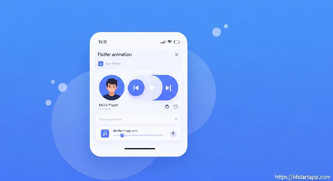

Flutter Animated Slide-Up Panel for Music Players
Creating an intuitive and visually appealing user interface is paramount for modern mobile applications, especially for media players. A common pattern seen in popular music apps like Spotify and Apple Music is the "slide-up panel" – a persistent mini-player at the bottom that can be expanded to reveal full track details and controls. This article explores how to implement such an animated slide-up panel in Flutter, focusing on enhancing the music player experience.
The Power of Slide-Up Panels in Music Apps
The slide-up panel pattern offers several significant advantages:
- Space Efficiency: It allows a mini-player to be present across various screens without consuming much valuable screen real estate.
- Seamless Navigation: Users can quickly access full playback controls and track information with a simple gesture.
- Contextual Awareness: The current song is always visible, maintaining user context even when browsing other parts of the app.
- Enhanced User Experience: Smooth animations provide a delightful and responsive interaction.
Choosing the Right Tool: sliding_up_panel
While Flutter provides powerful primitives like DraggableScrollableSheet and AnimatedPositioned to build custom slide-up panels, the sliding_up_panel package offers a ready-to-use, highly customizable, and robust solution. It simplifies the implementation considerably by handling gestures, animations, and various configurations out of the box.
Setup and Installation
To begin, add the sliding_up_panel dependency to your pubspec.yaml file:
dependencies:
  flutter:
    sdk: flutter
  sliding_up_panel: ^2.0.0+1 # Use the latest stable version
Then, run flutter pub get in your terminal to fetch the package.
Basic Implementation of the Slide-Up Panel
The core of the implementation involves wrapping your main content (the "body") with the SlidingUpPanel widget. You then provide two key builders: panelBuilder for the content that slides up, and optionally collapsed for the content shown when the panel is at its minimum height. We'll use collapsed to build our mini-player.
import 'package:flutter/material.dart';
import 'package:sliding_up_panel/sliding_up_panel.dart';

class MusicPlayerScreen extends StatefulWidget {
  @override
  _MusicPlayerScreenState createState() => _MusicPlayerScreenState();
}

class _MusicPlayerScreenState extends State {
  @override
  Widget build(BuildContext context) {
    return Scaffold(
      appBar: AppBar(
        title: Text('My Music App'),
      ),
      body: SlidingUpPanel(
        minHeight: 60.0, // Height of the mini-player
        maxHeight: MediaQuery.of(context).size.height * 0.9, // Max height for full player
        panelBuilder: (sc) => _panelBuilder(sc),
        collapsed: _collapsedPanel(),
        body: Center(
          child: Text("Your main music browsing content goes here."),
        ),
      ),
    );
  }

  Widget _panelBuilder(ScrollController sc) {
    return Container(
      padding: EdgeInsets.all(16.0),
      decoration: BoxDecoration(
        color: Colors.blueGrey[900],
        borderRadius: BorderRadius.vertical(top: Radius.circular(24.0)),
      ),
      child: ListView(
        controller: sc,
        padding: EdgeInsets.zero,
        children: [
          Center(
            child: Container(
              width: 40,
              height: 5,
              decoration: BoxDecoration(
                color: Colors.white54,
                borderRadius: BorderRadius.circular(10),
              ),
            ),
          ),
          SizedBox(height: 16.0),
          // Full song details and controls will go here
          Center(
            child: Text(
              "Song Title - Artist Name",
              style: TextStyle(fontSize: 24, color: Colors.white, fontWeight: FontWeight.bold),
            ),
          ),
          SizedBox(height: 200), // Placeholder for album art
          Center(child: Text("Full Player Controls", style: TextStyle(color: Colors.white70))),
        ],
      ),
    );
  }

  Widget _collapsedPanel() {
    return Container(
      decoration: BoxDecoration(
        color: Colors.blueGrey[800],
        borderRadius: BorderRadius.vertical(top: Radius.circular(24.0)),
      ),
      child: Center(
        child: Text(
          "Current Song - Artist",
          style: TextStyle(color: Colors.white, fontSize: 18),
        ),
      ),
    );
  }
}
Integrating Music Player UI and Customization
Now, let's enhance the _panelBuilder and _collapsedPanel to resemble a music player. We'll add album art, song title, artist, and basic playback controls. We can also add visual flair like rounded corners and a backdrop effect.
import 'package:flutter/material.dart';
import 'package:sliding_up_panel/sliding_up_panel.dart';

class MusicPlayerScreen extends StatefulWidget {
  @override
  _MusicPlayerScreenState createState() => _MusicPlayerScreenState();
}

class _MusicPlayerScreenState extends State {
  PanelController _panelController = PanelController(); // For programmatic control

  @override
  Widget build(BuildContext context) {
    return Scaffold(
      appBar: AppBar(
        title: Text('My Music App'),
        backgroundColor: Colors.blueGrey[900],
      ),
      body: SlidingUpPanel(
        controller: _panelController,
        minHeight: 80.0, // Height of the mini-player
        maxHeight: MediaQuery.of(context).size.height * 0.9, // Max height for full player
        panelBuilder: (sc) => _fullPlayerPanel(sc),
        collapsed: _miniPlayerPanel(),
        body: Center(
          child: Column(
            mainAxisAlignment: MainAxisAlignment.center,
            children: [
              Text(
                "Your main music browsing content goes here.",
                style: TextStyle(fontSize: 18, color: Colors.black54),
              ),
              SizedBox(height: 20),
              ElevatedButton(
                onPressed: () {
                  // Example of programmatic control
                  _panelController.isPanelClosed ? _panelController.open() : _panelController.close();
                },
                child: Text('Toggle Player'),
              ),
            ],
          ),
        ),
        borderRadius: BorderRadius.vertical(top: Radius.circular(24.0)),
        boxShadow: [
          BoxShadow(
            blurRadius: 20.0,
            color: Colors.black.withOpacity(0.3),
          ),
        ],
        color: Colors.transparent, // Make the panel background transparent to show gradient/image
        backdropEnabled: true,
        backdropOpacity: 0.5,
        parallaxEnabled: true,
        parallaxOffset: 0.1,
        onPanelSlide: (double pos) {
          // You can use this to animate other elements based on panel position
          // e.g., fade out album art on main screen as panel slides up
        },
      ),
    );
  }

  // Full Player Panel
  Widget _fullPlayerPanel(ScrollController sc) {
    return Container(
      decoration: BoxDecoration(
        color: Colors.blueGrey[900],
        borderRadius: BorderRadius.vertical(top: Radius.circular(24.0)),
      ),
      child: ListView(
        controller: sc,
        padding: EdgeInsets.only(top: 16.0), // Padding for the handle
        children: [
          Center(
            child: Container(
              width: 40,
              height: 5,
              decoration: BoxDecoration(
                color: Colors.white54,
                borderRadius: BorderRadius.circular(10),
              ),
            ),
          ),
          SizedBox(height: 24.0),
          // Album Art
          Center(
            child: Container(
              width: MediaQuery.of(context).size.width * 0.7,
              height: MediaQuery.of(context).size.width * 0.7,
              decoration: BoxDecoration(
                color: Colors.grey[700],
                borderRadius: BorderRadius.circular(16),
                image: DecorationImage(
                  image: NetworkImage('https://via.placeholder.com/150'), // Replace with actual album art
                  fit: BoxFit.cover,
                ),
              ),
            ),
          ),
          SizedBox(height: 32.0),
          // Song Details
          Padding(
            padding: const EdgeInsets.symmetric(horizontal: 24.0),
            child: Column(
              children: [
                Text(
                  "Everglow",
                  style: TextStyle(fontSize: 28, color: Colors.white, fontWeight: FontWeight.bold),
                  textAlign: TextAlign.center,
                  maxLines: 1,
                  overflow: TextOverflow.ellipsis,
                ),
                SizedBox(height: 8.0),
                Text(
                  "COLDPLAY",
                  style: TextStyle(fontSize: 18, color: Colors.white70),
                  textAlign: TextAlign.center,
                  maxLines: 1,
                  overflow: TextOverflow.ellipsis,
                ),
              ],
            ),
          ),
          SizedBox(height: 32.0),
          // Progress Bar (Simplified)
          Slider(
            value: 0.5, // Current progress
            onChanged: (double value) {},
            activeColor: Colors.tealAccent,
            inactiveColor: Colors.white30,
          ),
          Padding(
            padding: const EdgeInsets.symmetric(horizontal: 24.0),
            child: Row(
              mainAxisAlignment: MainAxisAlignment.spaceBetween,
              children: [
                Text("2:30", style: TextStyle(color: Colors.white70)),
                Text("4:50", style: TextStyle(color: Colors.white70)),
              ],
            ),
          ),
          SizedBox(height: 24.0),
          // Playback Controls
          Row(
            mainAxisAlignment: MainAxisAlignment.spaceEvenly,
            children: [
              IconButton(
                icon: Icon(Icons.skip_previous, size: 48, color: Colors.white),
                onPressed: () {},
              ),
              IconButton(
                icon: Icon(Icons.play_circle_filled, size: 72, color: Colors.tealAccent),
                onPressed: () {},
              ),
              IconButton(
                icon: Icon(Icons.skip_next, size: 48, color: Colors.white),
                onPressed: () {},
              ),
            ],
          ),
          SizedBox(height: 50.0), // Extra space to scroll past controls
        ],
      ),
    );
  }

  // Mini Player Panel (Collapsed State)
  Widget _miniPlayerPanel() {
    return Container(
      decoration: BoxDecoration(
        color: Colors.blueGrey[800],
        borderRadius: BorderRadius.vertical(top: Radius.circular(24.0)),
      ),
      child: Padding(
        padding: const EdgeInsets.symmetric(horizontal: 16.0),
        child: Row(
          children: [
            // Mini Album Art
            Container(
              width: 50,
              height: 50,
              decoration: BoxDecoration(
                color: Colors.grey[600],
                borderRadius: BorderRadius.circular(8),
                image: DecorationImage(
                  image: NetworkImage('https://via.placeholder.com/150'), // Replace with actual album art
                  fit: BoxFit.cover,
                ),
              ),
            ),
            SizedBox(width: 12.0),
            // Song Info
            Expanded(
              child: Column(
                mainAxisAlignment: MainAxisAlignment.center,
                crossAxisAlignment: CrossAxisAlignment.start,
                children: [
                  Text(
                    "Everglow",
                    style: TextStyle(color: Colors.white, fontSize: 16, fontWeight: FontWeight.bold),
                    maxLines: 1,
                    overflow: TextOverflow.ellipsis,
                  ),
                  Text(
                    "COLDPLAY",
                    style: TextStyle(color: Colors.white70, fontSize: 14),
                    maxLines: 1,
                    overflow: TextOverflow.ellipsis,
                  ),
                ],
              ),
            ),
            // Mini Controls
            IconButton(
              icon: Icon(Icons.skip_previous, color: Colors.white, size: 28),
              onPressed: () {},
            ),
            IconButton(
              icon: Icon(Icons.play_arrow, color: Colors.tealAccent, size: 36),
              onPressed: () {},
            ),
            IconButton(
              icon: Icon(Icons.skip_next, color: Colors.white, size: 28),
              onPressed: () {},
            ),
          ],
        ),
      ),
    );
  }
}
Controlling the Panel Programmatically
The SlidingUpPanel can also be controlled programmatically using a PanelController. This is useful for scenarios like tapping a mini-player to expand it, or a custom button to toggle its state.
1. Declare a PanelController:
final PanelController _panelController = PanelController();
2. Assign it to the SlidingUpPanel:
SlidingUpPanel(
  controller: _panelController,
  // ... other properties
)
3. Use its methods to interact with the panel:
_panelController.open(): Fully opens the panel._panelController.close(): Fully closes the panel._panelController.animatePanelToPosition(0.5): Animates the panel to a specific fractional position (0.0 to 1.0)._panelController.isPanelOpen/_panelController.isPanelClosed/_panelController.isPanelAnimating: Check the panel's current state.
The example above already includes a basic button that uses _panelController.isPanelClosed ? _panelController.open() : _panelController.close(); to toggle the panel's state.
Conclusion
Implementing an animated slide-up panel for a music player in Flutter significantly enhances the user experience, providing an elegant and efficient way to manage playback. The sliding_up_panel package streamlines this process, allowing developers to quickly integrate a highly customizable and interactive UI component. By leveraging its features and Flutter's rich animation capabilities, you can create a music player that not only sounds great but also looks and feels exceptional.


