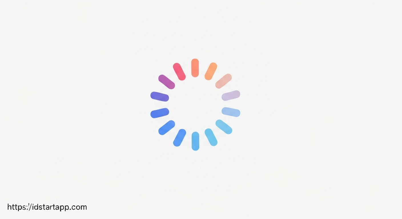

Flutter Animated Rotating Icon for Loading Indicators
Loading indicators are crucial for enhancing user experience in mobile applications. They provide visual feedback, assuring users that an action is in progress and preventing frustration. While Flutter offers standard progress indicators, creating a custom animated rotating icon can add a unique touch and better align with your app's branding. This article will guide you through building a professional, continuously rotating icon animation in Flutter, perfect for signaling loading states.
Why Custom Animated Loading Indicators?
Standard CircularProgressIndicator and LinearProgressIndicator are functional, but a custom animation, like a rotating gear or refresh icon, can:
- Improve brand consistency.
- Provide more engaging user feedback.
- Offer a more intuitive representation of data fetching or processing.
Core Concepts: Animation in Flutter
Flutter's animation system is powerful and flexible. For a continuous rotating animation, we will leverage:
AnimationController: Manages the animation's state, starting, stopping, and repeating.Tween: Defines the range of values an animation can animate between (e.g., 0 to 2π for a full rotation).RotationTransition: A widget that applies a rotation transformation to its child based on anAnimation<double>.
Implementing a Rotating Icon Animation
Step 1: Setup a Stateful Widget
Since our animation needs to manage its state (controller, animation values), we'll start with a StatefulWidget.
Step 2: Initialize Animation Controller
In the initState method, we'll set up our AnimationController to repeat indefinitely. The controller will generate values from 0.0 to 1.0 over its duration, which directly maps to a full turn in RotationTransition.
Step 3: Build the Animation with RotationTransition
RotationTransition is a convenient widget that takes an Animation<double> and applies a rotation transformation to its child. Its turns property expects values from 0.0 to 1.0, representing a full turn. Our AnimationController naturally provides values in this range when using .repeat(), so we can pass it directly.
Step 4: Dispose the Controller
It's crucial to dispose of the AnimationController when the widget is removed from the widget tree to prevent memory leaks. This is done in the dispose method.
Complete Code Example
Below is a complete Flutter widget demonstrating a rotating "refresh" icon suitable for a loading indicator.
import 'package:flutter/material.dart';

class RotatingLoadingIcon extends StatefulWidget {
  final IconData icon;
  final Color? iconColor;
  final double iconSize;
  final Duration duration;

  const RotatingLoadingIcon({
    Key? key,
    this.icon = Icons.refresh,
    this.iconColor,
    this.iconSize = 24.0,
    this.duration = const Duration(seconds: 1),
  }) : super(key: key);

  @override
  State<RotatingLoadingIcon> createState() => _RotatingLoadingIconState();
}

class _RotatingLoadingIconState extends State<RotatingLoadingIcon>
    with SingleTickerProviderStateMixin {
  late AnimationController _controller;

  @override
  void initState() {
    super.initState();
    _controller = AnimationController(
      vsync: this,
      duration: widget.duration,
    )..repeat(); // Makes the animation repeat indefinitely
  }

  @override
  void dispose() {
    _controller.dispose();
    super.dispose();
  }

  @override
  Widget build(BuildContext context) {
    return RotationTransition(
      turns: _controller, // Directly use the controller for 0.0-1.0 turns
      child: Icon(
        widget.icon,
        size: widget.iconSize,
        color: widget.iconColor ?? Theme.of(context).colorScheme.primary,
      ),
    );
  }
}

// How to use it in your app:
class MyApp extends StatelessWidget {
  const MyApp({Key? key}) : super(key: key);

  @override
  Widget build(BuildContext context) {
    return MaterialApp(
      title: 'Flutter Loading Icon Demo',
      theme: ThemeData(
        primarySwatch: Colors.blue,
      ),
      home: Scaffold(
        appBar: AppBar(title: const Text('Loading Icon Demo')),
        body: Center(
          child: Column(
            mainAxisAlignment: MainAxisAlignment.center,
            children: const [
              Text('Loading data...', style: TextStyle(fontSize: 18)),
              SizedBox(height: 20),
              RotatingLoadingIcon(),
              SizedBox(height: 40),
              Text('Fetching updates...', style: TextStyle(fontSize: 18)),
              SizedBox(height: 20),
              RotatingLoadingIcon(
                icon: Icons.settings,
                iconSize: 48.0,
                duration: Duration(seconds: 2),
                iconColor: Colors.deepPurple,
              ),
              SizedBox(height: 40),
              Text('Processing...', style: TextStyle(fontSize: 18)),
              SizedBox(height: 20),
              RotatingLoadingIcon(
                icon: Icons.sync,
                iconSize: 32.0,
                duration: Duration(milliseconds: 700),
                iconColor: Colors.green,
              ),
            ],
          ),
        ),
      ),
    );
  }
}

void main() {
  runApp(const MyApp());
}
Code Explanation
RotatingLoadingIcon extends StatefulWidget: This defines the widget itself, allowing for internal state management necessary for animations.with SingleTickerProviderStateMixin: This mixin provides thevsyncobject, a required parameter forAnimationController. It helps Flutter optimize resource usage by preventing animations from running when they are not visible.late AnimationController _controller;: Declares the animation controller, which will manage the animation's progress.initState():- Initializes
_controller. We passthisas thevsync. duration: widget.durationsets the time for one full rotation (defaulting to 1 second)...repeat()is chained to make the animation loop continuously from 0.0 to 1.0 (a full turn) and back, until explicitly stopped or disposed.
- Initializes
dispose(): This method is crucial for memory management. It ensures that the_controlleris properly released when the widget is removed from the widget tree, preventing memory leaks.RotationTransition:- Its
turnsproperty directly takes the_controller. SinceAnimationControlleranimates from 0.0 to 1.0 by default when using.repeat(), this perfectly represents a full 0 to 360-degree rotation. - The
childproperty is a standardIconwidget, which can be customized withwidget.icon,widget.iconSize, andwidget.iconColor.
- Its
Customization and Best Practices
- Icon: Easily change
widget.iconto anyIconsconstant (e.g.,Icons.sync,Icons.hourglass_empty,Icons.settings) to match your app's context. - Speed: Adjust
widget.durationto control how fast the icon rotates. A shorter duration results in a faster rotation. - Size and Color: Utilize
widget.iconSizeandwidget.iconColorfor precise styling to fit your UI. By default, it uses the primary color from your app's theme. - Conditional Display: In a real-world scenario, you would typically show this loading icon conditionally based on a boolean state variable (e.g.,
_isLoading) that reflects the actual loading status. - Accessibility: While visually engaging, consider adding accessibility labels (e.g., using Flutter's
Semanticswidget) for screen readers to inform users with visual impairments about the loading state, enhancing inclusivity.
Conclusion
Creating a custom rotating icon for your loading indicators in Flutter is a straightforward process that significantly enhances user experience and app aesthetics. By leveraging Flutter's powerful animation framework with AnimationController and RotationTransition, you can easily implement engaging visual feedback while maintaining a professional and consistent brand identity.


