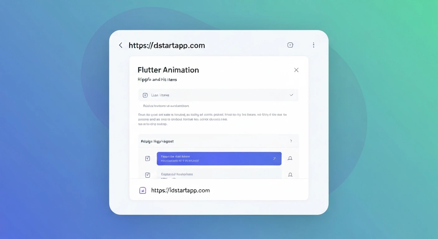

Enhancing User Experience with Ripple & Highlight Animations in Flutter List Items
In modern user interface design, subtle visual feedback plays a crucial role in creating an intuitive and engaging user experience. Animations like ripple effects and highlights inform users that their interaction has been registered, making an app feel more responsive and polished. Flutter, with its declarative UI and powerful animation capabilities, makes implementing these effects straightforward, especially for list items.
Understanding Ripple Effects
A ripple effect, characteristic of Material Design, provides a visual expanding circle (ink splash) originating from the point of touch when a user interacts with a tappable area. In Flutter, the primary widget for implementing this is
InkWellBasic Ripple with InkWell
InkWellonTap
import 'package:flutter/material.dart';

class BasicRippleExample extends StatelessWidget {
  @override
  Widget build(BuildContext context) {
    return Scaffold(
      appBar: AppBar(title: Text('Basic Ripple Example')),
      body: Center(
        child: InkWell(
          onTap: () {
            print('Basic InkWell tapped!');
          },
          child: Container(
            padding: EdgeInsets.all(20),
            decoration: BoxDecoration(
              border: Border.all(color: Colors.grey),
              borderRadius: BorderRadius.circular(8),
            ),
            child: Text(
              'Tap Me for Ripple',
              style: TextStyle(fontSize: 18),
            ),
          ),
        ),
      ),
    );
  }
}
Customizing the Ripple Effect
InkWellsplashColorhighlightColorborderRadiussplashFactory
: The color of the ripple effect itself.splashColor
: The color of the highlight that appears when the user presses down on the InkWell, before the ripple spreads.highlightColor
: Defines the shape of the ink splash if the wrapped child has a non-rectangular shape.borderRadius
: Determines the visual behavior of the ink splash, e.g.,splashFactory
orInkRipple.splashFactory
.InkSparkle.splashFactory
import 'package:flutter/material.dart';

class CustomRippleExample extends StatelessWidget {
  @override
  Widget build(BuildContext context) {
    return Scaffold(
      appBar: AppBar(title: Text('Custom Ripple Example')),
      body: Center(
        child: InkWell(
          onTap: () {
            print('Custom InkWell tapped!');
          },
          splashColor: Colors.purple.withOpacity(0.5),
          highlightColor: Colors.deepPurple.withOpacity(0.2),
          borderRadius: BorderRadius.circular(10),
          child: Container(
            padding: EdgeInsets.all(20),
            decoration: BoxDecoration(
              color: Colors.blue.shade50,
              borderRadius: BorderRadius.circular(10),
            ),
            child: Text(
              'Tap Me for Custom Ripple',
              style: TextStyle(fontSize: 18, color: Colors.blue.shade900),
            ),
          ),
        ),
      ),
    );
  }
}
Implementing a Highlight Effect
A highlight effect typically involves a temporary change in the background color of a list item when it's tapped. This provides immediate visual feedback, often used to indicate a momentary selection or active state. Unlike
InkWellhighlightColorWe can achieve this using a
StatefulWidgetAnimatedContainerFuture.delayed
import 'package:flutter/material.dart';
import 'dart:async';

class HighlightListItem extends StatefulWidget {
  final String title;
  final VoidCallback? onTap;

  HighlightListItem({required this.title, this.onTap});

  @override
  _HighlightListItemState createState() => _HighlightListItemState();
}

class _HighlightListItemState extends State {
  bool _isHighlighted = false;

  void _handleTap() {
    setState(() {
      _isHighlighted = true;
    });
    // Remove highlight after a short delay
    Future.delayed(Duration(milliseconds: 300), () {
      if (mounted) {
        setState(() {
          _isHighlighted = false;
        });
      }
    });
    widget.onTap?.call();
    print('${widget.title} highlighted and tapped!');
  }

  @override
  Widget build(BuildContext context) {
    return GestureDetector( // Using GestureDetector for tap detection
      onTap: _handleTap,
      child: AnimatedContainer(
        duration: Duration(milliseconds: 150),
        curve: Curves.easeOut,
        color: _isHighlighted
            ? Theme.of(context).colorScheme.primary.withOpacity(0.1)
            : Colors.transparent,
        padding: EdgeInsets.symmetric(horizontal: 16, vertical: 12),
        alignment: Alignment.centerLeft,
        child: Text(
          widget.title,
          style: TextStyle(fontSize: 16, color: Colors.black87),
        ),
      ),
    );
  }
}
Combining Ripple and Highlight Effects in List Items
To provide a rich interactive experience, we can combine both ripple and highlight effects. The
InkWellAnimatedContainer
import 'package:flutter/material.dart';
import 'dart:async';

class CombinedEffectListItem extends StatefulWidget {
  final String title;

  CombinedEffectListItem({required this.title});

  @override
  _CombinedEffectListItemState createState() => _CombinedEffectListItemState();
}

class _CombinedEffectListItemState extends State {
  bool _isHighlighted = false;

  void _onTap() {
    setState(() {
      _isHighlighted = true;
    });
    Future.delayed(Duration(milliseconds: 300), () {
      if (mounted) {
        setState(() {
          _isHighlighted = false;
        });
      }
    });
    print('${widget.title} tapped, showing ripple and highlight!');
  }

  @override
  Widget build(BuildContext context) {
    return InkWell(
      onTap: _onTap,
      // Ripple specific properties
      splashColor: Theme.of(context).colorScheme.primary.withOpacity(0.3),
      highlightColor: Colors.transparent, // Let AnimatedContainer handle highlight color
      borderRadius: BorderRadius.circular(0), // No border radius for the list item
      child: AnimatedContainer(
        duration: Duration(milliseconds: 150),
        curve: Curves.easeOut,
        color: _isHighlighted
            ? Theme.of(context).colorScheme.primary.withOpacity(0.1)
            : Colors.transparent,
        padding: EdgeInsets.symmetric(horizontal: 16, vertical: 12),
        alignment: Alignment.centerLeft,
        child: Text(
          widget.title,
          style: TextStyle(fontSize: 16, color: Colors.black87),
        ),
      ),
    );
  }
}

class CombinedEffectsDemo extends StatelessWidget {
  @override
  Widget build(BuildContext context) {
    return Scaffold(
      appBar: AppBar(title: Text('Combined Ripple & Highlight Demo')),
      body: ListView.builder(
        itemCount: 15,
        itemBuilder: (context, index) {
          return Column(
            children: [
              CombinedEffectListItem(title: 'List Item ${index + 1}'),
              Divider(height: 1), // Optional: for visual separation
            ],
          );
        },
      ),
    );
  }
}
Best Practices and Considerations
-
Performance
While Flutter is highly optimized, be mindful of complex animations, especially within long lists. Keep animation durations short (
) to maintain a fluid user experience.100-300ms -
Material Design Guidelines
Adhering to Material Design principles ensures consistency and familiarity for users. Ripples are a core part of Material Design interactivity.
-
Accessibility
Ensure that visual feedback is clear and, where appropriate, consider adding semantic descriptions for users who rely on accessibility services.
-
Theming
Always use
orTheme.of(context).colorScheme
for colors to ensure your animations adapt seamlessly to your app's overall theme.Theme.of(context).splashColor -
State Management
For simple highlight effects, managing state within the list item's
is sufficient. For more complex scenarios, like multi-selection or global state changes, consider using a dedicated state management solution (e.g., Provider, BLoC, Riverpod).StatefulWidget
Conclusion
Implementing ripple and highlight animations in Flutter list items is a powerful way to enhance user interaction and make your application feel more professional and responsive. By leveraging widgets like
InkWellAnimatedContainer


