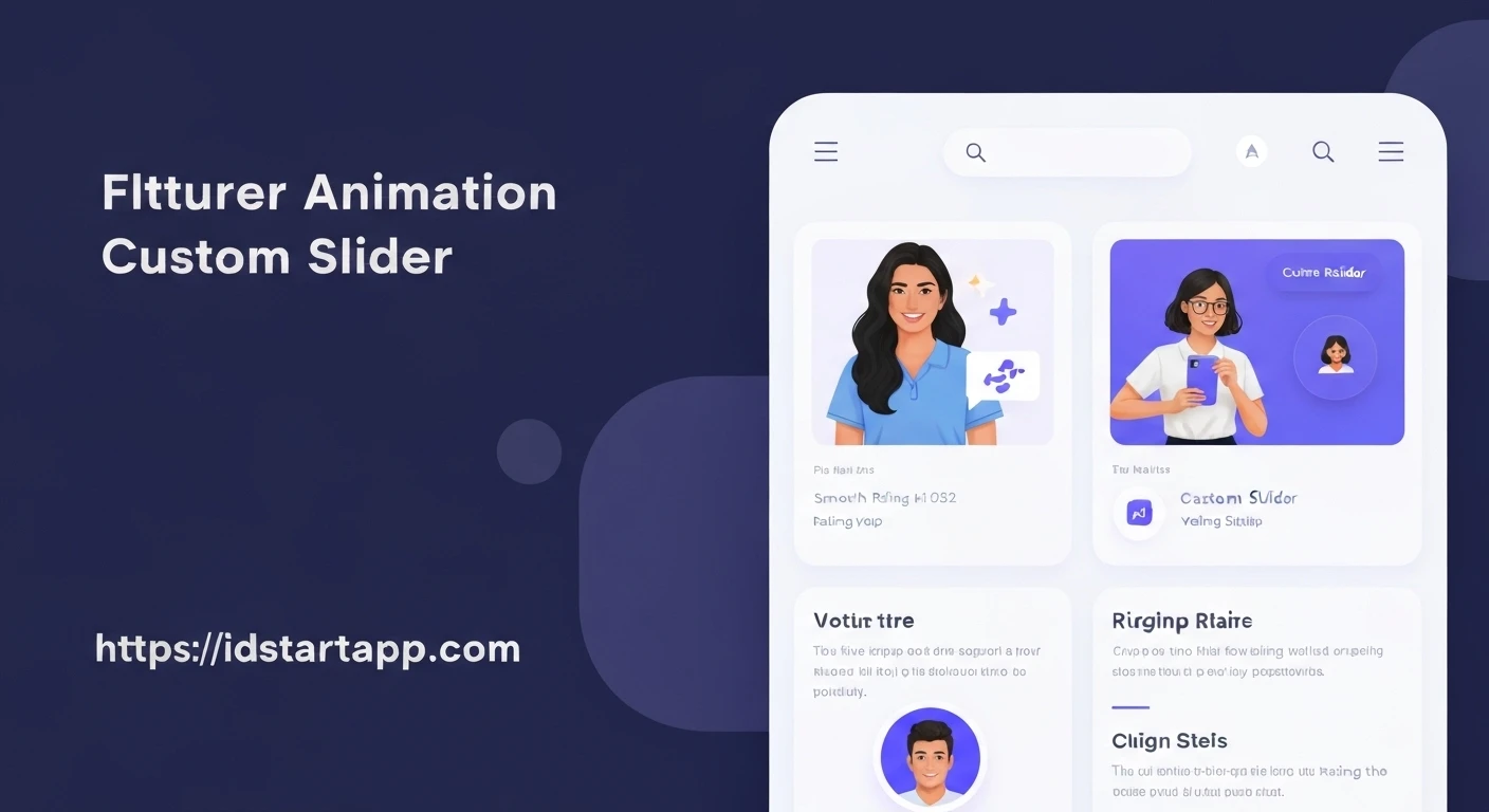

Custom Animated Slider in Flutter for Rating Apps
Sliders are a common UI element, especially in rating applications where users need to provide a numerical score or select a level of satisfaction. While Flutter provides a powerful built-in Slider widget, creating a custom, animated slider can significantly enhance the user experience, making the interaction more intuitive and engaging.
Why Custom Animated Sliders?
A standard slider gets the job done, but a custom animated one offers several advantages:
- Enhanced User Experience: Smooth animations provide visual feedback, making the app feel more responsive and polished.
- Brand Consistency: Customize the look and feel to perfectly match your application's design language.
- Unique Interactions: Implement bespoke animations (e.g., a "bounce" on selection, a "glow" when hovered, or a custom thumb icon change) that set your app apart.
- Clarity and Engagement: Animations can draw attention to the selected value or guide the user's interaction flow.
Flutter's declarative UI and robust animation framework make it an excellent choice for building such custom components with relative ease.
Core Concepts and Implementation
Building a custom animated slider involves several steps, primarily focusing on styling the Slider widget and then integrating animation controllers for dynamic effects.
1. Basic Flutter Slider
First, let's start with a basic Slider widget. This serves as the foundation upon which we will build our custom features.
import 'package:flutter/material.dart';

void main() {
  runApp(MyApp());
}

class MyApp extends StatelessWidget {
  @override
  Widget build(BuildContext context) {
    return MaterialApp(
      title: 'Rating App',
      theme: ThemeData(
        primarySwatch: Colors.blue,
        visualDensity: VisualDensity.adaptivePlatformDensity,
      ),
      home: RatingSliderScreen(),
    );
  }
}

class RatingSliderScreen extends StatefulWidget {
  @override
  _RatingSliderScreenState createState() => _RatingSliderScreenState();
}

class _RatingSliderScreenState extends State {
  double _currentRating = 3.0;

  @override
  Widget build(BuildContext context) {
    return Scaffold(
      appBar: AppBar(
        title: Text('Rate Your Experience'),
      ),
      body: Center(
        child: Column(
          mainAxisAlignment: MainAxisAlignment.center,
          children: [
            Text(
              'Rating: ${_currentRating.toInt()}',
              style: TextStyle(fontSize: 24, fontWeight: FontWeight.bold),
            ),
            SizedBox(height: 20),
            Slider(
              value: _currentRating,
              min: 1.0,
              max: 5.0,
              divisions: 4, // For discrete values: 1, 2, 3, 4, 5
              label: _currentRating.round().toString(),
              onChanged: (double value) {
                setState(() {
                  _currentRating = value;
                });
              },
            ),
          ],
        ),
      ),
    );
  }
}
2. Customizing Slider Appearance
Flutter's SliderTheme widget and the SliderThemeData class allow extensive customization of the slider's visual elements, such as the thumb, track, and active/inactive colors. For a truly custom thumb, you might create a custom SliderComponentShape.
Custom Thumb Shape Example
Let's create a custom circular thumb with a border.
import 'package:flutter/material.dart';

// ... (Previous main and MyApp widgets omitted for brevity)

class CustomSliderThumbShape extends SliderComponentShape {
  final double thumbRadius;
  final Color borderColor;
  final double borderWidth;

  CustomSliderThumbShape({
    this.thumbRadius = 10.0,
    this.borderColor = Colors.white,
    this.borderWidth = 2.0,
  });

  @override
  Size getPreferredSize(bool isEnabled, bool isDiscrete) {
    return Size.fromRadius(thumbRadius);
  }

  @override
  void paint(
    PaintingContext context,
    Offset center, {
    required Animation activationAnimation,
    required Animation enableAnimation,
    required bool isPressed,
    required TextDirection textDirection,
    required SliderThemeData sliderTheme,
    required int? additionalActiveTrackSegmentStart,
    required int? additionalActiveTrackSegmentEnd,
    required double value, // The value of the slider
    required double textScaleFactor,
    required Size sizeWithConstraints,
  }) {
    final Canvas canvas = context.canvas;
    final Paint fillPaint = Paint()
      ..color = sliderTheme.thumbColor ?? Colors.blue
      ..style = PaintingStyle.fill;
    final Paint borderPaint = Paint()
      ..color = borderColor
      ..strokeWidth = borderWidth
      ..style = PaintingStyle.stroke;

    canvas.drawCircle(center, thumbRadius, fillPaint);
    canvas.drawCircle(center, thumbRadius, borderPaint);
  }
}

class RatingSliderScreen extends StatefulWidget {
  @override
  _RatingSliderScreenState createState() => _RatingSliderScreenState();
}

class _RatingSliderScreenState extends State {
  double _currentRating = 3.0;

  @override
  Widget build(BuildContext context) {
    return Scaffold(
      appBar: AppBar(
        title: Text('Rate Your Experience'),
      ),
      body: Center(
        child: Column(
          mainAxisAlignment: MainAxisAlignment.center,
          children: [
            Text(
              'Rating: ${_currentRating.toInt()}',
              style: TextStyle(fontSize: 24, fontWeight: FontWeight.bold),
            ),
            SizedBox(height: 20),
            // Apply custom theme
            SliderTheme(
              data: SliderTheme.of(context).copyWith(
                thumbShape: CustomSliderThumbShape(
                  thumbRadius: 15.0,
                  borderColor: Colors.deepPurple,
                  borderWidth: 3.0,
                ),
                activeTrackColor: Colors.deepPurple,
                inactiveTrackColor: Colors.deepPurple.withOpacity(0.3),
                overlayColor: Colors.deepPurple.withOpacity(0.2), // Color when thumb is hovered/pressed
                thumbColor: Colors.deepPurpleAccent,
                valueIndicatorColor: Colors.deepPurpleAccent,
                valueIndicatorTextStyle: TextStyle(color: Colors.white),
              ),
              child: Slider(
                value: _currentRating,
                min: 1.0,
                max: 5.0,
                divisions: 4,
                label: _currentRating.round().toString(),
                onChanged: (double value) {
                  setState(() {
                    _currentRating = value;
                  });
                },
              ),
            ),
          ],
        ),
      ),
    );
  }
}
3. Adding Custom Animations
To add animation, we can leverage Flutter's AnimationController and Tween classes. A common animation for sliders is to make the thumb grow or change color when its value changes. For this example, let's animate the thumb's size slightly when the rating changes.
This requires converting our _RatingSliderScreenState to include an AnimationController and mixing in SingleTickerProviderStateMixin.
import 'package:flutter/material.dart';

// ... CustomSliderThumbShape as defined above ...

class RatingSliderScreen extends StatefulWidget {
  @override
  _RatingSliderScreenState createState() => _RatingSliderScreenState();
}

class _RatingSliderScreenState extends State with SingleTickerProviderStateMixin {
  double _currentRating = 3.0;
  late AnimationController _animationController;
  late Animation _thumbSizeAnimation;

  @override
  void initState() {
    super.initState();
    _animationController = AnimationController(
      duration: const Duration(milliseconds: 200),
      vsync: this,
    );
    // Animate thumb radius from 1.0x to 1.2x its original size
    _thumbSizeAnimation = Tween(begin: 1.0, end: 1.2).animate(
      CurvedAnimation(
        parent: _animationController,
        curve: Curves.easeOut,
      ),
    );
  }

  @override
  void dispose() {
    _animationController.dispose();
    super.dispose();
  }

  void _onRatingChanged(double value) {
    setState(() {
      _currentRating = value;
    });
    // Trigger the animation to run when the value changes
    _animationController.forward(from: 0.0); // Resets and starts the animation
  }

  @override
  Widget build(BuildContext context) {
    return Scaffold(
      appBar: AppBar(
        title: Text('Rate Your Experience'),
      ),
      body: Center(
        child: Column(
          mainAxisAlignment: MainAxisAlignment.center,
          children: [
            Text(
              'Rating: ${_currentRating.toInt()}',
              style: TextStyle(fontSize: 24, fontWeight: FontWeight.bold),
            ),
            SizedBox(height: 20),
            // Use AnimatedBuilder to rebuild only the animated parts
            AnimatedBuilder(
              animation: _thumbSizeAnimation,
              builder: (context, child) {
                return SliderTheme(
                  data: SliderTheme.of(context).copyWith(
                    thumbShape: CustomSliderThumbShape(
                      // Apply the animated value to the thumbRadius
                      thumbRadius: 15.0 * _thumbSizeAnimation.value,
                      borderColor: Colors.deepPurple,
                      borderWidth: 3.0,
                    ),
                    activeTrackColor: Colors.deepPurple,
                    inactiveTrackColor: Colors.deepPurple.withOpacity(0.3),
                    overlayColor: Colors.deepPurple.withOpacity(0.2),
                    thumbColor: Colors.deepPurpleAccent,
                    valueIndicatorColor: Colors.deepPurpleAccent,
                    valueIndicatorTextStyle: TextStyle(color: Colors.white),
                  ),
                  child: Slider(
                    value: _currentRating,
                    min: 1.0,
                    max: 5.0,
                    divisions: 4,
                    label: _currentRating.round().toString(),
                    onChanged: _onRatingChanged, // Use our custom handler
                  ),
                );
              },
            ),
          ],
        ),
      ),
    );
  }
}
4. Further Enhancements
Beyond basic styling and simple animations, you can push the boundaries further:
- Feedback on Drag: Animate the thumb size or color dynamically as the user drags it (e.g., using `GestureDetector` around the slider or modifying `CustomSliderThumbShape` to react to `isPressed`).
- Icon Changes: For rating apps, you might want to change the icon inside the thumb (e.g., a star emoji or custom icon) based on the
_currentRatingvalue. This would require drawing an icon in your `CustomSliderThumbShape`'spaintmethod. - Haptic Feedback: Add
HapticFeedback.lightImpact()when the slider snaps to a division to enhance the tactile experience. - Custom Track: Extend
SliderTrackShapeto draw a completely custom track, perhaps with segments of different colors corresponding to rating ranges. - Tooltip Animation: Animate the value indicator (tooltip) as it appears and disappears, or change its background color dynamically.
Conclusion
Custom animated sliders in Flutter offer a powerful way to enhance user interaction and elevate the visual appeal of rating applications. By combining Flutter's flexible widget system, SliderTheme, custom SliderComponentShape implementations, and its robust animation framework, developers can craft truly unique and engaging UI elements that stand out. Experiment with different animation curves, durations, and visual styles to create an experience that perfectly fits your application's brand and delight your users.


