
Creating a Flutter Animated Slide-Up Panel for a Music Player with Control Buttons
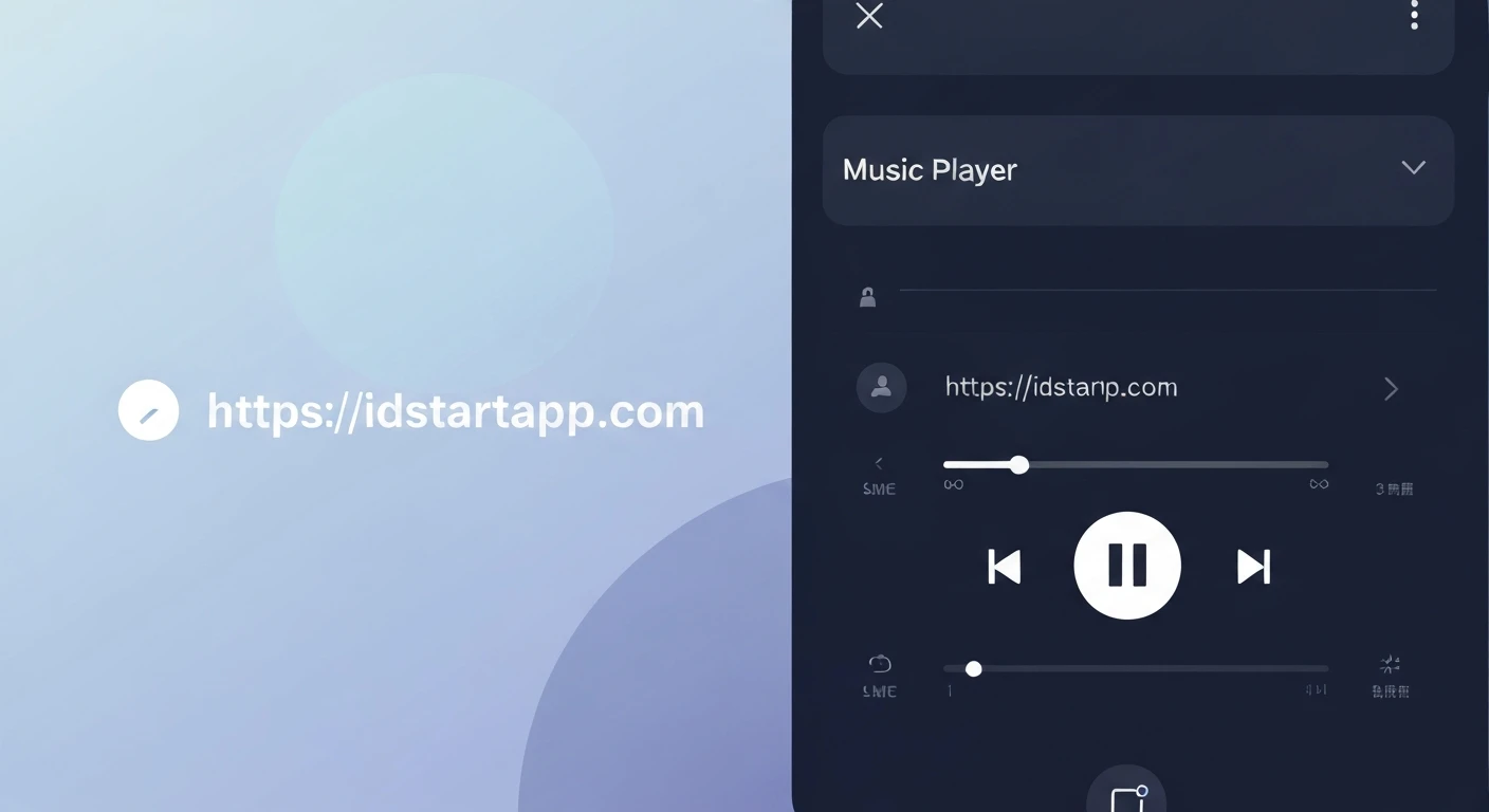
Modern music player applications often feature a sophisticated user interface that includes a mini-player bar at the bottom, which can be expanded into a full-screen player. This interactive design offers convenience and a rich user experience. This article will guide you through creating such an animated slide-up panel in Flutter, complete with essential control buttons like play, pause, next, and previous.
We'll leverage Flutter's powerful animation capabilities and flexible widget tree to build a seamless and interactive music playback experience that responds intuitively to user gestures.
Understanding the Core Components
The Slide-Up Panel Mechanism
For a draggable and resizable slide-up panel, Flutter provides the DraggableScrollableSheet widget. This widget is ideal because it automatically handles drag gestures and adjusts its size based on user interaction, allowing it to snap to different "snaps" or positions (e.g., collapsed mini-player, expanded full-player). It inherently offers smooth animation as the user drags.
Alternatively, for highly customized animation paths or specific non-scrollable interactions, a custom animation using AnimatedBuilder and an AnimationController could be used. However, for a standard draggable panel, DraggableScrollableSheet is often the more straightforward and performant choice.
Animation Fundamentals
While DraggableScrollableSheet handles much of the panel's animation internally, understanding basic Flutter animations is beneficial for implementing subtle effects within the panel itself. Key classes include:
AnimationController: Manages the animation's state, including starting, stopping, and reversing.Tween: Defines the range of values an animation can produce (e.g., 0.0 to 1.0 for opacity, or specific pixel values).CurvedAnimation: Applies a non-linear curve to an animation, making transitions feel more natural and fluid.
Music Player Control Buttons
The core functionality of any music player relies on its control buttons. We'll implement standard play/pause, next, and previous buttons using Flutter's IconButton widgets, typically arranged in a Row for horizontal alignment and easy interaction.
Implementation Steps
1. Project Setup
No special dependencies beyond the standard Flutter SDK are required for this implementation. Ensure you have a basic Flutter project ready.
2. Main Screen Layout with a Draggable Panel
We'll embed our music player panel within a Scaffold using a Stack widget. The Stack allows us to layer widgets on top of each other, with the DraggableScrollableSheet appearing above the main content of your app (e.g., a list of songs or albums).
import 'package:flutter/material.dart';
void main() {
runApp(const MyApp());
}
class MyApp extends StatelessWidget {
const MyApp({super.key});
@override
Widget build(BuildContext context) {
return MaterialApp(
title: 'Music Player',
theme: ThemeData(
primarySwatch: Colors.blue,
visualDensity: VisualDensity.adaptivePlatformDensity,
brightness: Brightness.dark, // Dark theme for a music player feel
),
home: const MusicPlayerScreen(),
);
}
}
class MusicPlayerScreen extends StatefulWidget {
const MusicPlayerScreen({super.key});
@override
State createState() => _MusicPlayerScreenState();
}
class _MusicPlayerScreenState extends State {
// Example state for music playback
bool _isPlaying = false;
String _currentSongTitle = "Flutter Anthem";
String _currentArtist = "The Dart Devs";
// Placeholder for current album art URL or asset path
String _albumArtUrl = "https://via.placeholder.com/200";
void _togglePlayPause() {
setState(() {
_isPlaying = !_isPlaying;
});
// In a real app, this would control actual music playback.
debugPrint("Play/Pause toggled. Is playing: $_isPlaying");
}
void _playNext() {
debugPrint("Playing next song.");
setState(() {
_currentSongTitle = "Next Hit Single";
_currentArtist = "Flutter Stars";
_albumArtUrl = "https://via.placeholder.com/200/FF0000/FFFFFF?text=Next"; // Example art change
_isPlaying = true;
});
}
void _playPrevious() {
debugPrint("Playing previous song.");
setState(() {
_currentSongTitle = "Old School Jam";
_currentArtist = "Dart Legends";
_albumArtUrl = "https://via.placeholder.com/200/00FF00/FFFFFF?text=Prev"; // Example art change
_isPlaying = true;
});
}
@override
Widget build(BuildContext context) {
return Scaffold(
appBar: AppBar(
title: const Text('My Music App'),
backgroundColor: Colors.blueGrey[900],
),
body: Stack(
children: [
// Main content of your app (e.g., a list of albums/songs)
Center(
child: Column(
mainAxisAlignment: MainAxisAlignment.center,
children: [
const Text(
'Your Main Content Here',
style: TextStyle(fontSize: 24, color: Colors.white70),
),
const SizedBox(height: 20),
ElevatedButton(
onPressed: () {
// Simulate playing a song from the main list
setState(() {
_currentSongTitle = "Flutter Love Song";
_currentArtist = "Widgets Band";
_albumArtUrl = "https://via.placeholder.com/200/0000FF/FFFFFF?text=Love"; // Example art change
_isPlaying = true;
});
},
style: ElevatedButton.styleFrom(
backgroundColor: Colors.cyan,
foregroundColor: Colors.black,
padding: const EdgeInsets.symmetric(horizontal: 30, vertical: 15),
textStyle: const TextStyle(fontSize: 18),
),
child: const Text("Start Playing Music"),
),
],
),
),
// The DraggableScrollableSheet for the music player panel
DraggableScrollableSheet(
initialChildSize: 0.1, // Initial height (e.g., mini-player)
minChildSize: 0.1, // Minimum height when collapsed
maxChildSize: 0.9, // Maximum height when fully expanded
snapSizes: const [0.1, 0.4, 0.9], // Optional snap points
builder: (BuildContext context, ScrollController scrollController) {
return Container(
decoration: BoxDecoration(
color: Colors.blueGrey[800], // Darker background for the panel
borderRadius: const BorderRadius.vertical(top: Radius.circular(20)),
boxShadow: [
BoxShadow(
color: Colors.black.withOpacity(0.5),
blurRadius: 15,
spreadRadius: 2,
),
],
),
child: SingleChildScrollView(
controller: scrollController,
child: Column(
children: [
// Drag handle
Padding(
padding: const EdgeInsets.symmetric(vertical: 8.0),
child: Container(
width: 40,
height: 5,
decoration: BoxDecoration(
color: Colors.white.withOpacity(0.6),
borderRadius: BorderRadius.circular(5),
),
),
),
// Mini-player view (always visible at the top of the panel)
Padding(
padding: const EdgeInsets.symmetric(horizontal: 16.0, vertical: 8.0),
child: Row(
children: [
ClipRRect(
borderRadius: BorderRadius.circular(8.0),
child: Image.network(
_albumArtUrl,
height: 50,
width: 50,
fit: BoxFit.cover,
errorBuilder: (context, error, stackTrace) => Container(
height: 50, width: 50, color: Colors.grey,
child: const Icon(Icons.broken_image, color: Colors.white),
),
),
),
const SizedBox(width: 15),
Expanded(
child: Column(
crossAxisAlignment: CrossAxisAlignment.start,
children: [
Text(
_currentSongTitle,
style: const TextStyle(color: Colors.white, fontSize: 16, fontWeight: FontWeight.bold),
overflow: TextOverflow.ellipsis,
),
Text(
_currentArtist,
style: TextStyle(color: Colors.white.withOpacity(0.7), fontSize: 14),
overflow: TextOverflow.ellipsis,
),
],
),
),
IconButton(
icon: Icon(
_isPlaying ? Icons.pause_circle_filled : Icons.play_circle_filled,
color: Colors.white,
size: 36,
),
onPressed: _togglePlayPause,
),
],
),
),
// Full player details (becomes visible as panel expands)
// Using a LayoutBuilder here could make elements visible based on sheet size,
// but for simplicity, they are always rendered within the SingleChildScrollView.
// Their full appearance depends on the sheet's expansion.
Padding(
padding: const EdgeInsets.all(16.0),
child: Column(
children: [
const SizedBox(height: 20),
ClipRRect(
borderRadius: BorderRadius.circular(15.0),
child: Image.network(
_albumArtUrl,
height: 250,
width: 250,
fit: BoxFit.cover,
errorBuilder: (context, error, stackTrace) => Container(
height: 250, width: 250, color: Colors.grey[700],
child: const Icon(Icons.broken_image, color: Colors.white, size: 80),
),
),
),
const SizedBox(height: 30),
Text(
_currentSongTitle,
style: const TextStyle(color: Colors.white, fontSize: 28, fontWeight: FontWeight.bold),
textAlign: TextAlign.center,
),
const SizedBox(height: 5),
Text(
_currentArtist,
style: TextStyle(color: Colors.white.withOpacity(0.7), fontSize: 18),
textAlign: TextAlign.center,
),
const SizedBox(height: 30),
// Progress bar (dummy)
LinearProgressIndicator(
value: 0.4, // Example progress
valueColor: const AlwaysStoppedAnimation(Colors.cyanAccent),
backgroundColor: Colors.white.withOpacity(0.3),
),
const SizedBox(height: 5),
Padding(
padding: const EdgeInsets.symmetric(horizontal: 4.0),
child: Row(
mainAxisAlignment: MainAxisAlignment.spaceBetween,
children: [
Text('1:23', style: TextStyle(color: Colors.white.withOpacity(0.6))),
Text('3:45', style: TextStyle(color: Colors.white.withOpacity(0.6))),
],
),
),
const SizedBox(height: 30),
// Control Buttons for full player
Row(
mainAxisAlignment: MainAxisAlignment.spaceEvenly,
children: [
IconButton(
icon: const Icon(Icons.skip_previous, color: Colors.white, size: 48),
onPressed: _playPrevious,
),
IconButton(
icon: Icon(
_isPlaying ? Icons.pause_circle_filled : Icons.play_circle_filled,
color: Colors.white,
size: 72, // Larger button for main play/pause
),
onPressed: _togglePlayPause,
),
IconButton(
icon: const Icon(Icons.skip_next, color: Colors.white, size: 48),
onPressed: _playNext,
),
],
),
const SizedBox(height: 80), // Extra space to ensure scrollability
],
),
),
],
),
),
);
},
),
],
),
);
}
}
3. Explaining the Code
- The
MusicPlayerScreenis aStatefulWidgetused to manage the playback state (_isPlaying,_currentSongTitle, etc.). - Inside the
Scaffold'sbody, aStackwidget holds the main app content (background) and theDraggableScrollableSheet(foreground panel). DraggableScrollableSheetis configured withinitialChildSize,minChildSize, andmaxChildSizeto define its initial, minimum (collapsed), and maximum (expanded) heights. The optionalsnapSizesproperty allows the sheet to automatically snap to predefined heights.- Its
buildermethod provides aScrollController, which is then passed to aSingleChildScrollViewinside the panel. This integration is crucial for the panel's content to be scrollable when the panel is expanded, allowing the user to view all content without clipping. - The panel's UI is designed with a drag handle, a compact mini-player bar (always visible at the top of the panel), and full player details (which become fully visible and interactive as the panel is expanded).
IconButtonwidgets are used for play/pause, next, and previous controls. The play/pause icon dynamically changes based on the_isPlayingstate.Image.networkis used for album art, with anerrorBuilderfor graceful fallback if the image fails to load.- Simple `debugPrint` statements and state updates simulate the music player's functionality. In a real application, these would interact with an audio playback service.
Conclusion
By combining Flutter's DraggableScrollableSheet with standard UI widgets and reactive state management, we can effectively create an animated slide-up panel for a music player. This pattern provides a flexible and engaging user experience, allowing users to control playback from a compact mini-player or delve into full song details when desired. Further enhancements could include real-time progress bars, custom animation transitions for content within the panel (e.g., fading in album art as the panel expands), and robust integration with actual audio playback services.


