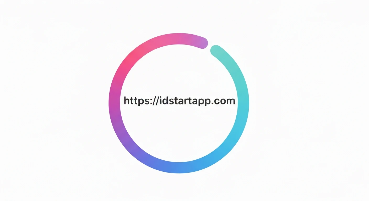

Creating a Dazzling Circular Loader Animation with Gradient & Rotation in Flutter
Circular loaders are ubiquitous in modern applications, providing visual feedback during asynchronous operations. While Flutter offers a default `CircularProgressIndicator`, creating a custom, visually rich loader with gradients and a captivating rotation can significantly enhance user experience. This article will guide you through building such a custom circular loader using Flutter's `CustomPainter` and `AnimationController`.
Key Concepts for Custom Loaders
To craft our custom loader, we'll leverage several core Flutter concepts:
1. CustomPainter
The backbone of our custom drawing. `CustomPainter` allows us to draw directly onto a canvas, giving us granular control over shapes, paths, and colors. We'll use it to draw an arc that forms our circular loader.
2. AnimationController
This class manages the animation. It controls whether an animation is running, paused, or stopped, and provides a value that changes over the animation's duration.
3. Tween
A `Tween` (short for "between") defines a range of values over which an animation should interpolate. For our loader, we'll primarily use `AnimationController`'s value, which implicitly acts like a `Tween
4. Gradients
Instead of a solid color, we'll apply a `SweepGradient` to our arc, creating a smooth transition between multiple colors around the circle. This adds a sophisticated visual touch.
5. Rotation
The entire loader will continuously rotate to give it an active, dynamic appearance. This will be achieved by wrapping our `CustomPaint` widget in a `Transform.rotate` widget and animating its angle.
Step-by-Step Implementation
1. Project Setup
Start by creating a new Flutter project:
flutter create gradient_circular_loader
cd gradient_circular_loader
2. Create the `CustomLoader` Widget
We'll create a `StatefulWidget` to manage the animation state. This widget will initialize and dispose of the `AnimationController`. Create a new file, e.g., `lib/custom_circular_loader.dart`.
import 'package:flutter/material.dart';
import 'dart:math' as math;

class CustomCircularLoader extends StatefulWidget {
  final double size;
  final double strokeWidth;
  final List gradientColors;
  final Duration duration;

  const CustomCircularLoader({
    Key? key,
    this.size = 100.0,
    this.strokeWidth = 10.0,
    this.gradientColors = const [Colors.blue, Colors.purple, Colors.red],
    this.duration = const Duration(milliseconds: 1500),
  }) : super(key: key);

  @override
  _CustomCircularLoaderState createState() => _CustomCircularLoaderState();
}

class _CustomCircularLoaderState extends State
    with SingleTickerProviderStateMixin {
  late AnimationController _controller;

  @override
  void initState() {
    super.initState();
    _controller = AnimationController(
      vsync: this,
      duration: widget.duration,
    )..repeat(); // Make the animation repeat indefinitely
  }

  @override
  void dispose() {
    _controller.dispose();
    super.dispose();
  }

  @override
  Widget build(BuildContext context) {
    return AnimatedBuilder(
      animation: _controller,
      builder: (context, child) {
        return Transform.rotate(
          angle: _controller.value * 2 * math.pi, // Rotate 360 degrees
          child: CustomPaint(
            size: Size(widget.size, widget.size),
            painter: _CircularLoaderPainter(
              sweepAngle: 3 * math.pi / 2, // An arc of 270 degrees
              strokeWidth: widget.strokeWidth,
              gradientColors: widget.gradientColors,
            ),
          ),
        );
      },
    );
  }
}
3. Implement the `_CircularLoaderPainter`
This `CustomPainter` subclass is where the drawing magic happens. It will draw an arc with a `SweepGradient`. Add this class to the same `lib/custom_circular_loader.dart` file.
class _CircularLoaderPainter extends CustomPainter {
  final double sweepAngle;
  final double strokeWidth;
  final List gradientColors;

  _CircularLoaderPainter({
    required this.sweepAngle,
    required this.strokeWidth,
    required this.gradientColors,
  });

  @override
  void paint(Canvas canvas, Size size) {
    final rect = Rect.fromLTWH(0, 0, size.width, size.height);

    // Create the gradient
    final gradient = SweepGradient(
      colors: gradientColors,
      startAngle: 0.0,
      endAngle: 2 * math.pi,
      tileMode: TileMode.clamp,
    );

    // Define the paint for the arc
    final paint = Paint()
      ..shader = gradient.createShader(rect) // Apply gradient to the paint
      ..strokeCap = StrokeCap.round // Rounded ends for the arc
      ..style = PaintingStyle.stroke // Draw only the outline
      ..strokeWidth = strokeWidth;

    // Draw the arc
    canvas.drawArc(
      Rect.fromCircle(
        center: Offset(size.width / 2, size.height / 2),
        radius: (size.width - strokeWidth) / 2,
      ),
      -math.pi / 2, // Start angle (top of the circle)
      sweepAngle, // How much of the circle to draw
      false, // Do not connect to the center
      paint,
    );
  }

  @override
  bool shouldRepaint(covariant _CircularLoaderPainter oldDelegate) {
    return oldDelegate.sweepAngle != sweepAngle ||
        oldDelegate.strokeWidth != strokeWidth ||
        oldDelegate.gradientColors != gradientColors;
  }
}
4. Integrate into `main.dart`
Finally, use your custom loader in your application's main widget by modifying `lib/main.dart`.
import 'package:flutter/material.dart';
import 'package:gradient_circular_loader/custom_circular_loader.dart'; // Adjust path if needed

void main() {
  runApp(const MyApp());
}

class MyApp extends StatelessWidget {
  const MyApp({Key? key}) : super(key: key);

  @override
  Widget build(BuildContext context) {
    return MaterialApp(
      title: 'Gradient Circular Loader Demo',
      theme: ThemeData(
        primarySwatch: Colors.blue,
      ),
      home: Scaffold(
        appBar: AppBar(
          title: const Text('Custom Gradient Loader'),
        ),
        body: Center(
          child: CustomCircularLoader(
            size: 150.0,
            strokeWidth: 15.0,
            gradientColors: const [
              Colors.cyan,
              Colors.lightGreen,
              Colors.orange,
              Colors.red,
            ],
            duration: const Duration(milliseconds: 2000),
          ),
        ),
      ),
    );
  }
}
Explanation of the Code
- The `_CustomCircularLoaderState` uses `SingleTickerProviderStateMixin` to provide a `Ticker` for `AnimationController`, which is essential for managing the animation's timing.
- The `AnimationController` is initialized to repeat indefinitely, making our loader spin continuously. Its `value` goes from `0.0` to `1.0` over the specified `duration`.
- `AnimatedBuilder` rebuilds its child whenever the animation value changes. Inside it, `Transform.rotate` applies the rotation effect. The `angle` is calculated by multiplying `_controller.value` by `2 * math.pi` (a full 360-degree rotation in radians).
- `_CircularLoaderPainter` is responsible for drawing the arc:
- `Rect.fromLTWH` defines the bounding box for the gradient.
- `SweepGradient` creates a gradient that sweeps around a center point. We apply this to the `Paint` object using `gradient.createShader(rect)`.
- `StrokeCap.round` makes the ends of the arc rounded, giving it a polished look.
- `PaintingStyle.stroke` ensures only the outline of the shape is drawn.
- `canvas.drawArc` draws the actual arc. The `startAngle` is `-math.pi / 2` (equivalent to 12 o'clock on a clock face), and `sweepAngle` is `3 * math.pi / 2` (270 degrees) to create a three-quarters circle effect, which is a common and visually interesting pattern for loaders.
- The `shouldRepaint` method in `_CircularLoaderPainter` is optimized to only trigger a repaint if the properties affecting the drawing (sweep angle, stroke width, or gradient colors) have actually changed, preventing unnecessary rebuilds and improving performance.
Full Code Example (`lib/custom_circular_loader.dart`)
import 'package:flutter/material.dart';
import 'dart:math' as math;

class CustomCircularLoader extends StatefulWidget {
  final double size;
  final double strokeWidth;
  final List gradientColors;
  final Duration duration;

  const CustomCircularLoader({
    Key? key,
    this.size = 100.0,
    this.strokeWidth = 10.0,
    this.gradientColors = const [Colors.blue, Colors.purple, Colors.red],
    this.duration = const Duration(milliseconds: 1500),
  }) : super(key: key);

  @override
  _CustomCircularLoaderState createState() => _CustomCircularLoaderState();
}

class _CustomCircularLoaderState extends State
    with SingleTickerProviderStateMixin {
  late AnimationController _controller;

  @override
  void initState() {
    super.initState();
    _controller = AnimationController(
      vsync: this,
      duration: widget.duration,
    )..repeat();
  }

  @override
  void dispose() {
    _controller.dispose();
    super.dispose();
  }

  @override
  Widget build(BuildContext context) {
    return AnimatedBuilder(
      animation: _controller,
      builder: (context, child) {
        return Transform.rotate(
          angle: _controller.value * 2 * math.pi,
          child: CustomPaint(
            size: Size(widget.size, widget.size),
            painter: _CircularLoaderPainter(
              sweepAngle: 3 * math.pi / 2,
              strokeWidth: widget.strokeWidth,
              gradientColors: widget.gradientColors,
            ),
          ),
        );
      },
    );
  }
}

class _CircularLoaderPainter extends CustomPainter {
  final double sweepAngle;
  final double strokeWidth;
  final List gradientColors;

  _CircularLoaderPainter({
    required this.sweepAngle,
    required this.strokeWidth,
    required this.gradientColors,
  });

  @override
  void paint(Canvas canvas, Size size) {
    final rect = Rect.fromLTWH(0, 0, size.width, size.height);

    final gradient = SweepGradient(
      colors: gradientColors,
      startAngle: 0.0,
      endAngle: 2 * math.pi,
      tileMode: TileMode.clamp,
    );

    final paint = Paint()
      ..shader = gradient.createShader(rect)
      ..strokeCap = StrokeCap.round
      ..style = PaintingStyle.stroke
      ..strokeWidth = strokeWidth;

    canvas.drawArc(
      Rect.fromCircle(
        center: Offset(size.width / 2, size.height / 2),
        radius: (size.width - strokeWidth) / 2,
      ),
      -math.pi / 2,
      sweepAngle,
      false,
      paint,
    );
  }

  @override
  bool shouldRepaint(covariant _CircularLoaderPainter oldDelegate) {
    return oldDelegate.sweepAngle != sweepAngle ||
        oldDelegate.strokeWidth != strokeWidth ||
        oldDelegate.gradientColors != gradientColors;
  }
}
Conclusion
By combining `CustomPainter` for drawing, `AnimationController` for managing the animation, `Transform.rotate` for the spinning effect, and `SweepGradient` for a visually appealing color transition, we've successfully built a beautiful, custom circular loader in Flutter. This approach offers immense flexibility for creating unique loading indicators that align perfectly with your application's design language, moving beyond the standard UI elements to deliver a more engaging user experience.


